

Spry User Guide - Support - Adobe
Spry User Guide - Support - Adobe
Spry User Guide - Support - Adobe

Create successful ePaper yourself
Turn your PDF publications into a flip-book with our unique Google optimized e-Paper software.
Option Description<br />
requiredClass Overrides the "textareaRequiredState" built-in value<br />
validClass Overrides the "textareaValidState" built-in value<br />
focusClass Overrides the "textareaFocusState" built-in value<br />
invalidCharsMinClass Overrides the "textareaMinCharsState" built-in value<br />
invalidCharsMaxClass Overrides the "textareaMaxCharsState" built-in value<br />
textareaFlashTextClass Overrides the "textareaFlashText" built-in value<br />
Working with the Validation Select widget<br />
Validation Select widget overview and structure<br />
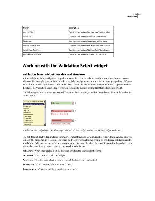
A <strong>Spry</strong> Validation Select widget is a drop-down menu that displays valid or invalid states when the user makes a<br />
selection. For example, you can insert a Validation Select widget that contains a list of states, grouped into different<br />
sections and divided by horizontal lines. If the user accidentally selects one of the divider lines as opposed to one of<br />
the states, the Validation Select widget returns a message to the user stating that their selection is invalid.<br />
The following example shows an expanded Validation Select widget, as well as the collapsed form of the widget in<br />
various states.<br />
A<br />
A. Validation Select widget in focus B. Select widget, valid state C. Select widget, required state D. Select widget, invalid state<br />
The Validation Select widget includes a number of states (for example, valid, invalid, required value, and so on). You<br />
can alter the properties of these states by using the Property inspector, depending on the desired validation results.<br />
A Validation Select widget can validate at various points (for example, when the user clicks outside the widget, as the<br />
user makes selections, or when the user tries to submit the form).<br />
Initial state When the page loads in the browser, or when the user resets the form.<br />
Focus state When the user clicks the widget.<br />
Valid state When the user selects a valid item, and the form can be submitted.<br />
Invalid state When the user selects an invalid item.<br />
Required state When the user fails to select a valid item.<br />
B<br />
C<br />
D<br />
SPRY<br />
<strong>User</strong> <strong>Guide</strong><br />
75


 Change language