

Spry User Guide - Support - Adobe
Spry User Guide - Support - Adobe
Spry User Guide - Support - Adobe

Create successful ePaper yourself
Turn your PDF publications into a flip-book with our unique Google optimized e-Paper software.
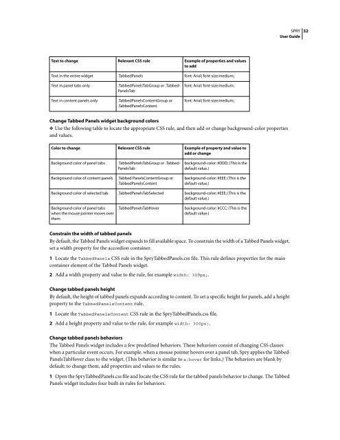
Text to change Relevant CSS rule Example of properties and values<br />
to add<br />
Text in the entire widget .TabbedPanels font: Arial; font-size:medium;<br />
Text in panel tabs only .TabbedPanelsTabGroup or .Tabbed-<br />
PanelsTab<br />
Text in content panels only .TabbedPanelsContentGroup or<br />
.TabbedPanelsContent<br />
Change Tabbed Panels widget background colors<br />
❖ Use the following table to locate the appropriate CSS rule, and then add or change background-color properties<br />
and values.<br />
SPRY<br />
<strong>User</strong> <strong>Guide</strong><br />
Constrain the width of tabbed panels<br />
By default, the Tabbed Panels widget expands to fill available space. To constrain the width of a Tabbed Panels widget,<br />
set a width property for the accordion container.<br />
1 Locate the TabbedPanels CSS rule in the <strong>Spry</strong>TabbedPanels.css file. This rule defines properties for the main<br />
container element of the Tabbed Panels widget.<br />
2 Add a width property and value to the rule, for example width: 300px;.<br />
font: Arial; font-size:medium;<br />
font: Arial; font-size:medium;<br />
Color to change Relevant CSS rule Example of property and value to<br />
add or change<br />
Background color of panel tabs .TabbedPanelsTabGroup or .Tabbed-<br />
PanelsTab<br />
Background color of content panels .Tabbed PanelsContentGroup or<br />
.TabbedPanelsContent<br />
Change tabbed panels height<br />
By default, the height of tabbed panels expands according to content. To set a specific height for panels, add a height<br />
property to the TabbedPanelsContent rule.<br />
1 Locate the TabbedPanelsContent CSS rule in the <strong>Spry</strong>TabbedPanels.css file.<br />
2 Add a height property and value to the rule, for example width: 300px;.<br />
background-color: #DDD; (This is the<br />
default value.)<br />
background-color: #EEE; (This is the<br />
default value.)<br />
Background color of selected tab .TabbedPanelsTabSelected background-color: #EEE; (This is the<br />
default value.)<br />
Background color of panel tabs<br />
when the mouse pointer moves over<br />
them<br />
.TabbedPanelsTabHover background-color: #CCC; (This is the<br />
default value.)<br />
Change tabbed panels behaviors<br />
The Tabbed Panels widget includes a few predefined behaviors. These behaviors consist of changing CSS classes<br />
when a particular event occurs. For example, when a mouse pointer hovers over a panel tab, <strong>Spry</strong> applies the Tabbed-<br />
PanelsTabHover class to the widget. (This behavior is similar to a:hover for links.) The behaviors are blank by<br />
default; to change them, add properties and values to the rules.<br />
1 Open the <strong>Spry</strong>TabbedPanels.css file and locate the CSS rule for the tabbed panels behavior to change. The Tabbed<br />
Panels widget includes four built-in rules for behaviors.<br />
32


 Change language