Spry User Guide - Support - Adobe
Spry User Guide - Support - Adobe
Spry User Guide - Support - Adobe
You also want an ePaper? Increase the reach of your titles
YUMPU automatically turns print PDFs into web optimized ePapers that Google loves.
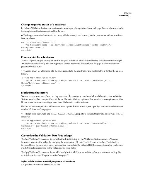
Change required status of a text area<br />
By default, Validation Text Area widgets require user input when published on a web page. You can, however, make<br />
the completion of text areas optional for the user.<br />
❖ To change the required status of a text area, add the isRequired property to the constructor and set its value to<br />
false, as follows:<br />
<br />
var textareawidget1 = new <strong>Spry</strong>.Widget.ValidationTextarea("textareawidget1",<br />
{isRequired:false});<br />
<br />
Create a hint for a text area<br />
The hint option lets you display a hint that lets your user know what kind of text they should enter (for example,<br />
“Enter your address here”). The hint appears in the text area when the user loads the page in a browser and no<br />
predefined value exists.<br />
❖ To create a hint for a text area, add the hint property to the constructor and the text of your hint as the value, as<br />
follows:<br />
<br />
var textareawidget1 = new <strong>Spry</strong>.Widget.ValidationTextarea("textareawidget1",<br />
{hint:"Enter your address here"});<br />
<br />
Block extra characters<br />
You can prevent your users from entering more than the maximum number of allowed characters in a Validation<br />
Text Area widget. For example, if you set the useCharacterMasking option so that a widget can accept no more than<br />
20 characters, the user cannot type more than 20 characters in the text area.<br />
Use this option in conjunction with the maxChars option. For information, see “Specify a minimum and maximum<br />
number of characters” on page 71.<br />
❖ To block extra characters, add the useCharacterMasking property to the constructor and set its value to true,<br />
as follows:<br />
<br />
var textareawidget1 = new <strong>Spry</strong>.Widget.ValidationTextarea("textareawidget1",<br />
maxChars:20, {useCharacterMasking:true});<br />
<br />
Customize the Validation Text Area widget<br />
The <strong>Spry</strong>ValidationTextarea.css file provides the default styling for the Validation Text Area widget. You can,<br />
however, customize the widget by changing the appropriate CSS rule. The CSS rules in the <strong>Spry</strong>ValidationTextarea.css<br />
file use the same class names as the related elements in the widget’s HTML code, so it’s easy for you to know<br />
which CSS rules correspond to the widget and its error states.<br />
The <strong>Spry</strong>ValidationTextarea.css file should already be included in your website before you start customizing. For<br />
more information, see “Prepare your files” on page 3.<br />
Style a Validation Text Area widget (general instructions)<br />
1 Open the <strong>Spry</strong>ValidationTextarea.css file.<br />
SPRY<br />
<strong>User</strong> <strong>Guide</strong><br />
73


