

Spry User Guide - Support - Adobe
Spry User Guide - Support - Adobe
Spry User Guide - Support - Adobe

You also want an ePaper? Increase the reach of your titles
YUMPU automatically turns print PDFs into web optimized ePapers that Google loves.
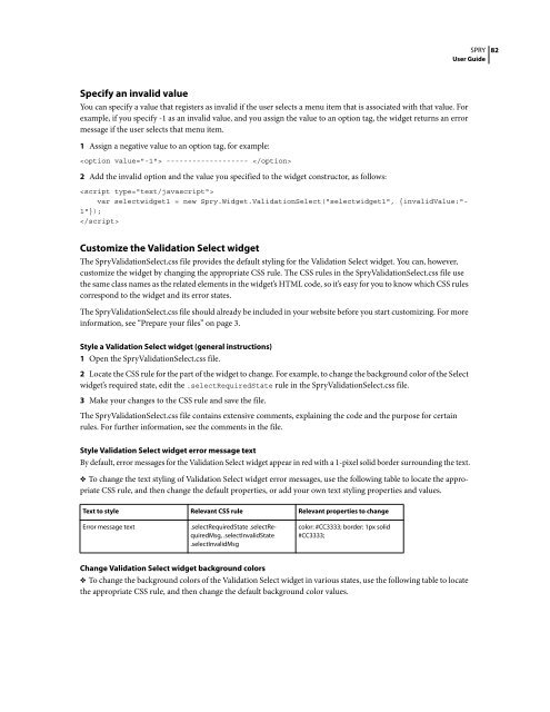
Specify an invalid value<br />
Youcanspecifyavaluethatregistersasinvalidiftheuserselectsamenuitemthatisassociatedwiththatvalue.For<br />
example, if you specify -1 as an invalid value, and you assign the value to an option tag, the widget returns an error<br />
message if the user selects that menu item.<br />
1 Assign a negative value to an option tag, for example:<br />
------------------- <br />
2 Add the invalid option and the value you specified to the widget constructor, as follows:<br />
<br />
var selectwidget1 = new <strong>Spry</strong>.Widget.ValidationSelect("selectwidget1", {invalidValue:"-<br />
1"});<br />
<br />
Customize the Validation Select widget<br />
The <strong>Spry</strong>ValidationSelect.css file provides the default styling for the Validation Select widget. You can, however,<br />
customize the widget by changing the appropriate CSS rule. The CSS rules in the <strong>Spry</strong>ValidationSelect.css file use<br />
the same class names as the related elements in the widget’s HTML code, so it’s easy for you to know which CSS rules<br />
correspond to the widget and its error states.<br />
The <strong>Spry</strong>ValidationSelect.css file should already be included in your website before you start customizing. For more<br />
information, see “Prepare your files” on page 3.<br />
Style a Validation Select widget (general instructions)<br />
1 Open the <strong>Spry</strong>ValidationSelect.css file.<br />
2 LocatetheCSSruleforthepartofthewidgettochange.Forexample,tochangethebackgroundcoloroftheSelect<br />
widget’s required state, edit the .selectRequiredState rule in the <strong>Spry</strong>ValidationSelect.css file.<br />
3 Make your changes to the CSS rule and save the file.<br />
The <strong>Spry</strong>ValidationSelect.css file contains extensive comments, explaining the code and the purpose for certain<br />
rules. For further information, see the comments in the file.<br />
SPRY<br />
<strong>User</strong> <strong>Guide</strong><br />
Style Validation Select widget error message text<br />
By default, error messages for the Validation Select widget appear in red with a 1-pixel solid border surrounding the text.<br />
❖ To change the text styling of Validation Select widget error messages, use the following table to locate the appropriate<br />
CSS rule, and then change the default properties, or add your own text styling properties and values.<br />
Text to style Relevant CSS rule Relevant properties to change<br />
Error message text .selectRequiredState .selectRequiredMsg,<br />
.selectInvalidState<br />
.selectInvalidMsg<br />
color: #CC3333; border: 1px solid<br />
#CC3333;<br />
Change Validation Select widget background colors<br />
❖ To change the background colors of the Validation Select widget in various states, use the following table to locate<br />
the appropriate CSS rule, and then change the default background color values.<br />
82


 Change language