Spry User Guide - Support - Adobe
Spry User Guide - Support - Adobe
Spry User Guide - Support - Adobe
You also want an ePaper? Increase the reach of your titles
YUMPU automatically turns print PDFs into web optimized ePapers that Google loves.
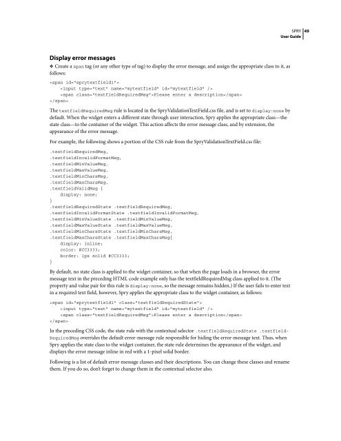
Display error messages<br />
❖ Create a span tag (or any other type of tag) to display the error message, and assign the appropriate class to it, as<br />
follows:<br />
<br />
<br />
Please enter a description<br />
<br />
The textfieldRequiredMsg rule is located in the <strong>Spry</strong>ValidationTextField.css file, and is set to display:none by<br />
default. When the widget enters a different state through user interaction, <strong>Spry</strong> applies the appropriate class—the<br />
state class—to the container of the widget. This action affects the error message class, and by extension, the<br />
appearance of the error message.<br />
For example, the following shows a portion of the CSS rule from the <strong>Spry</strong>ValidationTextField.css file:<br />
.textfieldRequiredMsg,<br />
.textfieldInvalidFormatMsg,<br />
.textfieldMinValueMsg,<br />
.textfieldMaxValueMsg,<br />
.textfieldMinCharsMsg,<br />
.textfieldMaxCharsMsg,<br />
.textfieldValidMsg {<br />
display: none;<br />
}<br />
.textfieldRequiredState .textfieldRequiredMsg,<br />
.textfieldInvalidFormatState .textfieldInvalidFormatMsg,<br />
.textfieldMinValueState .textfieldMinValueMsg,<br />
.textfieldMaxValueState .textfieldMaxValueMsg,<br />
.textfieldMinCharsState .textfieldMinCharsMsg,<br />
.textfieldMaxCharsState .textfieldMaxCharsMsg{<br />
display: inline;<br />
color: #CC3333;<br />
border: 1px solid #CC3333;<br />
}<br />
By default, no state class is applied to the widget container, so that when the page loads in a browser, the error<br />
message text in the preceding HTML code example only has the textfieldRequiredMsg class applied to it. (The<br />
propertyandvaluepairforthisruleisdisplay:none, so the message remains hidden.) If the user fails to enter text<br />
in a required text field, however, <strong>Spry</strong> applies the appropriate class to the widget container, as follows:<br />
<br />
<br />
Please enter a description<br />
<br />
In the preceding CSS code, the state rule with the contextual selector .textfieldRequiredState .textfield-<br />
RequiredMsg overrides the default error-message rule responsible for hiding the error-message text. Thus, when<br />
<strong>Spry</strong> applies the state class to the widget container, the state rule determines the appearance of the widget, and<br />
displays the error message inline in red with a 1-pixel solid border.<br />
Following is a list of default error-message classes and their descriptions. You can change these classes and rename<br />
them. If you do so, don’t forget to change them in the contextual selector also.<br />
SPRY<br />
<strong>User</strong> <strong>Guide</strong><br />
49


