Spry User Guide - Support - Adobe
Spry User Guide - Support - Adobe
Spry User Guide - Support - Adobe
Create successful ePaper yourself
Turn your PDF publications into a flip-book with our unique Google optimized e-Paper software.
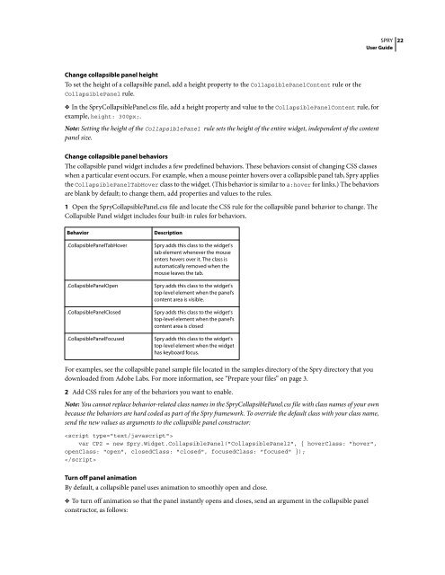
Change collapsible panel height<br />
To set the height of a collapsible panel, add a height property to the CollapsiblePanelContent rule or the<br />
CollapsiblePanel rule.<br />
❖ In the <strong>Spry</strong>CollapsiblePanel.css file, add a height property and value to the CollapsiblePanelContent rule, for<br />
example, height: 300px;.<br />
Note: Setting the height of the CollapsiblePanel rule sets the height of the entire widget, independent of the content<br />
panel size.<br />
Change collapsible panel behaviors<br />
The collapsible panel widget includes a few predefined behaviors. These behaviors consist of changing CSS classes<br />
when a particular event occurs. For example, when a mouse pointer hovers over a collapsible panel tab, <strong>Spry</strong> applies<br />
the CollapsiblePanelTabHover class to the widget. (This behavior is similar to a:hover for links.) The behaviors<br />
are blank by default; to change them, add properties and values to the rules.<br />
1 Open the <strong>Spry</strong>CollapsiblePanel.css file and locate the CSS rule for the collapsible panel behavior to change. The<br />
Collapsible Panel widget includes four built-in rules for behaviors.<br />
Behavior Description<br />
.CollapsiblePanelTabHover <strong>Spry</strong> adds this class to the widget's<br />
tab element whenever the mouse<br />
enters hovers over it. The class is<br />
automatically removed when the<br />
mouse leaves the tab.<br />
.CollapsiblePanelOpen <strong>Spry</strong> adds this class to the widget's<br />
top-level element when the panel’s<br />
content area is visible.<br />
.CollapsiblePanelClosed <strong>Spry</strong> adds this class to the widget's<br />
top-level element when the panel's<br />
content area is closed<br />
.CollapsiblePanelFocused <strong>Spry</strong> adds this class to the widget's<br />
top-level element when the widget<br />
has keyboard focus.<br />
For examples, see the collapsible panel sample file located in the samples directory of the <strong>Spry</strong> directory that you<br />
downloaded from <strong>Adobe</strong> Labs. For more information, see “Prepare your files” on page 3.<br />
SPRY<br />
<strong>User</strong> <strong>Guide</strong><br />
2 Add CSS rules for any of the behaviors you want to enable.<br />
Note: You cannot replace behavior-related class names in the <strong>Spry</strong>CollapsiblePanel.css file with class names of your own<br />
because the behaviors are hard coded as part of the <strong>Spry</strong> framework. To override the default class with your class name,<br />
send the new values as arguments to the collapsible panel constructor:<br />
<br />
var CP2 = new <strong>Spry</strong>.Widget.CollapsiblePanel("CollapsiblePanel2", { hoverClass: "hover",<br />
openClass: "open", closedClass: "closed", focusedClass: "focused" });<br />
<br />
Turn off panel animation<br />
By default, a collapsible panel uses animation to smoothly open and close.<br />
❖ To turn off animation so that the panel instantly opens and closes, send an argument in the collapsible panel<br />
constructor, as follows:<br />
22


