

Spry User Guide - Support - Adobe
Spry User Guide - Support - Adobe
Spry User Guide - Support - Adobe

Create successful ePaper yourself
Turn your PDF publications into a flip-book with our unique Google optimized e-Paper software.
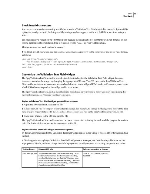
Block invalid characters<br />
You can prevent users from entering invalid characters in a Validation Text Field widget. For example, if you set this<br />
option for a widget set with the Integer validation type, nothing appears in the text field if the user tries to type a<br />
letter.<br />
You must specify a validation type for this option because the specification of the third parameter depends on the<br />
second parameter. If no validation type is required, specify "none" as your validation type.<br />
This option does not work in older browsers.<br />
❖ To block invalid characters, add the useCharacterMasking property to the constructor and set its value to true,<br />
as follows:<br />
<br />
var textfieldwidget1 = new <strong>Spry</strong>.Widget.ValidationTextField("textfieldwidget1",<br />
"validation_type", {useCharacterMasking:true});<br />
<br />
Customize the Validation Text Field widget<br />
The <strong>Spry</strong>ValidationTextField.css file provides the default styling for the Validation Text Field widget. You can,<br />
however, customize the widget by changing the appropriate CSS rule. The CSS rules in the <strong>Spry</strong>ValidationText-<br />
Field.css file use the same class names as the related elements in the widget’s HTML code, so it’s easy for you to know<br />
which CSS rules correspond to the widget and its error states.<br />
The <strong>Spry</strong>ValidationTextField.css file should already be included in your website before you start customizing. For<br />
more information, see “Prepare your files” on page 3.<br />
Style a Validation Text Field widget (general instructions)<br />
1 Open the <strong>Spry</strong>ValidationTextField.css file.<br />
2 Locate the CSS rule for the part of the widget to change. For example, to change the background color of the Text<br />
Field widget’s required state, edit the .textfieldRequiredState rule in the <strong>Spry</strong>ValidationTextField.css file.<br />
3 Make your changes to the CSS and save the file.<br />
The <strong>Spry</strong>ValidationTextField.css file contains extensive comments, explaining the code and the purpose for certain<br />
rules. For further information, see the comments in the file.<br />
Style Validation Text Field widget error message text<br />
By default, error messages for the Validation Text Field widget appear in red with a 1-pixel solid border surrounding<br />
the text.<br />
❖ To change the text styling of Validation Text Field widget error messages, use the following table to locate the<br />
appropriate CSS rule, and then change the default properties, or add your own text-styling properties and values.<br />
Text to change Relevant CSS rule Relevant properties to change<br />
Error message text .textfieldRequiredState .textfieldRequiredMsg, .textfieldInvalidFormatState<br />
.textfieldInvalidFormatMsg,<br />
.textfieldMinValueState .textfieldMinValueMsg, .textfieldMaxValueState<br />
.textfieldMaxValueMsg, .textfield-<br />
MinCharsState .textfieldMinCharsMsg, .textfieldMax-<br />
CharsState .textfieldMaxCharsMsg<br />
color: #CC3333; border: 1px solid<br />
#CC3333;<br />
SPRY<br />
<strong>User</strong> <strong>Guide</strong><br />
62


 Change language