STATA 11 for Windows SAMPLE SESSION - Food Security Group ...
STATA 11 for Windows SAMPLE SESSION - Food Security Group ...
STATA 11 for Windows SAMPLE SESSION - Food Security Group ...
Create successful ePaper yourself
Turn your PDF publications into a flip-book with our unique Google optimized e-Paper software.
Stata <strong>11</strong> Sample Session Section 4 – Tables and Graphs, Survey estimation<br />
Scatter plot using “by”<br />
subcommand<br />
command that created the graph to see the graph again. You<br />
cannot have more than one graph window open at a time.<br />
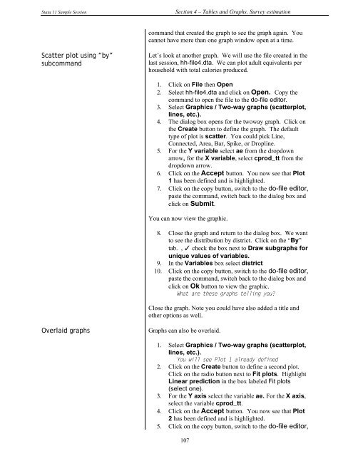
Let’s look at another graph. We will use the file created in the<br />
last session, hh-file4.dta. We can plot adult equivalents per<br />
household with total calories produced.<br />
1. Click on File then Open<br />
2. Select hh-file4.dta and click on Open. Copy the<br />
command to open the file to the do-file editor.<br />
3. Select Graphics / Two-way graphs (scatterplot,<br />
lines, etc.).<br />
4. The dialog box opens <strong>for</strong> the twoway graph. Click on<br />
the Create button to define the graph. The default<br />
type of plot is scatter. You could pick Line,<br />
Connected, Area, Bar, Spike, or Dropline.<br />
5. For the Y variable select ae from the dropdown<br />
arrow, <strong>for</strong> the X variable, select cprod_tt from the<br />
dropdown arrow.<br />
6. Click on the Accept button. You now see that Plot<br />
1 has been defined and is highlighted.<br />
7. Click on the copy button, switch to the do-file editor,<br />
paste the command, switch back to the dialog box and<br />
click on Submit.<br />
You can now view the graphic.<br />
Overlaid graphs Graphs can also be overlaid.<br />
8. Close the graph and return to the dialog box. We want<br />
to see the distribution by district. Click on the “By”<br />
tab. , ✓ check the box next to Draw subgraphs <strong>for</strong><br />
unique values of variables.<br />
9. In the Variables box select district<br />
10. Click on the copy button, switch to the do-file editor,<br />
paste the command, switch back to the dialog box and<br />
click on Ok button to view the graphic.<br />
What are these graphs telling you?<br />
Close the graph. Note you could have also added a title and<br />
other options as well.<br />
1. Select Graphics / Two-way graphs (scatterplot,<br />
lines, etc.).<br />
You will see Plot 1 already defined<br />
2. Click on the Create button to define a second plot.<br />
Click on the radio button next to Fit plots. Highlight<br />
Linear prediction in the box labeled Fit plots<br />
(select one).<br />
3. For the Y axis select the variable ae. For the X axis,<br />
select the variable cprod_tt.<br />
4. Click on the Accept button. You now see that Plot<br />
2 has been defined and is highlighted.<br />
5. Click on the copy button, switch to the do-file editor,<br />
107


