PV*SOL Expert 6.0 - Manual - Valentin Software
PV*SOL Expert 6.0 - Manual - Valentin Software
PV*SOL Expert 6.0 - Manual - Valentin Software
You also want an ePaper? Increase the reach of your titles
YUMPU automatically turns print PDFs into web optimized ePapers that Google loves.
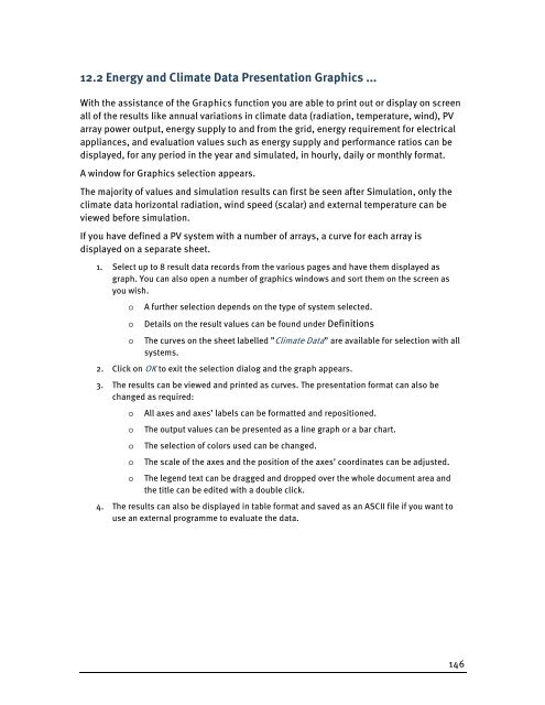
12.2 Energy and Climate Data Presentation Graphics ...<br />
With the assistance of the Graphics function you are able to print out or display on screen<br />
all of the results like annual variations in climate data (radiation, temperature, wind), PV<br />
array power output, energy supply to and from the grid, energy requirement for electrical<br />
appliances, and evaluation values such as energy supply and performance ratios can be<br />
displayed, for any period in the year and simulated, in hourly, daily or monthly format.<br />
A window for Graphics selection appears.<br />
The majority of values and simulation results can first be seen after Simulation, only the<br />
climate data horizontal radiation, wind speed (scalar) and external temperature can be<br />
viewed before simulation.<br />
If you have defined a PV system with a number of arrays, a curve for each array is<br />
displayed on a separate sheet.<br />
1. Select up to 8 result data records from the various pages and have them displayed as<br />
graph. You can also open a number of graphics windows and sort them on the screen as<br />
you wish.<br />
o A further selection depends on the type of system selected.<br />
o Details on the result values can be found under Definitions<br />
o The curves on the sheet labelled ”Climate Data” are available for selection with all<br />
systems.<br />
2. Click on OK to exit the selection dialog and the graph appears.<br />
3. The results can be viewed and printed as curves. The presentation format can also be<br />
changed as required:<br />
o All axes and axes’ labels can be formatted and repositioned.<br />
o The output values can be presented as a line graph or a bar chart.<br />
o The selection of colors used can be changed.<br />
o The scale of the axes and the position of the axes’ coordinates can be adjusted.<br />
o The legend text can be dragged and dropped over the whole document area and<br />
the title can be edited with a double click.<br />
4. The results can also be displayed in table format and saved as an ASCII file if you want to<br />
use an external programme to evaluate the data.<br />
146


