- Page 1 and 2:
LibreOffice 3.4 Calc Guide Using Sp
- Page 3 and 4:
Contents Copyright.................
- Page 5 and 6:
Using print ranges.................
- Page 7 and 8:
Note for Mac users.................
- Page 9 and 10:
Who is this book for? Anyone who wa
- Page 11 and 12:
What are all these things called? T
- Page 13 and 14:
Chapter 1 Introducing Calc Using Sp
- Page 15 and 16:
Figure 2: Parts of the Calc window
- Page 17 and 18:
Moving toolbars To move a docked to
- Page 19 and 20:
Formatting toolbar In the Formattin
- Page 21 and 22:
Status bar The Calc status bar prov
- Page 23 and 24:
Figure 15: LibreOffice Start Center
- Page 25 and 26:
characters are used to separate the
- Page 27 and 28: Figure 18. Saving a spreadsheet in
- Page 29 and 30: Figure 20: Two levels of password p
- Page 31 and 32: Using the Tab and Enter keys • Pr
- Page 33 and 34: Figure 23. Sheet tab arrows Selecti
- Page 35 and 36: Selecting sheets You can select eit
- Page 37 and 38: • Click in an empty space at the
- Page 39 and 40: Deleting sheets Figure 28: Move/Cop
- Page 41 and 42: Figure 30 shows some frozen rows an
- Page 43 and 44: Tip Splitting the screen vertically
- Page 45 and 46: Tip Ranges, scenarios, pictures, an
- Page 47 and 48: Chapter 2 Entering, Editing, and Fo
- Page 49 and 50: Entering dates and times Select the
- Page 51 and 52: Caution Choices that are not availa
- Page 53 and 54: Using selection lists Selection lis
- Page 55 and 56: Figure 46: Defining input help for
- Page 57 and 58: Formatting multiple lines of text M
- Page 59 and 60: • Apply any of the data types in
- Page 61 and 62: Formatting the cell borders Figure
- Page 63 and 64: Before you format a sheet with a th
- Page 65 and 66: Hiding and showing data When elemen
- Page 67 and 68: Figure 64: Select Mrs from the Titl
- Page 69 and 70: Note Sorting records A maximum of e
- Page 71 and 72: Using the Find toolbar The Find too
- Page 73 and 74: Finding and replacing cell styles T
- Page 75 and 76: Chapter 3 Creating Charts and Graph
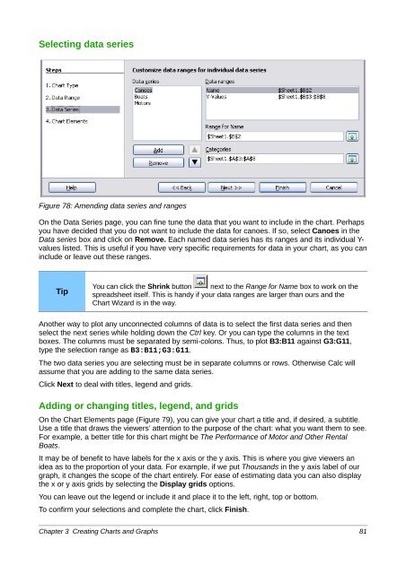
- Page 77: Next, open the Chart Wizard dialog
- Page 81 and 82: Figure 80: Elements of 2D chart Fig
- Page 83 and 84: Figure 94 on page 97 shows examples
- Page 85 and 86: Formatting charts The Format menu h
- Page 87 and 88: You can also use the Transparency p
- Page 89 and 90: Figure 88: Setting the illumination
- Page 91 and 92: The other tabs on the dialog, Line,
- Page 93 and 94: To move a chart interactively: 1) C
- Page 95 and 96: Figure 94: Pie charts As the Chart
- Page 97 and 98: As shown in Figure 97, an area char
- Page 99 and 100: Bubble charts A bubble chart is a v
- Page 101 and 102: Figure 104: Adjusting data series f
- Page 103 and 104: Chapter 4 Using Styles and Template
- Page 105 and 106: Cell styles Similar to paragraph st
- Page 107 and 108: Using the Apply Style list You can
- Page 109 and 110: Category In Calc, the only option i
- Page 111 and 112: Borders The Border and Background t
- Page 113 and 114: Figure 114: Choosing to copy styles
- Page 115 and 116: Creating a template You can create
- Page 117 and 118: Caution Note If you choose Keep Old
- Page 119 and 120: Associating a spreadsheet with a di
- Page 121 and 122: Chapter 5 Using Graphics in Calc
- Page 123 and 124: 3) On the Insert Picture dialog, na
- Page 125 and 126: Note Going the other way, from embe
- Page 127 and 128: Figure 124: The Picture Toolbar Tab
- Page 129 and 130:
Caution Adjusting colors Applying L
- Page 131 and 132:
Resizing a bit-mapped (raster) imag
- Page 133 and 134:
Group To group images: 1) Select on
- Page 135 and 136:
If support for Asian languages has
- Page 137 and 138:
Calc provides several options to re
- Page 139 and 140:
Figure 133: The dialog to create or
- Page 141 and 142:
Quick printing Click the Print File
- Page 143 and 144:
Selecting sheets to print In additi
- Page 145 and 146:
2) Select the cell range using the
- Page 147 and 148:
Defining a custom print range In ad
- Page 149 and 150:
Printing options setup in page styl
- Page 151 and 152:
From here you can also set the marg
- Page 153 and 154:
Controlling PDF content and quality
- Page 155 and 156:
Figure 149: Initial View page of PD
- Page 157 and 158:
Security page of PDF Options dialog
- Page 159 and 160:
2) In your e-mail program, enter th
- Page 161 and 162:
Chapter 7 Using Formulas and Functi
- Page 163 and 164:
Figure 154: Error checking of formu
- Page 165 and 166:
Formula Description =AVERAGE(BloodS
- Page 167 and 168:
Taking this example further, if the
- Page 169 and 170:
Examples Figure 160: Reference Oper
- Page 171 and 172:
Figure 161: Relative references You
- Page 173 and 174:
Order of calculation Order of calcu
- Page 175 and 176:
Figure 163: Combining data from sev
- Page 177 and 178:
6) Click Yes. You have now copied t
- Page 179 and 180:
The formula then uses the IF functi
- Page 181 and 182:
Figure 170: Function Wizard after s
- Page 183 and 184:
Place a unique formula in each cell
- Page 185 and 186:
Figure 175: Division by zero soluti
- Page 187 and 188:
) Initiate trace by clicking Trace
- Page 189 and 190:
Simple statistics Another common us
- Page 191 and 192:
determined by the closest multiple
- Page 193 and 194:
Advanced functions As is common wit
- Page 195 and 196:
Important note Unfortunately, due t
- Page 197 and 198:
Figure 180: Import settings Creatin
- Page 199 and 200:
For example, if you drag region and
- Page 201 and 202:
listing of the individual entry. If
- Page 203 and 204:
Figure 190: Original Pivot Table (t
- Page 205 and 206:
In the Subtotals section of the Dat
- Page 207 and 208:
determined mainly by the type of va
- Page 209 and 210:
You can change the default names fo
- Page 211 and 212:
Figure 213: Options for a row or co
- Page 213 and 214:
Filtering To limit the Pivot Table
- Page 215 and 216:
Figure 220: Formula reference to a
- Page 217 and 218:
Figure 223: Second syntax variation
- Page 219 and 220:
Introduction Once you are familiar
- Page 221 and 222:
Creating subtotals Subtotals are im
- Page 223 and 224:
You will appreciate this is a tedio
- Page 225 and 226:
Figure 233: Click the plus buttons
- Page 227 and 228:
5) Optionally select or deselect th
- Page 229 and 230:
Tracking values in scenarios Figure
- Page 231 and 232:
Tip You may find it easier to mark
- Page 233 and 234:
Multiple operations across rows and
- Page 235 and 236:
Figure 243: Example setup for goal
- Page 237 and 238:
Figure 246: The Solver dialog Figur
- Page 239 and 240:
Why use multiple sheets? Chapter 1
- Page 241 and 242:
To insert sheets and name them at t
- Page 243 and 244:
2) Now, click on the sheet tab for
- Page 245 and 246:
4) Switch back to the original spre
- Page 247 and 248:
• Document: the hyperlink points
- Page 249 and 250:
Figure 262: Using a Web Query to li
- Page 251 and 252:
6) Select the required range or tab
- Page 253 and 254:
Figure 269: Using the Name box to f
- Page 255 and 256:
Viewing data sources Open a documen
- Page 257 and 258:
Object Linking and Embedding (OLE)
- Page 259 and 260:
Non-linked OLE object If the OLE ob
- Page 261 and 262:
Chapter 11 Sharing and Reviewing Do
- Page 263 and 264:
Opening a shared spreadsheet When y
- Page 265 and 266:
Note It is not necessary to passwor
- Page 267 and 268:
Figure 285: Comment dialog After yo
- Page 269 and 270:
Formatting comments You can change
- Page 271 and 272:
Figure 291: Accept or Reject change
- Page 273 and 274:
Saving versions Most documents go t
- Page 275 and 276:
Chapter 12 Calc Macros Automating r
- Page 277 and 278:
7) Set the operation to Multiply an
- Page 279 and 280:
args1(3).Name = "Transpose" args1(3
- Page 281 and 282:
6) Select AuthorsCalcMacros and cli
- Page 283 and 284:
Figure 311: The function is gone Wh
- Page 285 and 286:
3) IsArray checks to see if the arg
- Page 287 and 288:
Sorting Consider sorting the data i
- Page 289 and 290:
Chapter 13 Calc as a Simple Databas
- Page 291 and 292:
Associating a range with a name In
- Page 293 and 294:
Table 14. com.sun.star.sheet.NamedR
- Page 295 and 296:
A database range provides behavior
- Page 297 and 298:
Caution When a cell is moved during
- Page 299 and 300:
Figure 320: Use the standard filter
- Page 301 and 302:
REM empty filter descriptor. oFilte
- Page 303 and 304:
The filter created in Listing 17 fi
- Page 305 and 306:
Function Description STDEVA Estimat
- Page 307 and 308:
Search a block of data using VLOOKU
- Page 309 and 310:
The formula =VLOOKUP(83; $Sheet2.$A
- Page 311 and 312:
Listing 20. Better use of OFFSET. =
- Page 313 and 314:
The database argument is the cell r
- Page 315 and 316:
Introduction This chapter describes
- Page 317 and 318:
Modify the color components as requ
- Page 319 and 320:
Appearance options On the LibreOffi
- Page 321 and 322:
VBA Properties Load/Save options On
- Page 323 and 324:
General options for Calc In the Opt
- Page 325 and 326:
Figure 333: Selecting view options
- Page 327 and 328:
Figure 334: Calc calculation option
- Page 329 and 330:
Sort Lists options In the Options d
- Page 331 and 332:
Figure 339: Calc grid options Print
- Page 333 and 334:
Figure 342: The Menus page of the C
- Page 335 and 336:
Adding a command to a menu You can
- Page 337 and 338:
The new toolbar now appears on the
- Page 339 and 340:
Figure 347: Assigning a cell style
- Page 341 and 342:
Appendix A Keyboard Shortcuts
- Page 343 and 344:
Shortcut Keys Effect Ctrl+Up Arrow
- Page 345 and 346:
Arrow key shortcuts Table 32. Arrow
- Page 347 and 348:
Appendix B Description of Functions
- Page 349 and 350:
Syntax Description ASINH(number) Re
- Page 351 and 352:
Syntax Description PRODUCT(number 1
- Page 353 and 354:
Accounting systems vary in the numb
- Page 355 and 356:
Syntax Description CUMIPMT_ADD(rate
- Page 357 and 358:
Syntax Description INTRATE(settleme
- Page 359 and 360:
Syntax Description PMT(rate; NPER;
- Page 361 and 362:
Syntax Description VDB(cost; salvag
- Page 363 and 364:
Syntax Description CHIINV(number; d
- Page 365 and 366:
Syntax Description INTERCEPT(data_Y
- Page 367 and 368:
Syntax Description RANK(value; data
- Page 369 and 370:
Caution Table 39: Data and time fun
- Page 371 and 372:
Syntax Description WORKDAY(start_da
- Page 373 and 374:
Syntax Description ISNA(value) Retu
- Page 375 and 376:
Syntax Description DVAR(database; d
- Page 377 and 378:
Syntax Description AREAS(reference)
- Page 379 and 380:
Syntax Description OFFSET(reference
- Page 381 and 382:
Syntax Description DECIMAL(text; ra
- Page 383 and 384:
Syntax Description T(value) Convert
- Page 385 and 386:
Syntax Description IMARGUMENT(compl
- Page 387 and 388:
Introduction to Calc error codes Ca
- Page 389 and 390:
General error codes The following t
- Page 391 and 392:
400 LibreOffice 3.4 Calc Guide
- Page 393 and 394:
formatting 87 formatting 3D 89 grap
- Page 395 and 396:
INDEX 317 INDIRECT 316 informationa
- Page 397 and 398:
general options 145 multiple pages
- Page 399:
408 LibreOffice 3.4 Calc Guide