- Page 1 and 2:
Conference Proceedings: Volume 04 E
- Page 3 and 4:
Table of Contents Volume 01 Afhami,
- Page 5 and 6:
Cox, Sarah Crabbe, Anthony Croft, M
- Page 7 and 8:
Volume 03 Imbesi, Lorenzo Jobst, Bi
- Page 9 and 10:
McCarthy, Steven McLaughlin, Sally
- Page 11 and 12:
Roncoletta, Mariana Rachel Santos,
- Page 13 and 14:
Wu, Jun-Chieh Chen, Cheng-Chi Hsin-
- Page 15 and 16:
Introduction 1554 Conference Procee
- Page 17 and 18:
1556 Conference Proceedings Osmud R
- Page 19 and 20:
1558 Conference Proceedings Osmud R
- Page 21 and 22:
I am uncomfortable when the colour
- Page 23 and 24:
1562 Conference Proceedings Osmud R
- Page 25 and 26:
1564 Conference Proceedings Osmud R
- Page 27 and 28:
Introduction 1566 Conference Procee
- Page 29 and 30:
1568 Conference Proceedings Mariano
- Page 31 and 32:
Australia New Zealand 1570 Conferen
- Page 33 and 34:
Projects 1572 Conference Proceeding
- Page 35 and 36:
1574 Conference Proceedings Mariano
- Page 37 and 38:
1576 Conference Proceedings Mariano
- Page 39 and 40:
1578 Conference Proceedings Mariano
- Page 41 and 42:
1580 Conference Proceedings Uni Deg
- Page 43 and 44:
1582 Conference Proceedings Holger
- Page 45 and 46:
1584 Conference Proceedings Holger
- Page 47 and 48:
1586 Conference Proceedings Holger
- Page 49 and 50:
1588 Conference Proceedings Holger
- Page 51 and 52:
1590 Conference Proceedings Holger
- Page 53 and 54:
1592 Conference Proceedings 1.0 Int
- Page 55 and 56:
1594 Conference Proceedings Fernand
- Page 57 and 58:
1596 Conference Proceedings Fernand
- Page 59 and 60:
1598 Conference Proceedings Fernand
- Page 61 and 62:
1600 Conference Proceedings Fernand
- Page 63 and 64:
1602 Conference Proceedings 6.0 Fur
- Page 65 and 66:
1604 Conference Proceedings Fernand
- Page 67 and 68:
Introduction 1606 2 Conference Proc
- Page 69 and 70:
1608 4 Conference Proceedings Maria
- Page 71 and 72:
1610 6 Conference Proceedings Maria
- Page 73 and 74:
1612 8 Conference Proceedings Maria
- Page 75 and 76:
1614 10 Conference Proceedings Mari
- Page 77 and 78:
1616 12 Conference Proceedings Mari
- Page 79 and 80:
1618 Conference Proceedings Daniela
- Page 81 and 82:
1620 Conference Proceedings Daniela
- Page 83 and 84:
1622 Conference Proceedings Daniela
- Page 85 and 86:
1624 Conference Proceedings Figure
- Page 87 and 88:
1626 Conference Proceedings Figure
- Page 89 and 90:
1628 Conference Proceedings Daniela
- Page 91 and 92:
1630 Conference Proceedings INTRODU
- Page 93 and 94:
Design Management Review The Design
- Page 95 and 96:
1634 Conference Proceedings In tota
- Page 97 and 98:
Common Features 1636 Conference Pro
- Page 99 and 100:
1638 Conference Proceedings The cha
- Page 101 and 102:
1640 Conference Proceedings Seymour
- Page 103 and 104:
1642 Conference Proceedings 4 - Ent
- Page 105 and 106:
1644 Conference Proceedings Seymour
- Page 107 and 108:
1646 Conference Proceedings DRS 201
- Page 109 and 110:
1648 Conference Proceedings Drawing
- Page 111 and 112:
1650 Conference Proceedings Drawing
- Page 113 and 114:
1652 Conference Proceedings Drawing
- Page 115 and 116:
1654 Conference Proceedings Drawing
- Page 117 and 118:
1656 Conference Proceedings Drawing
- Page 119 and 120:
1658 Conference Proceedings Drawing
- Page 121 and 122:
1660 Conference Proceedings DRS 201
- Page 123 and 124:
1662 Conference Proceedings Transfo
- Page 125 and 126:
1664 Conference Proceedings Transfo
- Page 127 and 128:
1666 Conference Proceedings Transfo
- Page 129 and 130:
1668 Conference Proceedings Transfo
- Page 131 and 132:
1670 Conference Proceedings Transfo
- Page 133 and 134:
1672 Conference Proceedings Transfo
- Page 135 and 136:
1674 Conference Proceedings Transfo
- Page 137 and 138:
1676 Conference Proceedings DRS 201
- Page 139 and 140:
1678 Conference Proceedings Partici
- Page 141 and 142:
1680 Conference Proceedings Neighbo
- Page 143 and 144:
1682 Conference Proceedings Neighbo
- Page 145 and 146:
1684 Conference Proceedings Neighbo
- Page 147 and 148:
1686 Conference Proceedings Neighbo
- Page 149 and 150:
References 1688 Conference Proceedi
- Page 151 and 152:
DRS 2012 Bangkok Chulalongkorn Univ
- Page 153 and 154:
1692 Conference Proceedings Buildin
- Page 155 and 156:
1694 Conference Proceedings Buildin
- Page 157 and 158:
1696 Conference Proceedings Buildin
- Page 159 and 160:
1698 Conference Proceedings Figure
- Page 161 and 162:
1700 Conference Proceedings Buildin
- Page 163 and 164:
4.2.2.2 Small-scale interventions f
- Page 165 and 166:
1704 Conference Proceedings Figure
- Page 167 and 168:
1706 Conference Proceedings Buildin
- Page 169 and 170:
1708 Conference Proceedings Buildin
- Page 171 and 172:
1710 Conference Proceedings DRS 201
- Page 173 and 174:
1712 Conference Proceedings Figure
- Page 175 and 176:
1714 Conference Proceedings Emotion
- Page 177 and 178:
1716 Conference Proceedings Figure
- Page 179 and 180:
1718 Conference Proceedings Figure
- Page 181 and 182:
1720 Conference Proceedings Figure
- Page 183 and 184:
1722 Conference Proceedings Emotion
- Page 185 and 186:
1724 Conference Proceedings Emotion
- Page 187 and 188:
Introduction 1726 Conference Procee
- Page 189 and 190:
1728 Conference Proceedings Alison
- Page 191 and 192:
1730 Conference Proceedings Alison
- Page 193 and 194:
1732 Conference Proceedings Alison
- Page 195 and 196:
References 1734 Conference Proceedi
- Page 197 and 198:
1736 Conference Proceedings DRS 201
- Page 199 and 200:
1738 Conference Proceedings Hindran
- Page 201 and 202:
1740 Conference Proceedings � ope
- Page 203 and 204:
1742 Conference Proceedings � not
- Page 205 and 206:
1744 Conference Proceedings Hindran
- Page 207 and 208:
1746 Conference Proceedings Hindran
- Page 209 and 210:
1748 Conference Proceedings DRS 201
- Page 211 and 212:
1750 Conference Proceedings Experim
- Page 213 and 214:
1752 Conference Proceedings Experim
- Page 215 and 216:
1754 Conference Proceedings Experim
- Page 217 and 218:
1756 Conference Proceedings Experim
- Page 219 and 220:
1758 Conference Proceedings Experim
- Page 221 and 222:
1760 Conference Proceedings 1. Intr
- Page 223 and 224:
1762 Conference Proceedings Adisorn
- Page 225 and 226:
1764 Conference Proceedings Adisorn
- Page 227 and 228:
1766 Conference Proceedings Adisorn
- Page 229 and 230:
1768 Conference Proceedings Adisorn
- Page 231 and 232:
1770 Conference Proceedings Adisorn
- Page 233 and 234:
1772 Conference Proceedings 5.2 Ret
- Page 235 and 236:
1774 Conference Proceedings Adisorn
- Page 237 and 238:
1776 Conference Proceedings DRS 201
- Page 239 and 240:
1778 Conference Proceedings Learnin
- Page 241 and 242:
1780 Conference Proceedings Learnin
- Page 243 and 244:
1782 Conference Proceedings Learnin
- Page 245 and 246:
1784 Conference Proceedings Learnin
- Page 247 and 248:
1786 Conference Proceedings Learnin
- Page 249 and 250:
1788 Conference Proceedings Transfo
- Page 251 and 252:
1790 Conference Proceedings Randy S
- Page 253 and 254:
1792 Conference Proceedings Randy S
- Page 255 and 256:
1794 Conference Proceedings Randy S
- Page 257 and 258:
1796 Conference Proceedings Randy S
- Page 259 and 260:
1798 Conference Proceedings Randy S
- Page 261 and 262:
Introduction 1800 Conference Procee
- Page 263 and 264:
1802 Conference Proceedings Project
- Page 265 and 266:
1804 Conference Proceedings Yasuko
- Page 267 and 268:
1806 Conference Proceedings Yasuko
- Page 269 and 270:
1808 Conference Proceedings 1. Util
- Page 271 and 272:
1810 Conference Proceedings Yasuko
- Page 273 and 274:
1812 Conference Proceedings Yasuko
- Page 275 and 276:
Introduction 1814 Conference Procee
- Page 277 and 278:
1816 Conference Proceedings Learnin
- Page 279 and 280:
1818 Conference Proceedings Batuhan
- Page 281 and 282:
1820 Conference Proceedings Batuhan
- Page 283 and 284:
1822 Conference Proceedings Batuhan
- Page 285 and 286:
1824 Conference Proceedings DRS 201
- Page 287 and 288:
Brainstorming 1826 Conference Proce
- Page 289 and 290:
1828 Conference Proceedings The Inf
- Page 291 and 292:
1830 Conference Proceedings The Inf
- Page 293 and 294:
1832 Conference Proceedings The Inf
- Page 295 and 296:
Percent 1834 Conference Proceedings
- Page 297 and 298:
percent 20 15 10 1836 Conference Pr
- Page 299 and 300:
1838 Conference Proceedings The Inf
- Page 301 and 302:
1840 Conference Proceedings Biologi
- Page 303 and 304:
1842 Conference Proceedings Synthet
- Page 305 and 306:
1844 Conference Proceedings Orkan T
- Page 307 and 308:
1846 Conference Proceedings Orkan T
- Page 309 and 310:
1848 Conference Proceedings Orkan T
- Page 311 and 312:
1850 Conference Proceedings Orkan T
- Page 313 and 314:
1852 Conference Proceedings Orkan T
- Page 315 and 316:
Introduction 1854 Conference Procee
- Page 317 and 318:
1856 Conference Proceedings Diana T
- Page 319 and 320:
1858 Conference Proceedings Diana T
- Page 321 and 322:
1860 Conference Proceedings Diana T
- Page 323 and 324:
1862 Conference Proceedings Diana T
- Page 325 and 326:
1864 Conference Proceedings Figure
- Page 327 and 328:
1866 Conference Proceedings Figure
- Page 329 and 330:
1868 Conference Proceedings DRS 201
- Page 331 and 332:
1870 Conference Proceedings Typogra
- Page 333 and 334:
1872 Conference Proceedings Typogra
- Page 335 and 336:
1874 Conference Proceedings Typogra
- Page 337 and 338:
1876 Conference Proceedings Experim
- Page 339 and 340:
1878 Conference Proceedings Experim
- Page 341 and 342:
1880 Conference Proceedings Experim
- Page 343 and 344:
1882 Conference Proceedings Experim
- Page 345 and 346:
1884 Conference Proceedings DRS 201
- Page 347 and 348:
1886 Conference Proceedings eRubric
- Page 349 and 350:
1888 Conference Proceedings eRubric
- Page 351 and 352:
1890 Conference Proceedings Group /
- Page 353 and 354:
1892 Conference Proceedings Adminis
- Page 355 and 356:
1894 Conference Proceedings eRubric
- Page 357 and 358:
Introduction 1896 Conference Procee
- Page 359 and 360:
1898 Conference Proceedings My Sust
- Page 361 and 362:
1900 Conference Proceedings Senem T
- Page 363 and 364:
1902 Conference Proceedings Senem T
- Page 365 and 366:
1904 Conference Proceedings Senem T
- Page 367 and 368:
1906 Conference Proceedings Senem T
- Page 369 and 370:
1908 Conference Proceedings DRS 201
- Page 371 and 372:
1910 Conference Proceedings Masked
- Page 373 and 374:
1912 Conference Proceedings 3.3 Exp
- Page 375 and 376:
1914 Conference Proceedings Masked
- Page 377 and 378:
1916 Conference Proceedings Masked
- Page 379 and 380:
1918 Conference Proceedings Masked
- Page 381 and 382:
1920 Conference Proceedings DRS 201
- Page 383 and 384:
1922 Conference Proceedings What is
- Page 385 and 386:
1924 Conference Proceedings What is
- Page 387 and 388:
1926 Conference Proceedings What is
- Page 389 and 390:
1928 Conference Proceedings Prototy
- Page 391 and 392:
1930 Conference Proceedings What is
- Page 393 and 394:
1932 Conference Proceedings What is
- Page 395 and 396:
Introduction 1934 Conference Procee
- Page 397 and 398:
1936 Conference Proceedings Annemie
- Page 399 and 400: 1938 Conference Proceedings Annemie
- Page 401 and 402: Design process 1940 Conference Proc
- Page 403 and 404: 1942 Conference Proceedings Annemie
- Page 405 and 406: 1944 Conference Proceedings Annemie
- Page 407 and 408: Introduction 1946 Conference Procee
- Page 409 and 410: 1948 Conference Proceedings Vinay V
- Page 411 and 412: 1950 Conference Proceedings Vinay V
- Page 413 and 414: 1952 Conference Proceedings Vinay V
- Page 415 and 416: 1954 Conference Proceedings Vinay V
- Page 417 and 418: 1956 Conference Proceedings Vinay V
- Page 419 and 420: Author Bio 1958 Conference Proceedi
- Page 421 and 422: Introduction 1960 Conference Procee
- Page 423 and 424: 1962 Conference Proceedings Sandra
- Page 425 and 426: 1964 Conference Proceedings Sandra
- Page 427 and 428: 1966 Conference Proceedings Sandra
- Page 429 and 430: 1968 Conference Proceedings Interve
- Page 431 and 432: 1970 Conference Proceedings Sandra
- Page 433 and 434: Introduction 1972 Conference Procee
- Page 435 and 436: 1974 Conference Proceedings Louise
- Page 437 and 438: 1976 Conference Proceedings Louise
- Page 439 and 440: 1978 Conference Proceedings The Rol
- Page 441 and 442: 1980 Conference Proceedings Louise
- Page 443 and 444: 1982 Conference Proceedings Lawson,
- Page 445 and 446: 1984 Conference Proceedings DRS 201
- Page 447 and 448: 1986 Conference Proceedings Buildin
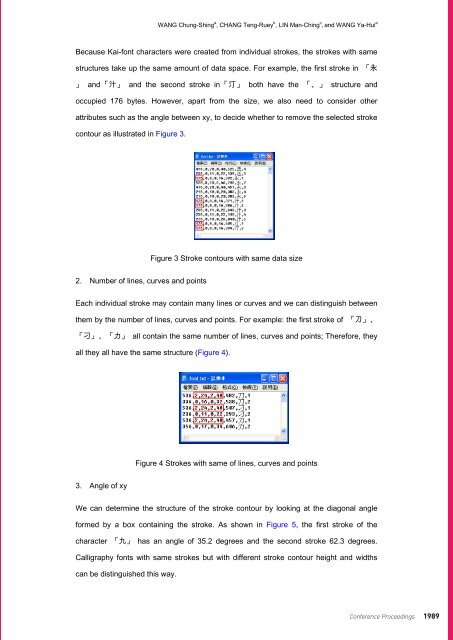
- Page 449: 1988 Conference Proceedings Buildin
- Page 453 and 454: 1992 Conference Proceedings Buildin
- Page 455 and 456: 1994 Conference Proceedings Oxford
- Page 457 and 458: 1996 Conference Proceedings 1. Intr
- Page 459 and 460: 1998 Conference Proceedings 4. Proc
- Page 461 and 462: 2000 Conference Proceedings Deny WI
- Page 463 and 464: 2002 Conference Proceedings Deny WI
- Page 465 and 466: 7. Discussion 2004 Conference Proce
- Page 467 and 468: 2006 Conference Proceedings Deny WI
- Page 469 and 470: 2008 Conference Proceedings Deny WI
- Page 471 and 472: 2010 Conference Proceedings Project
- Page 473 and 474: 2012 Conference Proceedings John Wo
- Page 475 and 476: 2014 Conference Proceedings John Wo
- Page 477 and 478: 2016 Conference Proceedings illustr
- Page 479 and 480: 2018 Conference Proceedings illustr
- Page 481 and 482: 2020 Conference Proceedings John Wo
- Page 483 and 484: 2022 Conference Proceedings John Wo
- Page 485 and 486: Introduction 2024 Conference Procee
- Page 487 and 488: 2026 Conference Proceedings Figure
- Page 489 and 490: 2028 Conference Proceedings Defined
- Page 491 and 492: Level of consideration Work setting
- Page 493 and 494: 2032 Conference Proceedings There i
- Page 495 and 496: 2034 Conference Proceedings Andrée
- Page 497 and 498: 2036 Conference Proceedings Submiss
- Page 499 and 500: Introduction 2038 Conference Procee
- Page 501 and 502:
2040 Conference Proceedings Paul WO
- Page 503 and 504:
2042 Conference Proceedings Paul WO
- Page 505 and 506:
2044 Conference Proceedings Paul WO
- Page 507 and 508:
2046 Conference Proceedings Discuss
- Page 509 and 510:
2048 Conference Proceedings DesignS
- Page 511 and 512:
Introduction 2050 Conference Procee
- Page 513 and 514:
2052 Conference Proceedings WU Jun-
- Page 515 and 516:
2054 Conference Proceedings WU Jun-
- Page 517 and 518:
2056 Conference Proceedings WU Jun-
- Page 519 and 520:
2058 Conference Proceedings DRS 201
- Page 521 and 522:
2060 Conference Proceedings A Pilot
- Page 523 and 524:
2062 Conference Proceedings Populat
- Page 525 and 526:
ID Research proposition 2064 Confer
- Page 527 and 528:
ID Research proposition 2066 Confer
- Page 529 and 530:
2068 Conference Proceedings A Pilot
- Page 531 and 532:
2070 Conference Proceedings DRS 201
- Page 533 and 534:
2072 Conference Proceedings Heurist
- Page 535 and 536:
2074 Conference Proceedings Figure
- Page 537 and 538:
2076 Conference Proceedings Heurist
- Page 539 and 540:
2078 Conference Proceedings Heurist
- Page 541 and 542:
function 2080 Conference Proceeding
- Page 543 and 544:
2082 Conference Proceedings Heurist
- Page 545 and 546:
2084 Conference Proceedings Heurist
- Page 547 and 548:
2086 Conference Proceedings DRS 201
- Page 549 and 550:
2088 Conference Proceedings Anticip
- Page 551 and 552:
2090 Conference Proceedings Anticip
- Page 553 and 554:
2092 Conference Proceedings Anticip
- Page 555 and 556:
2094 Conference Proceedings Anticip
- Page 557 and 558:
2096 Conference Proceedings Anticip
- Page 559 and 560:
2098 Conference Proceedings Anticip
- Page 561 and 562:
2100 Conference Proceedings DRS 201
- Page 563 and 564:
2102 Conference Proceedings Designi
- Page 565 and 566:
2104 Conference Proceedings Designi
- Page 567 and 568:
2106 Conference Proceedings Designi
- Page 569 and 570:
2108 Conference Proceedings Designi
- Page 571 and 572:
2110 Conference Proceedings Designi
- Page 573 and 574:
2112 Conference Proceedings Designi
- Page 575 and 576:
2114 Conference Proceedings Designi
- Page 577 and 578:
2116 Conference Proceedings DRS 201
- Page 579 and 580:
2118 Conference Proceedings Stop Mo
- Page 581 and 582:
2120 Conference Proceedings Stop Mo
- Page 583 and 584:
2122 Conference Proceedings Stop Mo
- Page 585 and 586:
2124 Conference Proceedings Stop Mo
- Page 587:
About Design Research Society Found