Report Services Document Analysis Guide - MicroStrategy
Report Services Document Analysis Guide - MicroStrategy
Report Services Document Analysis Guide - MicroStrategy

You also want an ePaper? Increase the reach of your titles
YUMPU automatically turns print PDFs into web optimized ePapers that Google loves.
<strong>Report</strong> <strong>Services</strong> <strong>Document</strong> <strong>Analysis</strong> <strong>Guide</strong> Exploring Your Data with Visual Insight Analyses 4<br />
variables at one time. (For an example, see Analyzing data in a Heat<br />
Map visualization, page 149.)<br />
Analyzing data in a Grid visualization<br />
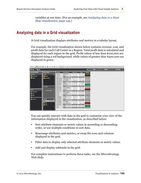
A Grid visualization displays attributes and metrics in a tabular layout.<br />
For example, the Grid visualization shown below contains revenue, cost, and<br />
profit data for each Call Center in a Region. Total profit data is calculated and<br />
displayed for each region in the grid. Profit values of less than $100,000 are<br />
displayed using a red background, while values of greater than $400,000 are<br />
displayed in green.<br />
You can quickly interact with data in the grid to customize your view of the<br />
information displayed in the visualization, as described below:<br />
• Sort attribute elements or metric values in ascending or descending<br />
order, or use multiple conditions to sort data.<br />
• Rearrange attributes and metrics, or swap the rows and columns<br />
displayed in the grid.<br />
• Filter data to display only selected attribute elements or metric values.<br />
• Add and display subtotals in the grid.<br />
For complete instructions to perform these tasks, see the <strong>MicroStrategy</strong><br />
Web Help.<br />
© 2012 <strong>MicroStrategy</strong>, Inc. Visualizations in analyses 145


![The New Era of Mobile Intelligence: [PDF] - MicroStrategy](https://img.yumpu.com/13859921/1/190x245/the-new-era-of-mobile-intelligence-pdf-microstrategy.jpg?quality=85)
![customer success story [pdf] - MicroStrategy](https://img.yumpu.com/13859884/1/190x146/customer-success-story-pdf-microstrategy.jpg?quality=85)
![Call for Speakers Guide [PDF] - MicroStrategy](https://img.yumpu.com/13859856/1/190x245/call-for-speakers-guide-pdf-microstrategy.jpg?quality=85)