Report Services Document Analysis Guide - MicroStrategy
Report Services Document Analysis Guide - MicroStrategy
Report Services Document Analysis Guide - MicroStrategy

You also want an ePaper? Increase the reach of your titles
YUMPU automatically turns print PDFs into web optimized ePapers that Google loves.
3<br />
Analyzing <strong>Document</strong>s in <strong>MicroStrategy</strong> Web <strong>Report</strong> <strong>Services</strong> <strong>Document</strong> <strong>Analysis</strong> <strong>Guide</strong><br />
• Using a grid or graph as a selector, page 51<br />
• Drilling into related data on grids and graphs, page 53<br />
• Linking to other documents and reports, page 58<br />
• How links, drilling, and selectors work together, page 66<br />
• Grouping documents: Page-by, page 68<br />
• Uncluttering the dashboard: Full Screen mode , page 69<br />
• Interacting with grids and graphs in Flash Mode and Express Mode,<br />
page 63<br />
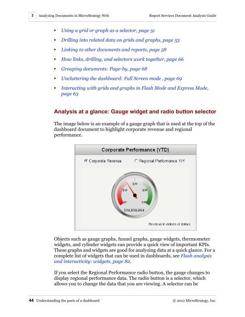
<strong>Analysis</strong> at a glance: Gauge widget and radio button selector<br />
The image below is an example of a gauge graph that is used at the top of the<br />
dashboard document to highlight corporate revenue and regional<br />
performance.<br />
Objects such as gauge graphs, funnel graphs, gauge widgets, thermometer<br />
widgets, and cylinder widgets can provide a quick view of important KPIs.<br />
These graphs and widgets are good for analyzing data at a quick glance. For a<br />
complete list of widgets that can be used in dashboards, see Flash analysis<br />
and interactivity: widgets, page 82.<br />
If you select the Regional Performance radio button, the gauge changes to<br />
display regional performance data. The radio button is a selector, which<br />
allows you to change the data that you are viewing. A selector can be<br />
44 Understanding the parts of a dashboard © 2012 <strong>MicroStrategy</strong>, Inc.


![The New Era of Mobile Intelligence: [PDF] - MicroStrategy](https://img.yumpu.com/13859921/1/190x245/the-new-era-of-mobile-intelligence-pdf-microstrategy.jpg?quality=85)
![customer success story [pdf] - MicroStrategy](https://img.yumpu.com/13859884/1/190x146/customer-success-story-pdf-microstrategy.jpg?quality=85)
![Call for Speakers Guide [PDF] - MicroStrategy](https://img.yumpu.com/13859856/1/190x245/call-for-speakers-guide-pdf-microstrategy.jpg?quality=85)