Nepal Hazard Risk Assessment - Asia-Pacific Gateway for Disaster ...
Nepal Hazard Risk Assessment - Asia-Pacific Gateway for Disaster ...
Nepal Hazard Risk Assessment - Asia-Pacific Gateway for Disaster ...
Create successful ePaper yourself
Turn your PDF publications into a flip-book with our unique Google optimized e-Paper software.
<strong>Nepal</strong> <strong>Hazard</strong> <strong>Risk</strong> <strong>Assessment</strong><br />
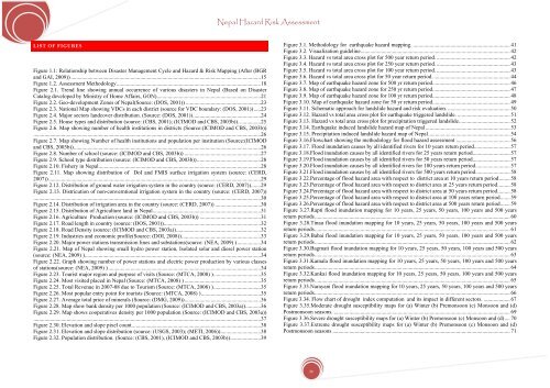
LIST OF FIGURES<br />
Figure 1.1: Relationship between <strong>Disaster</strong> Management Cycle and <strong>Hazard</strong> & <strong>Risk</strong> Mapping (After (BGR<br />
and GAI, 2009)) ......................................................................................................................................... 15<br />
Figure 1.2. <strong>Assessment</strong> Methodology ........................................................................................................ 18<br />
Figure 2.1. Trend line showing annual occurrence of various disasters in <strong>Nepal</strong> (Based on <strong>Disaster</strong><br />
Catalog developed by Ministry of Home Affairs, GON) ........................................................................... 21<br />
Figure 2.2. Geo-development Zones of <strong>Nepal</strong>(Source: (DOS, 2001)) ...................................................... 23<br />
Figure 2.3. National Map showing VDCs in each district (source <strong>for</strong> VDC boundary: (DOS, 2001)) ..... 23<br />
Figure 2.4. Major sectors landcover distribution. (Source: (DOS, 2001)). ................................................ 24<br />
Figure 2.5. House types and distribution (source: (CBS, 2001); (ICIMOD and CBS, 2003b)). ............... 25<br />
Figure 2.6. Map showing number of health institutions in districts (Source:(ICIMOD and CBS, 2003b))<br />
.................................................................................................................................................................... 26<br />
Figure 2.7. Map showing Number of health institutions and population per institution (Source:(ICIMOD<br />
and CBS, 2003b)) ....................................................................................................................................... 26<br />
Figure 2.8. Number of school (source: (ICIMOD and CBS, 2003b)) ....................................................... 27<br />
Figure 2.9. School type distribution (source: (ICIMOD and CBS, 2003b)) .............................................. 28<br />
Figure 2.10. Fishery in <strong>Nepal</strong> ..................................................................................................................... 28<br />
Figure 2.11. Map showing distribution of DoI and FMIS surface irrigation system (source: (CERD,<br />
2007)) ......................................................................................................................................................... 29<br />
Figure 2.12. Distribution of ground water irrigation system in the country (source: (CERD, 2007)) ....... 29<br />
Figure 2.13. Districution of non-converntional irrigation system in the country (source: (CERD, 2007))<br />
.................................................................................................................................................................... 30<br />
Figure 2.14. Distribution of irrigation area in the country (source: (CERD, 2007)) ................................. 30<br />
Figure 2.15. Distribution of Agriculture land in <strong>Nepal</strong> .............................................................................. 31<br />
Figure 2.16. Agriculture Production (source: (ICIMOD and CBS, 2003b)) ............................................ 31<br />
Figure 2.17. Road length in country (source: (DOS, 2001)) ...................................................................... 32<br />
Figure 2.18. Road Density (source: (ICIMOD and CBS, 2003a)) ............................................................. 32<br />
Figure 2.19. Industries and economic profile(Source: (DOI, 2008)). ........................................................ 33<br />
Figure 2.20. Major power stations transmission lines and substations(source: (NEA, 2009) ) ................. 34<br />
Figure 2.21. Map of <strong>Nepal</strong> showing small hydro power station, Isolated solar and diesel power station<br />
(source: (NEA, 2009) ) ............................................................................................................................... 34<br />
Figure 2.22. Graph showing number of power stations and electric power production by various classes<br />
of stations(source: (NEA, 2009) ) .............................................................................................................. 34<br />
Figure 2.23. Tourist major region and purpose of visits (Source: (MTCA, 2008) ) .................................. 35<br />
Figure 2.24. Most visited placed in <strong>Nepal</strong> (Source: (MTCA, 2008) ) ....................................................... 35<br />
Figure 2.25. Total Revenue in 2007-08 due to Tourism (Source: (MTCA, 2008) ) .................................. 35<br />
Figure 2.26. Most popular entry point <strong>for</strong> tourists (Source: (MTCA, 2008) ) ........................................... 35<br />
Figure 2.27. Average total price of minerals (Source: (DMG, 2009)) ....................................................... 36<br />
Figure 2.28. Map show bank density per 1000 population (Source: (ICIMOD and CBS, 2003a)) ........... 36<br />
Figure 2.29. Map shows cooperatives density per 1000 population (Source: (ICIMOD and CBS, 2003a))<br />
.................................................................................................................................................................... 37<br />
Figure 2.30. Elevation and slope pixel count. ............................................................................................ 38<br />
Figure 2.31. Elevation and slope distribution (source: (USGS, 2003); (METI, 2006)) ............................. 38<br />
Figure 2.32. Population distribution. (Source: (CBS, 2001), (ICIMOD and CBS, 2003b)) ...................... 39<br />
Figure 3.1. Methodology <strong>for</strong> earthquake hazard mapping. ...................................................................... 41<br />
Figure 3.2. Visualization guideline. ........................................................................................................... 42<br />
Figure 3.3. <strong>Hazard</strong> vs total area cross plot <strong>for</strong> 500 year return period. ..................................................... 42<br />
Figure 3.4. <strong>Hazard</strong> vs total area cross plot <strong>for</strong> 250 year return period. ..................................................... 43<br />
Figure 3.5. <strong>Hazard</strong> vs total area cross plot <strong>for</strong> 100 year return period. ..................................................... 43<br />
Figure 3.6. <strong>Hazard</strong> vs total area cross plot <strong>for</strong> 50 year return period. ....................................................... 44<br />
Figure 3.7. Map of earthquake hazard zone <strong>for</strong> 500 yr return period. ....................................................... 46<br />
Figure 3.8. Map of earthquake hazard zone <strong>for</strong> 250 yr return period. ....................................................... 47<br />
Figure 3.9. Map of earthquake hazard zone <strong>for</strong> 100 yr return period. ....................................................... 48<br />
Figure 3.10. Map of earthquake hazard zone <strong>for</strong> 50 yr return period. ....................................................... 49<br />
Figure 3.11. Schematic approach <strong>for</strong> landslide hazard and risk evaluation. ............................................. 50<br />
Figure 3.12. <strong>Hazard</strong> vs total area cross plot <strong>for</strong> earthquake triggered landslide. ...................................... 51<br />
Figure 3.13. <strong>Hazard</strong> vs total area cross plot <strong>for</strong> precipitation triggered landslide. .................................... 52<br />
Figure 3.14. Earthquake induced landslide hazard map of <strong>Nepal</strong> ............................................................. 53<br />
Figure 3.15. Precipitation induced landslide hazard map of <strong>Nepal</strong> ........................................................... 54<br />
Figure 3.16.Flowchart showing the methodology <strong>for</strong> flood hazard assessment ....................................... 56<br />
Figure 3.17. Flood inundation causes by all identified rivers <strong>for</strong> 10 years return period .......................... 57<br />
Figure 3.18.Flood inundation causes by all identified rivers <strong>for</strong> 25 years return period ........................... 57<br />
Figure 3.19.Flood inundation causes by all identified rivers <strong>for</strong> 50 years return period ........................... 57<br />
Figure 3.20.Flood inundation causes by all identified rivers <strong>for</strong> 100 years return period ......................... 57<br />
Figure 3.21.Flood inundation causes by all identified rivers <strong>for</strong> 500 years return period ......................... 58<br />
Figure 3.22.Percentage of flood hazard area with respect to district area at 10 years return period ........ 58<br />
Figure 3.23.Percentage of flood hazard area with respect to district area at 25 years return period ......... 58<br />
Figure 3.24.Percentage of flood hazard area with respect to district area at 50 years return period ......... 58<br />
Figure 3.25.Percentage of flood hazard area with respect to district area at 100 years return period ....... 59<br />
Figure 3.26.Percentage of flood hazard area with respect to district area at 500 years return period ....... 59<br />
Figure 3.27.Rapti flood inundation mapping <strong>for</strong> 10 years, 25 years, 50 years, 100 years and 500 years<br />
return periods ............................................................................................................................................. 60<br />
Figure 3.28.Tinau flood inundation mapping <strong>for</strong> 10 years, 25 years, 50 years, 100 years and 500 years<br />
return periods ............................................................................................................................................. 61<br />
Figure 3.29.Babai flood inundation mapping <strong>for</strong> 10 years, 25 years, 50 years, 100 years and 500 years<br />
return periods ............................................................................................................................................. 62<br />
Figure 3.30.Bagmati flood inundation mapping <strong>for</strong> 10 years, 25 years, 50 years, 100 years and 500 years<br />
return periods ............................................................................................................................................. 63<br />
Figure 3.31.Kamala flood inundation mapping <strong>for</strong> 10 years, 25 years, 50 years, 100 years and 500 years<br />
return periods ............................................................................................................................................. 64<br />
Figure 3.32.Kankai flood inundation mapping <strong>for</strong> 10 years, 25 years, 50 years, 100 years and 500 years<br />
return periods ............................................................................................................................................. 65<br />
Figure 3.33.Narayani flood inundation mapping <strong>for</strong> 10 years, 25 years, 50 years, 100 years and 500 years<br />
return periods ............................................................................................................................................. 66<br />
Figure 3.34. Flow chart of drought index computation and its impact in different sectors. ................... 67<br />
Figure 3.35.Moderate drought susceptibility maps <strong>for</strong> (a) Winter (b) Premonsoon (c) Monsoon and (d)<br />
Postmonsoon seasons. ............................................................................................................................... 69<br />
Figure 3.36.Severe drought susceptibility maps <strong>for</strong> (a) Winter (b) Premonsoon (c) Monsoon and (d) .... 70<br />
Figure 3.37.Extreme drought susceptibility maps <strong>for</strong> (a) Winter (b) Premonsoon (c) Monsoon and (d)<br />
Postmonsoon seasons ................................................................................................................................ 71<br />
iv


