

(Shelly Cashman Series) Gary B. Shelly, H. Albert Napier, Ollie N. Rivers-Web design_ introductory concepts and techniques -Cengage Learning (2008)

You also want an ePaper? Increase the reach of your titles
YUMPU automatically turns print PDFs into web optimized ePapers that Google loves.
112 Chapter 4 Planning a Successful <strong>Web</strong> Site: Part 2<br />
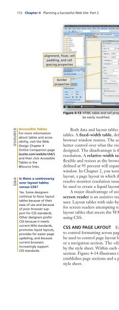
alignment, float, cell<br />
padding, <strong>and</strong> cell<br />
spacing properties<br />
height <strong>and</strong> width<br />
properties<br />
border<br />
properties<br />
Figure 4-13 HTML table <strong>and</strong> cell properties, such as height <strong>and</strong> width, can<br />
be easily modified.<br />
@SOURCE<br />
Q&A<br />
Accessible Tables<br />
For more information<br />
about tables <strong>and</strong> accessibility,<br />
visit the <strong>Web</strong><br />
Design Chapter 4<br />
Online Companion page<br />
(scsite.com/web3e/ch4/)<br />
<strong>and</strong> then click Accessible<br />
Tables in the<br />
@Source links.<br />
Is there a controversy<br />
over layout tables<br />
versus CSS?<br />
Yes. Some <strong>design</strong>ers<br />
continue to favor layout<br />
tables because of their<br />
ease of use <strong>and</strong> because<br />
of poor browser support<br />
for CSS st<strong>and</strong>ards.<br />
Other <strong>design</strong>ers prefer<br />
CSS because it meets<br />
current WAI st<strong>and</strong>ards,<br />
promotes liquid layouts,<br />
provides for easier page<br />
updating, <strong>and</strong> because<br />
current browsers<br />
increasingly support<br />
CSS st<strong>and</strong>ards.<br />
Both data <strong>and</strong> layout tables can be created as either fixed-width or relative-width<br />
tables. A fixed-width table, defined in pixels, is absolute <strong>and</strong> will not resize if the<br />
browser window resizes. The advantage of using a fixed-width table is you have<br />
better control over what the visitor sees at the specific resolution for which the page is<br />
<strong>design</strong>ed. The disadvantage is the table does not resize when viewed at a lower or higher<br />
resolution. A relative-width table, defined as a percentage of the browser window, is<br />
flexible <strong>and</strong> resizes as the browser window resizes. For example, a relative-width table<br />
defined at 95 percent will exp<strong>and</strong> or contract to display in 95 percent of the browser<br />
window. In Chapter 2, you were introduced to the concept of liquid <strong>design</strong> or liquid<br />
layout, a page layout in which the page resizes with the browser window size, helping to<br />
resolve monitor resolution issues. An advantage of relative-width layout tables is they can<br />
be used to create a liquid layout.<br />
A major disadvantage of using layout tables involves accessibility. For example, a<br />
screen reader is an assistive technology that reads a <strong>Web</strong> page to a visually impaired<br />
user. Layout tables with side-by-side content rather than linear content create a problem<br />
for screen readers attempting to correctly interpret page content. An alternative to<br />
layout tables that meets the WAI st<strong>and</strong>ard for <strong>Web</strong> accessibility is to control page layout<br />
using CSS.<br />
CSS AND PAGE LAYOUT Earlier in the chapter, you learned how style sheets are used<br />
to control formatting across pages, thus creating visual consistency. Style sheets can also<br />
be used to control page layout by dividing a page into sections, such as a header section<br />
or a navigation section. The tag within a page’s code specifies a section identified<br />
by the style sheet. Within each tag pair reside the other content tags for that<br />
section. Figure 4-14 illustrates the external style sheet for a WYSIWYG template that<br />
establishes page sections <strong>and</strong> a portion of the page code for a section established by the<br />
style sheet.
 Change language