- Page 1 and 2:
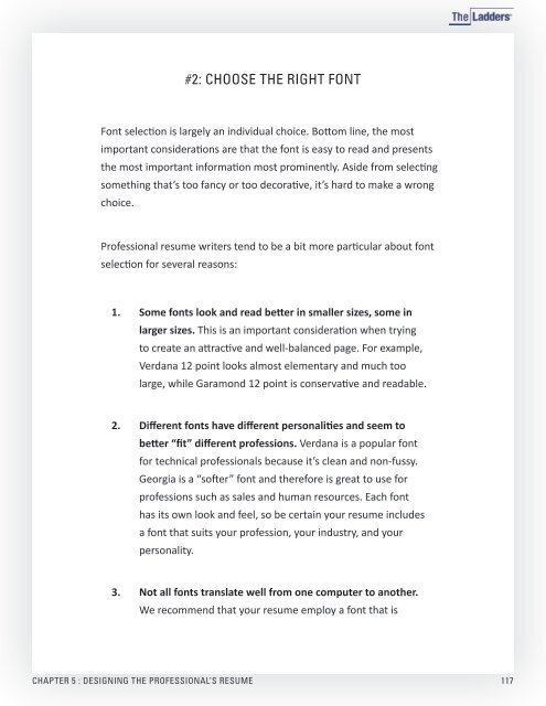
G U I D E T OCRAF TINGTHEPR0FESSION
- Page 3 and 4:
Introduction Chapter 3CRAFTING samp
- Page 5 and 6:
DEFINITION:A resume is a career mar
- Page 7 and 8:
Chapter 1WELCOME sample TOTHE CRAFT
- Page 9 and 10:
LIGHTBULB MOMENT:It’s our goal th
- Page 11 and 12:
WHO NEEDS A RESUME?Everyone. Beyond
- Page 13 and 14:
As you’ll read in later chapters
- Page 15 and 16:
should be the backbone and not the
- Page 17 and 18:
Consider adding resume sections lik
- Page 19 and 20:
WHAT DO PROFESSIONAL RESUME WRITERS
- Page 21 and 22:
Chapter 2sampleSTRATEGY TOOLSFOR TH
- Page 23 and 24:
To help you understand the critical
- Page 25:
evaluating one candidate versus ano
- Page 29 and 30:
Job Information(Repeat this section
- Page 31 and 32:
#2: WRITE TO THE FUTUREYour resume
- Page 33 and 34:
Cell: 309.555.7281KATE JORDANkatejo
- Page 35 and 36:
Cell: 309.555.7281KATE JORDANkatejo
- Page 37 and 38:
#4: THINK STRATEGICALLY ABOUT THE W
- Page 39 and 40:
Now consider the situation of the t
- Page 41 and 42:
If you’re a mid-career profession
- Page 43 and 44:
#8: ADDRESS THE UNIQUE CIRCUMSTANCE
- Page 45 and 46:
The sample resumes in chapters 6 th
- Page 47 and 48:
Chapter 3sampleFORMATTING THEPROFES
- Page 49 and 50:
Format Tool #5Start with a Career S
- Page 51 and 52:
If you live in the location in whic
- Page 53 and 54:
more. It is the format of choice fo
- Page 55 and 56:
Select the categories that coincide
- Page 57 and 58:
DONALD KATZ 2749 Topanga Drive,
- Page 59 and 60:
#4: USE A FUNCTIONAL RESUME FORMAT
- Page 61 and 62:
Celia Navarro 4390 Wells Road, Atla
- Page 63 and 64:
esume and to your employment experi
- Page 65 and 66: instantly catch your attention. The
- Page 67 and 68: #6: FOLLOW YOUR SUMMARY WITH YOUR C
- Page 69 and 70: LIGHTBULB MOMENT:Give your readers
- Page 71 and 72: Exceptions might include:• You ju
- Page 73 and 74: Welcome to the heart and soul of th
- Page 75 and 76: You could say that an education sec
- Page 77 and 78: On the following few pages is a lis
- Page 79 and 80: DriveEducateEffectElevateEliminateE
- Page 81 and 82: PerformPilotPinpointPlanPositionPre
- Page 83 and 84: #3: PUT RELEVANT INFORMATIONFRONT A
- Page 85 and 86: Resume Version #1: High-Profile Fie
- Page 87 and 88: Read the difference in impact of th
- Page 89 and 90: Dig deep into your performance to c
- Page 91 and 92: • Academic & Training Credentials
- Page 93 and 94: eferred to as a “summary,” the
- Page 95 and 96: Read #6 in this chapter for a more
- Page 97 and 98: Overview ParagraphOften a title or
- Page 99 and 100: Career HighlightsDo you want to mak
- Page 101 and 102: Today’s job search landscape is r
- Page 103 and 104: Once you’ve written your branding
- Page 105 and 106: Here’s another copy of that same
- Page 107 and 108: Here’s a great example:SENIOR VIC
- Page 109 and 110: #11: SIMPLIFY, STREAMLINE &TIGHTEN
- Page 111 and 112: 4. Polish, finalize, and let it go.
- Page 113 and 114: Have you ever seen a resume that lo
- Page 115: #1: MAKE YOUR RESUME INVITING TO RE
- Page 119 and 120: LIGHTBULB MOMENT:Follow TheLadders
- Page 121 and 122: As you work on your resume design,
- Page 123 and 124: The plain round bullet is the defau
- Page 125 and 126: Thomas P. Putnam7943 Winding Way 51
- Page 127 and 128: Review the sample resumes in chapte
- Page 129 and 130: space! When you’re trying to comf
- Page 131 and 132: Here are step-by-step directions fo
- Page 133 and 134: CYNTHIA ROWLEY89 East 83rd Street,
- Page 135 and 136: Bar Admissions:New York, Southern D
- Page 137 and 138: Chapter 6FINANCELADDER:sampleRESUME
- Page 139 and 140: • When you can’t reveal specifi
- Page 141 and 142: 250 KEYWORDS FORFINANCE RESUMESWhil
- Page 143 and 144: Economic ModelingEconomic PolicyEco
- Page 145 and 146: MacroeconomicsMake/Buy AnalysisMana
- Page 147 and 148: FINANCELADDER:SAMPLE RESUMESOn the
- Page 149 and 150: Midori Fukuoka2939 Lake Mary Drive,
- Page 151 and 152: NEIL RAGHAVAN, CIA, CPA, CA (INDIA)
- Page 153 and 154: ADAM BERG, CFE513 Muir Drive, Carro
- Page 155 and 156: Mary P. Davenport29 Winding Way, Ri
- Page 157 and 158: ROBERT MATTHEWS29 Maple Terrace, We
- Page 159 and 160: Chapter 7HRLADDER: sampleRESUME SAM
- Page 161 and 162: 1. Make the most of metrics. When y
- Page 163 and 164: Behavioral InterviewBenefits Admini
- Page 165 and 166: Human CapitalHuman FactorsHuman Res
- Page 167 and 168:
Policies & ProceduresPosition Class
- Page 169 and 170:
while the strong content blends job
- Page 171 and 172:
Daniel HellmanLearning & Developmen
- Page 173 and 174:
TRINA L. MOLINARI513-555-5555 6062
- Page 175 and 176:
PATRICIA TAYLOR - PAGE 2 06-
- Page 177 and 178:
MELISSA SANDLER, SPHRPage TwoMANPOW
- Page 179 and 180:
PROFESSIONAL EXPERIENCE APEX COMP
- Page 181 and 182:
LAW:IT’S ALL ABOUT EXPERTISE AND
- Page 183 and 184:
5. Leverage your relationships. Thr
- Page 185 and 186:
CourtCourtroom HearingCourtroom Pro
- Page 187 and 188:
Legal DocumentationLegal Instrument
- Page 189 and 190:
Transactions LawTrialTrial LawTrust
- Page 191 and 192:
Donald Mann: Law Firm Managing Part
- Page 193 and 194:
Ellen Reilly, Esq. Phone: (631)
- Page 195 and 196:
THOMAS K. ROGERS tkrogers@gmail.com
- Page 197 and 198:
RACHEL SPEARS, ESQ. - PAGE TWOM: 51
- Page 199 and 200:
732.555.5555 MARK P. WINFIELD ¥ PA
- Page 201 and 202:
DONALD MANN JR.630.555.1012 ¥ mann
- Page 203 and 204:
MARKETING:IT’S ALL ABOUT IDENTIFY
- Page 205 and 206:
and media to web-based platforms an
- Page 207 and 208:
Customer FeedbackCustomer Focus Gro
- Page 209 and 210:
Marketing ManagementMarketing Plan
- Page 211 and 212:
Strategic RelationshipManagementSur
- Page 213 and 214:
Luisa Valdez: Chief Marketing Offic
- Page 215 and 216:
CHRISTINE WONG - PAGE TWO555-5555 |
- Page 217 and 218:
CARL DAVIDSON PAGE TWO(212) 555-12
- Page 219 and 220:
LUIS TAVARES • Page 2 of 2
- Page 221 and 222:
Debra Axminster ¥ Page Two310.555.
- Page 223 and 224:
§ Achieved 23% increase in linear-
- Page 225 and 226:
OPERATIONS:IT’S ALL ABOUT PERFORM
- Page 227 and 228:
4. Paint the big picture. Particula
- Page 229 and 230:
E-CommerceEarnings Before Interest
- Page 231 and 232:
MentorMergerMetricsMulti-ChannelMul
- Page 233 and 234:
StrategySystems DesignSystems Devel
- Page 235 and 236:
Richard Lee: Senior Operations Exec
- Page 237 and 238:
ALLEN RICHMOND § Page 2 allen.rich
- Page 239 and 240:
EVELYN LANDTedLand@sc.rr.comPage 2
- Page 241 and 242:
Samuel Phipps ¥ Page TwoCell: 813.
- Page 243 and 244:
RICHARD W. LEE — Page 2 of 2 ¥ (
- Page 245 and 246:
Brianna H. Jensen Cell: (862) 555-5
- Page 247 and 248:
SALES:IT’S ALL ABOUT CAPTURING CL
- Page 249 and 250:
250 KEYWORDS FORSALES RESUMESWhile
- Page 251 and 252:
Distributor SalesDistrict SalesDist
- Page 253 and 254:
Product LicensingProduct LifecycleP
- Page 255 and 256:
SALESLADDER:SAMPLE RESUMESOn the fo
- Page 257 and 258:
Carlos Rodriguez1 Leon Drive ♦ We
- Page 259 and 260:
DONALD MYERS745 Aztec Ave. Austin,
- Page 261 and 262:
Winona Majors6807 Hardy Drive ¥ Pi
- Page 263 and 264:
Mark HedbergCharlotte, NC mhedberg@
- Page 265 and 266:
Phaedra Markopolisphaedra@gmail.com
- Page 267 and 268:
Chapter 12TECHNOLOGYLADDER:sampleRE
- Page 269 and 270:
leadership, and business accomplish
- Page 271 and 272:
Budget ManagementBudgetingCamera-Ba
- Page 273 and 274:
Human-Computer InterfaceImageImage
- Page 275 and 276:
Real-Time DataReal-Time Motion Capt
- Page 277 and 278:
proficiencies positioned at the end
- Page 279 and 280:
SANDRA JONES sjones@gmail.com •
- Page 281 and 282:
► Wade Shaw570-555-5555 ► wshaw
- Page 283 and 284:
Valerie Michaelsvmichaels@gmail.com
- Page 285 and 286:
Richard Sanchez10958 Viejo Street,
- Page 287 and 288:
JANELLE THOMPKINSjthompkins@gmail.c
- Page 289 and 290:
Chapter 13sample USING THEPROFESSIO
- Page 291 and 292:
#1: UPDATE YOUR RESUME EVERY SIX MO
- Page 293 and 294:
If you have important new informati
- Page 295 and 296:
strategically about how to position
- Page 297 and 298:
as they relate to specific skill ar
- Page 299 and 300:
#5: BUILD SKILLS FOR THE FUTUREJob
- Page 301 and 302:
THELADDERS RESUME WRITERSEvery resu


