- Page 5 and 6:
Vol. 4S SEPTEMBER. 1939 No. 1 The E
- Page 7 and 8:
The POPULAR PLACE TO STAY IN TOLEDO
- Page 9 and 10:
New Standard Typewriting by Nathani
- Page 11 and 12:
THIS DUCATOR (DEVOTED TO FENMAKTSII
- Page 13 and 14:
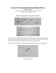
Th^ Educator Get the arm rolling in
- Page 15 and 16:
The Educator 11 (f (3 {3- e (S. (3
- Page 17 and 18:
The Educator 13 The capital letter
- Page 19 and 20:
The Educator 15 C_.^-'^-^^^-^2^fl-
- Page 21 and 22:
Doing all the photographic work you
- Page 23 and 24:
fi rurtirYl *i"^ (f liialirtii ohCb
- Page 25 and 26:
eading and writing, but to overcome
- Page 27 and 28:
^ >' ,\ ^ r*i The Educator 23 iwov^
- Page 29 and 30:
The Educator A LOST DESTINY or KILL
- Page 31 and 32:
STRENGTH Be grateful in the morning
- Page 33 and 34:
— BOOK REVIEWS Our readers are in
- Page 35 and 36:
y / ^^
- Page 37 and 38:
The Place of Handwriting in the Com
- Page 39 and 40:
The POPULAR PLACE TO STAY IN TOLEDO
- Page 41 and 42:
New Standard Typewriting Nathaniel
- Page 43 and 44:
America's Only Handwriting Magazine
- Page 45 and 46:
The Educator / /r / /r/ /r Use a pu
- Page 47 and 48:
The Educator LEGIBLE FIGURES //////
- Page 49 and 50:
The Place of Handwriting in the Com
- Page 51 and 52:
Opportunities Today Greater Than Ev
- Page 53 and 54:
Keep the body and arm flexible and
- Page 55 and 56:
756 ^. The Educator 19 ttThi-sr rer
- Page 57 and 58:
The Educator A COMING YOUNG PENMAN
- Page 59 and 60:
THE EDUCATOR Many years ago, in a M
- Page 61 and 62: DESIGNING AND ENGROSSING By E. L. B
- Page 63 and 64: GETTING WHAT YOU PAY FOR If you wer
- Page 65 and 66: BOOK REVIEWS ^ Our readers are inte
- Page 67 and 68: y^ X X ^. X / X X ,X_ X, X . _ ^. .
- Page 69 and 70: Vol. 45 NOVEMBER, 1939 No. 3 I, V.1
- Page 71 and 72: The POPULAR PLACE TO STAY IN TOLEDO
- Page 73 and 74: THE ROAD TO SKETCHING FROM NATURE s
- Page 76 and 77: Business Writing By E. A. Lupfer No
- Page 78 and 79: 10 The Educator -^ :^-/B^^ These ai
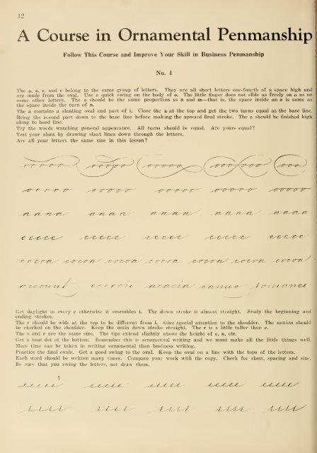
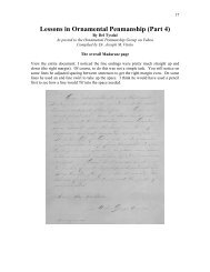
- Page 80 and 81: 12 A Course in Ornamental Penmanshi
- Page 82 and 83: 14 — Some Recent Experiments in H
- Page 84 and 85: 16 The Educator paper). It groes ve
- Page 86 and 87: 18 J. D. WILLIAMS . . The Pioneer P
- Page 88 and 89: iruutnTirinrr#' .AND tr^'unnriiinn
- Page 90 and 91: 22 A New Procedure in Teaching Hand
- Page 92 and 93: 24 By F. W. Martin. Boston, Mass. C
- Page 94 and 95: 26 The Educator TOOLS THAT ARE BUIL
- Page 96 and 97: Primary pupils will enjoy the handw
- Page 98 and 99: 30 The Educator Importance of Handw
- Page 100 and 101: For Students of Engrossing ZANERIAN
- Page 102 and 103: The Educator 25 Cards for 50c, post
- Page 104 and 105: ^ Courteous Service )f Genuine Hosp
- Page 106 and 107: The Educator TWO ASSETS FOR YOUR CO
- Page 108 and 109: This illustration shows the back of
- Page 110 and 111: lU The Educator MaKe curved siroKe
- Page 114 and 115: 14 What is your most difficult penm
- Page 116 and 117: 16 In Other Subjects "The children
- Page 118 and 119: 18 — Handwriting Lesson By JAMES
- Page 120 and 121: 20 HANDWRITING IN BOSTON SCHOOLS In
- Page 122 and 123: 22 The Educator When Mr. Barringer
- Page 124 and 125: 24 S'f The Educator lutJtk ^Ob ev*2
- Page 126 and 127: 26 The Educator ! INK THAT LIVES Hi
- Page 128 and 129: 28 Primary Writing {'("his copy was
- Page 130 and 131: The Educator ''^ jcranton oiuci m f
- Page 132 and 133: Christmas Ctvin^ to Your Pupi/s You
- Page 134 and 135: The Educator PENMANSHIP SUPPLIES Su
- Page 136 and 137: ^ Courteous Service )f Genuine Hosp
- Page 138 and 139: V 5 OUR / i- BUSINESS/ The Educator
- Page 140 and 141: This shows the proper way to hold t
- Page 142 and 143: 10 The Educator The t is an extende
- Page 144 and 145: 12 A Course in Ornamental Penmanshi
- Page 146 and 147: 14 DID'JA KNOW, DID'JA? W. A. Larim
- Page 148 and 149: 16 The Part Instruction In Handwrit
- Page 150 and 151: clicfifodcru n l)iTutitn unidi I bc
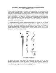
- Page 152 and 153: 20 The Educator KNIFEMANSHIP By Fra
- Page 154 and 155: 22 The Educator OK i!*r uf Itummt i
- Page 156 and 157: 24 The Educator The Part Instructio
- Page 158 and 159: 26 The Educator INK THAT LIVES Higg
- Page 160 and 161: 28 The Educator Children like to wr
- Page 162 and 163:
30 The Educator mij^t rxtii nmi ^u^
- Page 164 and 165:
For Students of Engrossing ZANERIAN
- Page 166 and 167:
The Educator For Students of Engros
- Page 168 and 169:
^ Courteous Service )f Genuine Hosp
- Page 170 and 171:
ilR COllTIOli IN LOUISVILLE KENTUCK
- Page 172 and 173:
A close-up of the right hand. Study
- Page 174 and 175:
10 The Educator The S begins on the
- Page 176 and 177:
12 i A Course in Ornamental Penmans
- Page 178 and 179:
14 ^^Should Handwriting Training Be
- Page 180 and 181:
16 Left-Handed Pupils' Club At Fore
- Page 182 and 183:
18 The Educator _. 'Ip^ tl)C ^ unii
- Page 184 and 185:
20 4jf56on6 By F. W. Martin, Boston
- Page 186 and 187:
22 I CONVENTION ANNOUNCEMENTS N. C.
- Page 188 and 189:
24 1 !u' Educator THOS. GEO. LITTLE
- Page 190 and 191:
26 The Educator INK THAT LIVES Higg
- Page 192 and 193:
28 WHAT TO IMPROVE Poor quality of
- Page 194 and 195:
30 The Educator A skillful page of
- Page 196 and 197:
^A,£y w IS PENMANSHIP SUPPLIES Sug
- Page 198 and 199:
The Educator ZANERIAN July 5 to Aug
- Page 200 and 201:
HOTEL 'ALPIN agteatHoteC FROM S3.00
- Page 202:
The Educator KANSAS ADOPTS GREGG TY
- Page 205 and 206:
I The Educator -.^^^>t^-^^^-77-i,^i
- Page 207 and 208:
The Educator ////9ly / ^^/-^3^Z^^^^
- Page 209 and 210:
What Would You Do With This Pupil ?
- Page 211 and 212:
1. Do you have a philosophy of educ
- Page 213 and 214:
Grades 3-4. Begin the use of pen an
- Page 215 and 216:
I with I of I ILLUMINATED LETTER Th
- Page 217 and 218:
INSTRUCTIONS FOR ENGROSSING THE JOH
- Page 219 and 220:
STRENGTHEN THY STAKES (Continued fr
- Page 221 and 222:
OMX ELITrL.^ ITTLE HINGS. pup on a
- Page 223 and 224:
DESIGNING AND ENGROSSING By E. L. B
- Page 225 and 226:
BOOK REVIEWS Our readers are intere
- Page 227 and 228:
f£^# /i me A LAn The Educator 31 H
- Page 229 and 230:
Vol. 45 APRIL,1940 No. Published mo
- Page 231 and 232:
¥hM§U a^ m^^me HOTEL MARK TWAIN T
- Page 233 and 234:
SUCCESS DRILLS IN TOUCH TYPEWRITING
- Page 235 and 236:
America's Only Handwriting Magazine
- Page 237 and 238:
M ^^^^^y ( .-t^^'ry-Tj-^ TF.HXyfS l
- Page 239 and 240:
The Educator / 7 77 .5' oo 2. o o o
- Page 241 and 242:
I of I I modern ' ing places. In on
- Page 243 and 244:
Our Lesson in Manuscript Writing By
- Page 245 and 246:
"Children's interests are what we m
- Page 247 and 248:
CHARMING FLOURISHES This flourish w
- Page 249 and 250:
— Ornamental Signatures These sig
- Page 251 and 252:
^-^
- Page 253 and 254:
The Educator 25 Whtn thf young chil
- Page 255 and 256:
A SCHOOL ADMINISTRATION CLINIC The
- Page 257 and 258:
BOOK REVIEWS Our readers are intere
- Page 259 and 260:
The Educator 31 Soscball for a 0cnt
- Page 261 and 262:
Vol. 45 MAY, 1940 No. 9 JZaner - Bl
- Page 263 and 264:
[ ¥hM§U a
- Page 265 and 266:
SUCCESS DRILLS IN TOUCH TYPEWRITING
- Page 267 and 268:
America's Only Handwriting Magazine
- Page 269 and 270:
The Educator 9 (iood writing is the
- Page 271 and 272:
The Educator 11 It is not how much
- Page 273 and 274:
Perceptual Learning Test Each small
- Page 275 and 276:
What Would You Do With This Pupil?
- Page 277 and 278:
^-^ /^ The Educator 17 By G. C. Gre
- Page 279 and 280:
was able to produce some of the fin
- Page 281 and 282:
The accompanying: piece of work was
- Page 283 and 284:
Suggestions for Teaching Handwritin
- Page 285 and 286:
The Educator 25 This unique bird wa
- Page 287 and 288:
A PLEA FOR MORE HANDWRIT- ING INSTR
- Page 289 and 290:
BOOK REVIEWS Our readers are intere
- Page 291 and 292:
This specimen by Fielding: Schofiel
- Page 293 and 294:
U ~] JUNE. 1940 No. 10 M TJ? D E !R
- Page 295 and 296:
I I 1 ! HOTEL agteatHoteC FROM S3.0
- Page 297 and 298:
THE "HOME" OF Gmteiu a^ G^loit liOT
- Page 300 and 301:
Business Writing By E. A. Lupfer Ch
- Page 302 and 303:
10 The Educator // V 1 Do you use a
- Page 304 and 305:
12 "Handwriting--Its Relation to Ph
- Page 306 and 307:
14 The earliest known records in th
- Page 308 and 309:
16 A Course in Ornamental Penmanshi
- Page 310 and 311:
18 Our Lesson in Manuscript Writing
- Page 312 and 313:
20 Causes of Good and Poor Left-han
- Page 314 and 315:
22 Successful Penman and Educator T
- Page 316 and 317:
24 For many years we have been rece
- Page 318 and 319:
28 The Educator These signatures we
- Page 320 and 321:
30 The Educator hat* tauCfUt no tha
- Page 322:
Supplies for Ornamental Penmanship