- Page 1 and 2: FINAL REPORT Options for Managing L
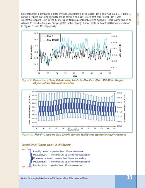
- Page 3: FINAL REPORT Options for Managing L
- Page 6 and 7: FINAL REPORT current operating regi
- Page 8 and 9: FINAL REPORT The current regulation
- Page 10 and 11: FINAL REPORT If none of the candida
- Page 12 and 13: FINAL REPORT Divergent Viewpoints T
- Page 14 and 15: FINAL REPORT Transition to Implemen
- Page 16 and 17: FINAL REPORT 10: Priority Performan
- Page 18 and 19: FINAL REPORT a considerable amount
- Page 20 and 21: FINAL REPORT The plan consists of a
- Page 22 and 23: FINAL REPORT Figure 2: The Lake Ont
- Page 24 and 25: FINAL REPORT 2. Criteria and regula
- Page 26 and 27: FINAL REPORT water level and flow d
- Page 28 and 29: FINAL REPORT Independent Review Ind
- Page 30 and 31: FINAL REPORT Coastal Processes The
- Page 32 and 33: FINAL REPORT The current estimate o
- Page 34 and 35: FINAL REPORT Table 2: Economic Perf
- Page 36 and 37: FINAL REPORT • Shore protection m
- Page 38 and 39: FINAL REPORT Abbreviations STELLA -
- Page 40 and 41: FINAL REPORT Approach 2: Optimizati
- Page 42 and 43: FINAL REPORT Evaluation and Screeni
- Page 44 and 45: FINAL REPORT • All performance in
- Page 46 and 47: FINAL REPORT 5. During the Seaway n
- Page 48 and 49: FINAL REPORT The programmed Plan 19
- Page 52 and 53: FINAL REPORT Plan E generally produ
- Page 54 and 55: FINAL REPORT An early version of Pl
- Page 56 and 57: FINAL REPORT Plan Evaluations and C
- Page 58 and 59: FINAL REPORT Table 3: Differences i
- Page 60 and 61: Lake Ontario FINAL REPORT Figure 13
- Page 62 and 63: St. Lawrence River at Lac St. Louis
- Page 64 and 65: FINAL REPORT Figures 29, 30, 32 and
- Page 66 and 67: Discharge (m 3 /s) Discharge (tcfs)
- Page 68 and 69: Level (m IGLD 1985) Level (ft. IGLD
- Page 70 and 71: FINAL REPORT Economic Results All p
- Page 72 and 73: FINAL REPORT Disproportionate Loss
- Page 74 and 75: FINAL REPORT Table 7: Percent Damag
- Page 76 and 77: FINAL REPORT Table 8: Environmental
- Page 78 and 79: FINAL REPORT Beyond the Summary Num
- Page 80 and 81: FINAL REPORT Figure 36: Net economi
- Page 82 and 83: FINAL REPORT On Lake Ontario, lakeb
- Page 84 and 85: FINAL REPORT Coastal damages occur
- Page 86 and 87: FINAL REPORT Figure 39: Wetland pla
- Page 88 and 89: FINAL REPORT Sensitivity Analyses D
- Page 90 and 91: FINAL REPORT Table 11: Summary of E
- Page 92 and 93: FINAL REPORT Figure 43: Lake Ontari
- Page 94 and 95: FINAL REPORT Climate Change Analysi
- Page 96 and 97: FINAL REPORT Table 13: Summary of E
- Page 98 and 99: FINAL REPORT Validation The Plan Fo
- Page 100 and 101:
FINAL REPORT Municipal and Industri
- Page 102 and 103:
FINAL REPORT Interest-specific shor
- Page 104 and 105:
FINAL REPORT Change the Criteria an
- Page 106 and 107:
FINAL REPORT Through the advocacy o
- Page 108 and 109:
FINAL REPORT 5. People living along
- Page 110 and 111:
FINAL REPORT The Study Board consid
- Page 112 and 113:
FINAL REPORT • Ecohydrology is th
- Page 114 and 115:
FINAL REPORT Institutional issues d
- Page 116 and 117:
FINAL REPORT Environmental Data and
- Page 118 and 119:
FINAL REPORT The point of access to
- Page 120 and 121:
FINAL REPORT Possible Changes in th
- Page 122 and 123:
FINAL REPORT 106 Options for Managi
- Page 124 and 125:
FINAL REPORT People and Organizatio
- Page 126 and 127:
FINAL REPORT Environmental Technica
- Page 128 and 129:
FINAL REPORT Common Data and Inform
- Page 130 and 131:
FINAL REPORT 114 Options for Managi
- Page 132 and 133:
FINAL REPORT BASIN; WATERSHED - The
- Page 134 and 135:
FINAL REPORT EROSION - The wearing
- Page 136 and 137:
FINAL REPORT INTEGRATED ECOLOGICAL
- Page 138 and 139:
FINAL REPORT PHYSIOGRAPHY - A descr
- Page 140 and 141:
FINAL REPORT TECHNICAL WORK GROUP (
- Page 142 and 143:
FINAL REPORT Pacific International
- Page 144 and 145:
FINAL REPORT Savage, C. Lake Ontari
- Page 146 and 147:
FINAL REPORT Doyon, B., et al. (200
- Page 148 and 149:
FINAL REPORT Planning and Managemen
- Page 150 and 151:
FINAL REPORT h. Information Managem
- Page 152 and 153:
FINAL REPORT 136 Options for Managi
- Page 154 and 155:
FINAL REPORT 138 Options for Managi
- Page 156 and 157:
FINAL REPORT 140 Options for Managi
- Page 158 and 159:
FINAL REPORT 142 Options for Managi
- Page 160 and 161:
FINAL REPORT 144 Options for Managi
- Page 162 and 163:
FINAL REPORT 146 Options for Managi
- Page 164:
ANNEXES Options for Managing Lake O
- Page 167 and 168:
ANNEXES Annex 3 - Plan Descriptions
- Page 170 and 171:
ANNEX 1 Annex 1 Pertinent Documents
- Page 172 and 173:
The Study Board shall provide optio
- Page 174 and 175:
Pertinent Document 2 Plan of Study
- Page 176 and 177:
trial regulation plans will need to
- Page 178 and 179:
WHEREAS pursuant to the said Applic
- Page 180 and 181:
(c) (d) (e) (f) (g) The works shall
- Page 182 and 183:
(i) (j) (k) Under regulation, the f
- Page 184 and 185:
(b) Control Facilities Adequate con
- Page 186 and 187:
ANNEX 2 2 Annex2 Technical Work Gro
- Page 188 and 189:
Hydrology, supplies Historical and
- Page 190 and 191:
Performance Indicators As noted ear
- Page 192 and 193:
Table A-2: Lower St. Lawrence River
- Page 194 and 195:
Table A-3: Weighting Scheme for Eco
- Page 196 and 197:
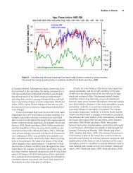
In the St. Lawrence River, high spr
- Page 198 and 199:
References Armellin, A., Mingelbier
- Page 200 and 201:
A. Environmental Contextual Narrati
- Page 202 and 203:
types. Analyses of historical aeria
- Page 204 and 205:
9. References Listed in text Baedke
- Page 206 and 207:
B. Recreational Boating and Tourism
- Page 208 and 209:
In addition to recreational boating
- Page 210 and 211:
Summary of Key Findings Based on it
- Page 212 and 213:
ANNEX 2 Figure B-3: Alexandria Bay
- Page 214 and 215:
Participants Recreational Boating a
- Page 216 and 217:
Communities along New York waters v
- Page 218 and 219:
On the Canadian side, a telephone s
- Page 220 and 221:
3. Potentially Significant Benefit
- Page 222 and 223:
The average horsepower of motor boa
- Page 224 and 225:
Noden, D. and Brown, T. (1975) The
- Page 226 and 227:
The Lower St. Lawrence River In com
- Page 228 and 229:
Table C-1: Unit Costs for the Const
- Page 230 and 231:
Beach Access The beach access perfo
- Page 232 and 233:
Since the value of shore protection
- Page 234 and 235:
ANNEX 2 Figure C-6: Map of percent
- Page 236 and 237:
ANNEX 2 Figure C-8: Map of downstre
- Page 238 and 239:
References Baird, W.F. and Associat
- Page 240 and 241:
C. Coastal Processes Contextual Nar
- Page 242 and 243:
Given the current land use policies
- Page 244 and 245:
. In the case of the shore protecti
- Page 246 and 247:
e. With the ever increasing urban d
- Page 248 and 249:
8. Risk Assessment/Sensitivity Anal
- Page 250 and 251:
C. Coastal Processes Contextual Nar
- Page 252 and 253:
This interest suffered badly during
- Page 254 and 255:
5. Key Trends Construction along ri
- Page 256 and 257:
Finally, from a computational stand
- Page 258 and 259:
D. Commercial Navigation Technical
- Page 260 and 261:
More information on the socio-econo
- Page 262 and 263:
Participants Commercial Navigation
- Page 264 and 265:
. Number of stakeholders The St. La
- Page 266 and 267:
g. Trade flows and current market c
- Page 268 and 269:
Commercial navigation costs actuall
- Page 270 and 271:
5. Key Trends Provided below are hi
- Page 272 and 273:
Another adaptive measure to falling
- Page 274 and 275:
f. In Montreal, water levels impact
- Page 276 and 277:
U.S. Dollars ANNEX 2 Figure E-1: Sh
- Page 278 and 279:
Ice formation Ice cover stability i
- Page 280 and 281:
Hydroelectric Power Generation Tech
- Page 282 and 283:
Regionally, hydropower is seen main
- Page 284 and 285:
NYISO administers the Day Ahead Mar
- Page 286 and 287:
(b) The hydropower performance indi
- Page 288 and 289:
Synapse Energy Economics Inc. devel
- Page 290 and 291:
9. References The Hydroelectric Pow
- Page 292 and 293:
F. Municipal, Industrial and Domest
- Page 294 and 295:
Taste and odours performance indica
- Page 296 and 297:
Determining a critical elevation fo
- Page 298 and 299:
Water level in Pointe-Claire (m) Fi
- Page 300 and 301:
F. Municipal, Industrial and Domest
- Page 302 and 303:
7. Adaptive Behaviours The evaluati
- Page 304 and 305:
(d) History of the interest The Akw
- Page 306 and 307:
Under this project, the H&H TWG pro
- Page 308 and 309:
increases throughout the year. Mixi
- Page 310 and 311:
• build operational hydrology for
- Page 312 and 313:
Fan, Y. and Fay, D. (2001) Variatio
- Page 314 and 315:
I. Common Data Needs Technical Work
- Page 316 and 317:
Collection of detailed bathymetric
- Page 318 and 319:
• Metadata requirements Metadata
- Page 320 and 321:
FTP Support The first component of
- Page 322 and 323:
ANNEX 2 Figure J-3: Typical product
- Page 324 and 325:
ANNEX 3 Annex 3 Plan Descriptions a
- Page 326 and 327:
After discussions, the Plan Formula
- Page 328 and 329:
Table A-1: Constraints Applied to E
- Page 330 and 331:
Deviations The outflow calculated a
- Page 332 and 333:
The following list summarizes the a
- Page 334 and 335:
ANNEX 3 Figure B-3: Lake Ontario Av
- Page 336 and 337:
Lake Ontario level (m) 1.9 1.8 1.7
- Page 338 and 339:
ANNEX 3 Figure B-8: Cumulative Freq
- Page 340 and 341:
Total winter flow (10 m 3 /s - quar
- Page 342 and 343:
Plan 1958-DD - Appendix Detailed de
- Page 344 and 345:
SELECT CASE adjusted supply indicat
- Page 346 and 347:
If the Lake Ontario level is greate
- Page 348 and 349:
The inflow category (e.g., wet, dry
- Page 350 and 351:
Step 5 - Ice limit: Exactly the sam
- Page 352 and 353:
ANNEX 3 Figure B-18: Plan A + rule
- Page 354 and 355:
Other rules Plan B + has two additi
- Page 356 and 357:
Plan D + : Blended Benefits Objecti
- Page 358 and 359:
ANNEX 3 Figure B-19A: Lake Ontario
- Page 360 and 361:
ANNEX 3 Figure B-20: Lake Ontario s
- Page 362 and 363:
ANNEX 3 Figure B-21F: Long Sault Da
- Page 364 and 365:
Figure B-23 shows the three benefit
- Page 366 and 367:
Score Figure B-25: Score based on t
- Page 368 and 369:
Flow Constraints In addition to the
- Page 370 and 371:
This procedure is repeated until th
- Page 372 and 373:
Reference and Interest Specific Reg
- Page 374 and 375:
Plan 1958-D Regulation of Lake Onta
- Page 376 and 377:
4. The “I” limits, or ice limit
- Page 378 and 379:
Figure B-31 compares the scoring re
- Page 380 and 381:
Experimental variations In simpler
- Page 382 and 383:
C. Summary Tables of Plan Results T
- Page 384 and 385:
Historical Time Series (1900-2000)
- Page 386 and 387:
Environmental Results (Historical)
- Page 388 and 389:
Stochastic Supply Sequences Economi
- Page 390 and 391:
Table C-8: Economic results for can
- Page 392 and 393:
Table C-10: Economic results for ca
- Page 394 and 395:
Table C-12: Environmental results f
- Page 396 and 397:
Table C-14: Environmental results f
- Page 398 and 399:
Table C-16: Economic results for ca
- Page 400 and 401:
Table C-18: Economic results for ca
- Page 402 and 403:
ANNEX 4 Introduction Annex 4 Mitiga
- Page 404 and 405:
The great majority of potential act
- Page 406 and 407:
Great Lakes Advance Emergency Manag
- Page 408 and 409:
“(b) General Plan. (1) The Secret
- Page 410 and 411:
Adaptive Management Action Plan (AM
- Page 412 and 413:
difference in evaluations. If, for
- Page 414 and 415:
Coastal Monitoring Purpose: Monitor
- Page 416 and 417:
Adaptive Management Program Summary
- Page 418 and 419:
GLOSSARY OF TERMS ABIOTIC - Non-liv
- Page 420 and 421:
COASTAL EROSION - The wearing away
- Page 422 and 423:
EROSION - The wearing away of land
- Page 424 and 425:
HYDROLOGIC MODELING - The use of ph
- Page 426 and 427:
MEASURE, STRUCTURAL - Any measure t
- Page 428 and 429:
PUBLIC INFORMATION - Activities whe
- Page 430 and 431:
SUBSTRATE COMPOSITION - Categorical