Evaluation of the Ticket to Work Program Initial Evaluation Report
Evaluation of the Ticket to Work Program Initial Evaluation Report
Evaluation of the Ticket to Work Program Initial Evaluation Report

You also want an ePaper? Increase the reach of your titles
YUMPU automatically turns print PDFs into web optimized ePapers that Google loves.
79<br />
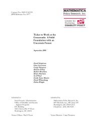
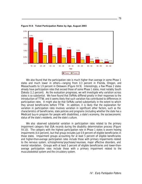
Figure IV.8: <strong>Ticket</strong> Participation Rates by Age, August 2003<br />
2.5%<br />
2.0%<br />
1.5%<br />
1.0%<br />
0.5%<br />
0.0%<br />
2.0%<br />
1.6%<br />
1.4%<br />
1.2%<br />
1.1%<br />
0.9%<br />
0.9%<br />
0.6%<br />
0.5%<br />
0.6%<br />
0.4%<br />
0.4%<br />
0.3%<br />
0.3%<br />
0.2%<br />
0.1% 0.1%<br />
0.0%<br />
18 - 24 25 - 29 30 - 34 35 - 39 40 - 44 45 - 49 50 - 54 55 - 59 60 - 64<br />
Age<br />
Phase 1 Phase 2<br />
We also found that <strong>the</strong> participation rate is much higher than average in some Phase 1<br />
states and much lower in o<strong>the</strong>rs—ranging from 0.3 percent in Florida, Oregon, and<br />
Massachusetts <strong>to</strong> 1.9 percent in Delaware (Figure IV.9). Interestingly, a few Phase 2 states<br />
already have participation rates that exceed those <strong>of</strong> some Phase 1 states, most notably South<br />
Dakota (1.2 percent). As <strong>the</strong> evaluation progresses, we will investigate why variation across<br />
states is so substantial. We have found that SVRAs differed greatly in <strong>the</strong>ir responses <strong>to</strong> <strong>the</strong><br />
introduction <strong>of</strong> TTW, and it seems likely that such variation has contributed <strong>to</strong> differences in<br />
participation rates. It might also be that SVRAs varied substantially in <strong>the</strong> extent <strong>to</strong> which<br />
<strong>the</strong>y served beneficiaries before TTW. In addition, it is likely that <strong>the</strong> explanation for<br />
variation in participation rates involves variation in significant o<strong>the</strong>r fac<strong>to</strong>rs, such as <strong>the</strong><br />
characteristics <strong>of</strong> beneficiaries, state policies and programs (including whe<strong>the</strong>r <strong>the</strong> state has a<br />
Medicaid buy-in program for people with disabilities), a state’s economy, <strong>the</strong> socioeconomic<br />
status <strong>of</strong> <strong>the</strong> state’s residents, and <strong>the</strong> state’s culture.<br />
We also observed substantial variation in participation rates related <strong>to</strong> <strong>the</strong> primary<br />
impairment category that SSA records during <strong>the</strong> disability determination process (Figure<br />
IV.10). The category with <strong>the</strong> highest participation rate in Phase 1 states is severe hearing<br />
impairments (4.4 percent), but that group includes just 0.9 percent <strong>of</strong> eligible beneficiaries in<br />
those states. Impairment groups accounting for at least 5 percent <strong>of</strong> eligible beneficiaries<br />
and higher-than-average participation rates include those with primary impairments related<br />
<strong>to</strong> <strong>the</strong> nervous system, schizophrenia/psychoses/neuroses, major affective disorders, and<br />
mental retardation. Groups with at least 5 percent <strong>of</strong> eligible beneficiaries and lower-thanaverage<br />
participation rates include those with a primary impairment related <strong>to</strong> <strong>the</strong><br />
musculoskeletal system and <strong>the</strong> circula<strong>to</strong>ry system.<br />
IV: Early Participation Patterns