Us - B2B24 - Il Sole 24 Ore
Us - B2B24 - Il Sole 24 Ore
Us - B2B24 - Il Sole 24 Ore

You also want an ePaper? Increase the reach of your titles
YUMPU automatically turns print PDFs into web optimized ePapers that Google loves.
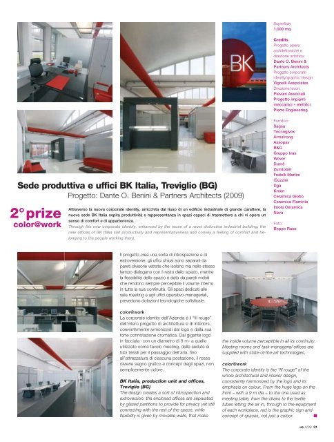
Sede produttiva e uffici BK Italia, Treviglio (BG)<br />
Progetto: Dante O. Benini & Partners Architects (2009)<br />
2°prize<br />
color@work<br />
Attraverso la nuova corporate identity, arricchita dal riuso di un edificio industriale di grande carattere, la<br />
nuova sede BK Italia ospita produttività e rappresentanza in spazi capaci di trasmettere a chi vi opera un<br />
senso di comfort e di appartenenza.<br />
Through the new corporate identity, enhanced by the reuse of a most distinctive industrial building, the<br />
new offices of BK Italia suit productivity and representativeness and convey a feeling of comfort and belonging<br />
to the people working there.<br />
<strong>Il</strong> progetto crea una sorta di introspezione e di<br />
estroversione: gli uffici chiusi sono separati da<br />
pareti divisorie vetrate che isolano ma nello stesso<br />
tempo dialogano con il resto dello spazio, mentre<br />
la flessibilità dello spazio è data da pareti mobili<br />
che rendono sempre percepibile il volume interno<br />
in tutta la sua continuità. Gli spazi dedicati alle<br />
sale meeting e agli uffici operativo-manageriali,<br />
prevedono dotazioni tecnologiche sofisticate.<br />
color@work<br />
La corporate identity dell’Azienda è il “fil rouge”<br />
dell’intero progetto di architettura e di interiors,<br />
coerentemente armonizzati dal logo e dalla sua<br />
forte connotazione cromatica. Dal gigante logo<br />
in facciata -con un diametro di 9 m- a quello<br />
utilizzato come tavolo meeting, dalle sedute ai<br />
tubi tessili per il passaggio dell’aria, fino<br />
all’attrezzatura di ciascuna postazione, il rosso<br />
diviene segno grafico e concept degli spazi, non<br />
semplicemente colore.<br />
BK Italia, production unit and offices,<br />
Treviglio (BG)<br />
The design creates a sort of introspection and<br />
extroversion: the enclosed offices are separated<br />
by glazed partitions to provide for privacy yet still<br />
connecting with the rest of the space, while<br />
flexibility is given by movable walls, that make<br />
Superficie:<br />
1.000 mq<br />
Credits<br />
Progetto opere<br />
architettoniche e<br />
direzione artistica:<br />
Dante O. Benini &<br />
Partners Architects<br />
Progetto corporate<br />
identity/graphic design:<br />
Vignelli Associates<br />
Direzione lavori:<br />
Pievani Associati<br />
Progetto impianti<br />
meccanici – elettrici<br />
Pierre Engineering<br />
Fornitori:<br />
Sagsa<br />
Tecnogivex<br />
Armstrong<br />
Assopav<br />
B&G<br />
Gruppo Ivas<br />
Wever<br />
Ducrè<br />
Zumtobel<br />
Fratelli Martini<br />
iGuzzini<br />
Dga<br />
Kreon<br />
Ceramica Globo<br />
Ceramica Flaminia<br />
Imola Ceramica<br />
Nava<br />
Foto:<br />
Beppe Raso<br />
the inside volume perceptible in all its continuity.<br />
Meeting rooms and task-managerial offices are<br />
supplied with state-of-the-art technologies.<br />
color@work<br />
The corporate identity is the “fil rouge” of the<br />
whole architectural and interior design,<br />
consistently harmonized by the logo and its<br />
emphasis on colour. From the huge logo on the<br />
front – with a 9 m dia – to the one used as<br />
meeting table, from the chairs to the textile<br />
tubes letting the air in, through to the equipment<br />
of each workplace, red is the graphic sign and<br />
concept of spaces, not just a colour. ■<br />
us 4/09 31