CDOT Performance Data Business Plan - Cambridge Systematics
CDOT Performance Data Business Plan - Cambridge Systematics
CDOT Performance Data Business Plan - Cambridge Systematics

Create successful ePaper yourself
Turn your PDF publications into a flip-book with our unique Google optimized e-Paper software.
<strong>CDOT</strong> <strong>Performance</strong> <strong>Data</strong> <strong>Business</strong> <strong>Plan</strong><br />
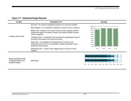
Figure 5.17 Dashboard Design Elements<br />
Function Visualization Tool Examples<br />
Compare a Set of Values<br />
Bar Chart – For numerical comparisons showing one or more set of variables<br />
Block Histogram – For visualization of distribution of numeric values in a data set.<br />
Bubble Chart – Displays a set of numeric values as circles, especially useful for<br />
data sets with dozens to hundreds of values or with values that differ by several<br />
orders of magnitude.<br />
Candlestick Chart – A combination of bar and line chart representing the range of<br />
movement of the measure over a given time interval.<br />
Radar Chart – For visualization of multivariate data in the form of a twodimensional<br />
chart of three or more quantitative variables represented on axes<br />
starting from the same point.<br />
Stacked Bar Chart – If values of each category add up to 100% and if this is<br />
important<br />
100%<br />
90%<br />
80%<br />
70%<br />
60%<br />
50%<br />
40%<br />
30%<br />
20%<br />
10%<br />
0%<br />
2007 2008 2009 2010<br />
Display Key Measures With<br />
Comparative Measure and<br />
Qualitative Ranges<br />
Bullet Graph<br />
n<br />
n<br />
0% 10% 20% 30% 40% 50% 60% 70% 80% 90% 100%<br />
<strong>Cambridge</strong> <strong>Systematics</strong>, Inc. 5-25