- Page 1 and 2:
North West London Shaping a healthi
- Page 3 and 4:
Table of contents Volume 1 Foreword
- Page 5 and 6:
Foreword Dr Mark Spencer The Clinic
- Page 7 and 8:
6. Consultation, feedback and how w
- Page 9 and 10:
13. Equalities implications This ch
- Page 11 and 12:
1. Executive Summary Introduction t
- Page 13 and 14:
The overall programme timeline is b
- Page 15 and 16:
The process was used before consult
- Page 17 and 18:
• Delivery of multi-disciplinary
- Page 19 and 20:
Stage 1 - Case for Change Our work
- Page 21 and 22:
For Quality of care, clinicians hav
- Page 23 and 24:
1 2 3 4 5 A 6 B 7 C 8 Quality of Ca
- Page 25 and 26:
Assuring the proposals Throughout t
- Page 27 and 28:
Programme implementation arrangemen
- Page 29 and 30:
5. To agree that Hammersmith Hospit
- Page 31 and 32:
DMBC Chapter 2 - Introduction to th
- Page 33 and 34:
2. Introduction to the NHS in NW Lo
- Page 35 and 36:
Figure 2.3: Clinical Commissioning
- Page 37 and 38:
West Middlesex University Hospital
- Page 39 and 40:
major hospital, elective centre and
- Page 41 and 42:
DMBC Chapter 3 - Introduction to th
- Page 43 and 44:
3. Introduction to the Shaping a he
- Page 45 and 46:
3.3 Programme governance The Joint
- Page 47 and 48:
The JCPCT is advised by a Programme
- Page 49 and 50:
Consultation - during this phase, t
- Page 51 and 52:
Ensure consistency of communication
- Page 53 and 54:
Stakeholder Group Political Individ
- Page 55 and 56:
o o o o o Rationale for options dev
- Page 57 and 58:
The implications of the options in
- Page 59 and 60:
DMBC Chapter 4 -The Case for Change
- Page 61 and 62:
4. The Case for Change This chapter
- Page 63 and 64:
Stroke Services: The provision of s
- Page 65 and 66:
We need to do more to support patie
- Page 67 and 68:
In NW London, however, the NHS is s
- Page 69 and 70:
Figure 4.6: Emergency general surgi
- Page 71 and 72:
attack or stroke to designated cent
- Page 73 and 74:
Figure 4.9: Evaluation of primary c
- Page 75 and 76:
Inequalities would continue and pro
- Page 77 and 78:
DMBC Chapter 5 - Process for identi
- Page 79 and 80:
5. Process for identifying a recomm
- Page 81 and 82:
Figure 5.1: Basis of decision of wh
- Page 83 and 84:
We confirmed this decision, and the
- Page 85 and 86:
5.5 A detailed description of the s
- Page 87 and 88:
Correct care setting to deliver hig
- Page 89 and 90:
Figure 5.11: Ratings used in evalua
- Page 91 and 92:
DMBC Chapter 6 - Consultation, feed
- Page 93 and 94:
6. Consultation, feedback and how w
- Page 95 and 96:
6.2.1 Key findings from the consult
- Page 97 and 98:
times (particularly for patients tr
- Page 99 and 100:
Westminster City Council, Adult Ser
- Page 101 and 102:
Analysed and considered consultatio
- Page 103 and 104:
6.3 Our responses to feedback This
- Page 105 and 106:
Feedback received Stakeholders who
- Page 107 and 108:
6.3.3 Theme 3: Clinical vision and
- Page 109 and 110:
Feedback received Stakeholders who
- Page 111 and 112:
Feedback received Stakeholders who
- Page 113 and 114:
6.3.5 Theme 5: Proposals for local
- Page 115 and 116:
Feedback received Stakeholders who
- Page 117 and 118:
Feedback received Stakeholders who
- Page 119 and 120:
Feedback received Stakeholders who
- Page 121 and 122:
Feedback received Stakeholders who
- Page 123 and 124:
DMBC Chapter 7 - Clinical vision, s
- Page 125 and 126:
7a. Clinical, vision, standards and
- Page 127 and 128:
Local clinicians agreed that in ord
- Page 129 and 130:
▪ Expectant mothers should have t
- Page 131 and 132:
# Standard care services (111). As
- Page 133 and 134:
Figure 7.8: Development of the acut
- Page 135 and 136:
# Standard Adapted from source depa
- Page 137 and 138:
Figure 7.11: Shaping a healthier fu
- Page 139 and 140:
No. Standard Adapted from source Su
- Page 141 and 142:
No. Standard Adapted from source se
- Page 143 and 144:
# Standard All emergency department
- Page 145 and 146:
# Standard All non-urgent - within
- Page 147 and 148:
Figure 7.18: Shaping a healthier fu
- Page 149 and 150:
# Standard Adapted from source shou
- Page 151 and 152:
# Standard Adapted from source Comm
- Page 153 and 154:
The final standards are more demand
- Page 155 and 156:
Figure 7.26: Proposed services to b
- Page 157 and 158:
Each CCG is taking steps to help pr
- Page 159 and 160:
in major hospitals) and equipment t
- Page 161 and 162:
tangible differences for patients
- Page 163 and 164:
Referral A&E Illustrative patient j
- Page 165 and 166:
Illustrative patient journey matern
- Page 167 and 168:
Illustrative patient journey in mat
- Page 169 and 170:
Illustrative patient journey planne
- Page 171 and 172:
GP-led care Illustrative patient jo
- Page 173 and 174:
7.8.1 Scope of the CIG’s work The
- Page 175 and 176:
Theme Clinical outcomes Staff attit
- Page 177 and 178:
Further stakeholder engagement is n
- Page 179 and 180:
Figure 7.31 E&UC CIG Responses to N
- Page 181 and 182:
NCAT recommendation CIG response Se
- Page 183 and 184:
Conditions suitable for UCC Clinica
- Page 185 and 186:
Exclusion criterion Mental health A
- Page 187 and 188:
Diagnostics 7.14.3 Streaming, regis
- Page 189 and 190:
Biochemistry Microbiology Radiology
- Page 191 and 192:
The Provider must deliver appropria
- Page 193 and 194:
Figure 7.41: E&UC CIG recommended k
- Page 195 and 196:
will be able to establish a service
- Page 197 and 198:
The UCC provider will be responsibl
- Page 199 and 200:
Key differences Governance As with
- Page 201 and 202:
should be provided with appropriate
- Page 203 and 204:
Process map 1: Assessing UCC patien
- Page 205 and 206:
Process map 3: UCC to ED transfer p
- Page 207 and 208:
make an appointment with their own
- Page 209 and 210:
7.19 ED workforce A programme-wide
- Page 211 and 212:
The purpose of this section is to s
- Page 213 and 214:
Figure 7.45 Consultation results on
- Page 215 and 216:
Figure 7.46: Specific Responses the
- Page 217 and 218:
NCAT recommendation Original Progra
- Page 219 and 220:
7.25.1 London Health Programmes cli
- Page 221 and 222:
Future capacity in centralised serv
- Page 223 and 224:
3. There would be an additional "st
- Page 225 and 226:
in NWL will have a choice of delive
- Page 227 and 228:
Support for the proposal is higher
- Page 229 and 230:
Figure 7.49: Specific feedback the
- Page 231 and 232:
Sub-Theme Organisation Support Conc
- Page 233 and 234:
Sub-Theme Organisation Support Conc
- Page 235 and 236:
7.36.1 National Clinical Advisory T
- Page 237 and 238:
NCAT recommendation Further engagem
- Page 239 and 240:
edistributed nationwide. We envisag
- Page 241 and 242:
6. The Maternity CIG have considere
- Page 243 and 244:
DMBC Chapter 8A-E - Out of hospital
- Page 245 and 246:
Out of hospital improvements This c
- Page 247 and 248:
8.2. Settings of out of hospital ca
- Page 249 and 250:
practical solution for the site, wh
- Page 251 and 252:
Brent Health Partnerships Overview
- Page 253 and 254:
Consultation theme Standards for ca
- Page 255 and 256:
Consultation theme Integration Inve
- Page 257 and 258:
8.5.3. Workforce Following feedback
- Page 259 and 260:
Delivering this workforce shift wil
- Page 261 and 262:
Measure type Domain Potential measu
- Page 263 and 264:
8b. Primary care development 8.6. S
- Page 265 and 266:
consultation they could have receiv
- Page 267 and 268:
8.10. Next steps We are developing
- Page 269 and 270:
Figure 8.11: Hub/health centre requ
- Page 271 and 272:
some cases, these will be offered o
- Page 273 and 274:
Process for development of local ho
- Page 275 and 276:
The result is an emerging picture o
- Page 277 and 278:
Across NW London, these sites will
- Page 279 and 280:
need redeveloping or rebuilding to
- Page 281 and 282: 8d. Urgent care centres When indivi
- Page 283 and 284: Figure 8.22: NW London urgent care
- Page 285 and 286: Conditions suitable for UCC Clinica
- Page 287 and 288: Key differences Governance As with
- Page 289 and 290: processes of the CCG and as such th
- Page 291 and 292: around the table accelerates the un
- Page 293 and 294: Improved empowerment - specifically
- Page 295 and 296: Figure 8.28: Realising our integrat
- Page 297 and 298: Figure 8.29: Summary of CCG commiss
- Page 299 and 300: DMBC Chapter 9 - Decision making an
- Page 301 and 302: 9a. Decision making analysis stages
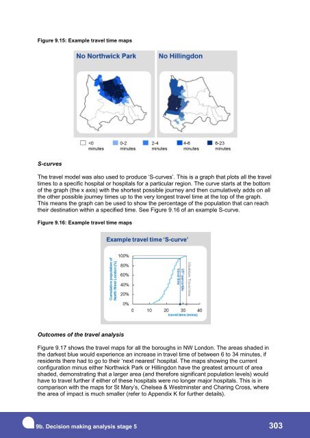
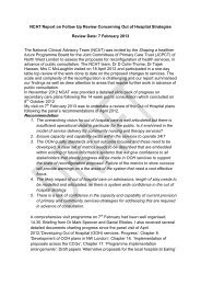
- Page 303 and 304: Correct care setting to deliver hig
- Page 305 and 306: “The Brent Health Partnerships Ov
- Page 307 and 308: Correct care setting to deliver hig
- Page 309 and 310: Royal College of Midwives “The RC
- Page 311 and 312: Correct care setting to deliver hig
- Page 313 and 314: clinicians wanted to take this into
- Page 315 and 316: 9.6.3 Feedback received about the s
- Page 317 and 318: Confirm the service models reflect
- Page 319 and 320: Figure 9.9: The seven hurdle criter
- Page 321 and 322: surgeons in NW London, but we would
- Page 323 and 324: We confirmed this decision with the
- Page 325 and 326: Appropriate staffing is integral to
- Page 327 and 328: The proposals are supported by Depa
- Page 329 and 330: NW London to deliver high quality c
- Page 331: 1. Support predicting where activit
- Page 335 and 336: The analysis shown in Figure 9.18,
- Page 337 and 338: Figure 9.18: Impact on private car
- Page 339 and 340: 33% support 10% opposed 57% of peop
- Page 341 and 342: Figure 9.21: Watershed map for blue
- Page 343 and 344: etained as a major hospital, becaus
- Page 345 and 346: 9.7.29 The implications of this fee
- Page 347 and 348: Figure 9.25: Potential activity flo
- Page 349 and 350: Figure 9.27: Changes in travel time
- Page 351 and 352: Figure 9.29: Changes in travel time
- Page 353 and 354: Figure 9.31: Possible choices betwe
- Page 355 and 356: Either Charing Cross or Chelsea & W
- Page 357 and 358: Figure 9.33: Option A, excluding ca
- Page 359 and 360: Figure 9.36: Option C responses, in
- Page 361 and 362: Richmond Upon Thames LINk Royal Bor
- Page 363 and 364: Southall Black Sisters “The closu
- Page 365 and 366: Figure 9.38: Ranking of evaluation
- Page 367 and 368: Figure 9.42: Evaluation criteria as
- Page 369 and 370: anked third according to the mean s
- Page 371 and 372: 9.9.5 The analysis of the five eval
- Page 373 and 374: Figure 9.45: Quality Dashboard data
- Page 375 and 376: Response to feedback about the eval
- Page 377 and 378: Figure 9.48: Quality of care - Acut
- Page 379 and 380: experience. In order to use this as
- Page 381 and 382: Figure 9.50: Time to major hospital
- Page 383 and 384:
Rationalising provision across the
- Page 385 and 386:
Figure 9.51: Blue light travel time
- Page 387 and 388:
Figure 9.52 shows the reduction in
- Page 389 and 390:
3 Value for money 9.9.26 The purpos
- Page 391 and 392:
Staff recommendation as a place to
- Page 393 and 394:
This analysis was agreed prior to c
- Page 395 and 396:
Figure 9.56: Ease of delivering eac
- Page 397 and 398:
Response to feedback about implemen
- Page 399 and 400:
Changes to the designation of the M
- Page 401 and 402:
5 Research and Education: Disruptio
- Page 403 and 404:
Figure 9.60: Evaluation of disrupti
- Page 405 and 406:
9.9.48 The outcome of the disruptio
- Page 407 and 408:
Greg Hands, MP for Chelsea & Fulham
- Page 409 and 410:
comprises more than 22 million cita
- Page 411 and 412:
Quality/Impact score Figure 9.65 Re
- Page 413 and 414:
9. Decision making analysis - stage
- Page 415 and 416:
There were six distinct parts of th
- Page 417 and 418:
Figure 9.69: 5 year gross savings,
- Page 419 and 420:
Figure 9.73: Commissioners intend t
- Page 421 and 422:
Figure 9.75: Beds bridge: 2012/13 t
- Page 423 and 424:
The key modelling assumptions appli
- Page 425 and 426:
Figure 9.79: DMBC NHS net capital e
- Page 427 and 428:
Figure 9.81: Approach to estimating
- Page 429 and 430:
Figure 9.84: Summary of net surplus
- Page 431 and 432:
Figure 9.86: Evaluation of total su
- Page 433 and 434:
9.13.9 Impact of the changes: Updat
- Page 435 and 436:
Figure 9.89: Effect of the expanded
- Page 437 and 438:
Correct care setting to deliver hig
- Page 439 and 440:
Sensitivity tests g) Tariff efficie
- Page 441 and 442:
Figure 9.93 summarises the impact o
- Page 443 and 444:
Figure 9.94: Change in expanded NPV
- Page 445 and 446:
The sensitivity analysis supports t
- Page 447 and 448:
DMBC Chapter 10 - The recommendatio
- Page 449 and 450:
10. The proposed future configurati
- Page 451 and 452:
The changes to the scoring before a
- Page 453 and 454:
10.3. Why this is the recommendatio
- Page 455 and 456:
In the rest of this section, the se