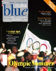
BLUE NEW 31_215x270 - Blue Liguria - Sagep
BLUE NEW 31_215x270 - Blue Liguria - Sagep
BLUE NEW 31_215x270 - Blue Liguria - Sagep

Create successful ePaper yourself
Turn your PDF publications into a flip-book with our unique Google optimized e-Paper software.
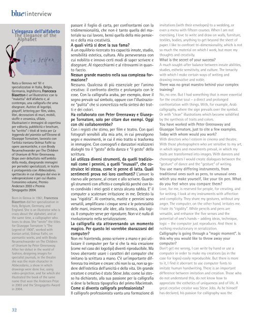
lue interview<br />
L'eleganza dell'alfabeto<br />
The Elegance of the<br />
Alphabet<br />
Nata a Genova nel ’61 e<br />
specializzatasi in Italia, Belgio,<br />
Germania, Inghilterra, Francesca<br />
Biasetton è un’illustratrice con la<br />
“malattia” dell’alfabeto e, al<br />
contempo, una calligrafa che ama<br />
disegnare. Autrice di logotipi,<br />
playoff, lettering per film, video,<br />
libri, decorazioni di muri, mobili,<br />
stoffe e ceramica, sfilate,<br />
illustrazioni e immagini di copertina<br />
per editoria, pubblicità e brochure,<br />
ha “scritto” i titoli di testa per La<br />
leggenda del pianista sull’Oceano di<br />
Giuseppe Tornatore, lavorato con<br />
l’artista iraniana Golnaz Fathi su<br />
opere asemantiche, e con Brody<br />
Neuenschwander per The Children<br />
of Uranium di Peter Greenaway.<br />
Dopo aver debuttato nell’ambito<br />
della moda, disegnando immagini<br />
per periodici specializzati, in teatro<br />
è protagonista con Abbecedario,<br />
spettacolo in cui disegna dal vivo in<br />
videoproiezione e per cui illustra<br />
l’omonimo volume, Premio<br />
Andersen 2003 e Premio<br />
Stregagatto 2004.<br />
Born in Genoa in 1961, Francesca<br />
Biasetton did her specialization in<br />
Italy, Belgium, Germany, and<br />
England. She is an illustrator who is<br />
crazy about the alphabet, and at<br />
the same time, a calligrapher who<br />
loves to draw. She “wrote” the titles<br />
for Giuseppe Tornatore ‘s “The<br />
Legend of 1900”, worked with<br />
Iranian artist, Golnaz Fathi, on<br />
asemantic works, and with Brody<br />
Neuenschwander on The Children<br />
of Uranium by Peter Greenaway.<br />
After her debut in the world of<br />
fashion, designing images for<br />
specialist journals, in the theatre<br />
she was the main character in<br />
Abbecedario, a show in which<br />
drawings were done live, using<br />
video-projection, and for which she<br />
illustrated the book of the same<br />
name that won the Andersen Prize<br />
in 2003 and the Stregagatto Award<br />
in 2004.<br />
passare il foglio di carta, per confrontarmi con la<br />
tridimensionalità, che non è tanto quella del materiale<br />
su cui lavoro, bensì quella della mio pensiero<br />
e della mia creatività.<br />
A quali virtù si deve la sua fama?<br />
A un equilibrio ricercato tra capacità innate, studio,<br />
sensibilità estetica, cultura. Alla perseveranza con<br />
cui nobilito e innovo certi modi di saper scrivere e<br />
disegnare. Al rispecchiarmi e al ritrovarmi in quanto<br />
faccio.<br />
Nessun grande maestro nella sua complessa formazione?<br />
Nessuno. Qualcosa di più essenziale per l’animo<br />
creativo: il confronto diretto e prolungato con le<br />
cose. Con la calligrafia araba, per esempio, dove il<br />
segno prevale sul simbolo, oppure con l’illustrazione<br />
“pulita” che si concretizza nella sintesi dei tratti<br />
e dei colori.<br />
Ha collaborato con Peter Greenaway e Giuseppe<br />
Tornatore, solo per citare due esempi. Oggi<br />
con chi collaborerebbe?<br />
Con i registi che stimo, per film e teatro. Con quei<br />
fotografi sensibili alla mia arte, in cui prevalgono<br />
segni e movimenti, in cui il mio tratto si trasforma<br />
in immagine. Con coreografi e danzatori realizzerei<br />
dialoghi tra il “gesto” della danza e “il gesto” della<br />
scrittura.<br />
Lei utilizza diversi strumenti, da quelli tradizionali<br />
come i pennini, a quelli “inusuali”, che costruisce<br />
lei stessa, come le penne di latta. Quali<br />
sentimenti prova nei loro confronti? L’amore lo<br />
riservo alle persone, al creare e allo scrivere. Guardo<br />
gli strumenti con affetto e complicità perché con loro<br />
condivido i miei gesti e senza alcuna rabbia. E’ il<br />
computer a scatenare irritazione in me. Detesto la<br />
sua “rigidità”. Al contrario, matite e pennini sono<br />
versatili, amplificano i cinque sensi e le potenzialità<br />
delle mani, insieme alle idee, alla tecnica, alla logica.<br />
Il computer serve per riprodurre. Non vi è nulla di<br />
rivoluzionario nella serializzazione.<br />
La calligrafia sta attraversando un momento<br />
magico. Per questo lei vorrebbe sbarazzarsi del<br />
computer?<br />
Non mi fraintenda, posso scrivere a mano e poi utilizzare<br />
il computer per far sì che la mia creazione<br />
(come nel caso dei logotipi) diventi riproducibile. Ma<br />
trovo aberrante usare i caratteri del computer che<br />
imitano la scrittura a mano. C’è un’importante differenza<br />
tra imitare e creare: chi non lo sa, non sa godere<br />
dell’estetica dell’unicità e della vita. Un grande<br />
creatore e creativo è stato Steve Jobs: come lui stesso<br />
ha dichiarato, alla sua passione per la calligrafia<br />
si deve la bellezza tipografica del primo Macintosh.<br />
Come si diventa calligrafa professionista?<br />
Il calligrafo professionista vanta una formazione di<br />
invitations (with their envelopes) to a wedding, or<br />
even a menu with fifteen courses. When I am not<br />
exercising, I love to write and draw on walls, furniture,<br />
textiles, bodies, anything to get beyond the sheet of<br />
paper. I like to confront tri-dimensionality, which is not<br />
so much the material on which I work, but more my<br />
thoughts and creativity.<br />
What is the secret of your success?<br />
A much sought-after balance between innate abilities,<br />
studies, esthetic sensitivity, and culture. The tenacity<br />
with which I make certain ways of writing and<br />
drawing innovative and noble.<br />
There was no great maestro behind your complex<br />
training?<br />
No, no one. But I had something that is more essential<br />
for the creative soul – a direct and prolonged<br />
confrontation with things. With, for example, Arab<br />
calligraphy, where the sign prevails over the symbol.<br />
Or with “clean” illustrations which become solidified<br />
by the synthesis of traits and colors.<br />
You have worked with Peter Greenaway and<br />
Giuseppe Tornatore, just to cite a few examples.<br />
Today with whom would you work?<br />
With directors who I esteem in cinema and theatre.<br />
With those photographers who are sensitive to my art,<br />
in which signs and movements prevail, in which my<br />
traits are transformed into images. With dancers and<br />
choreographers I would create dialogues between the<br />
“gesture” of dance and the “gesture” of writing.<br />
You use many differing instruments, from<br />
traditional ones such as pens, to unusual ones<br />
which you make yourself, like your tin pen. What<br />
do you feel when you compare them?<br />
Love, for me, is reserved for people, for creating, and<br />
for writing. I look at my instruments with affection<br />
and complicity. They share my gestures, without any<br />
anger. The computer, on the other hand, irritates me.<br />
I hate its “rigidity”. While pencils and pens are<br />
versatile, and enhance the five senses and the<br />
potential of one’s hands – adding ideas, technique,<br />
logic – the computer just reproduces. And there is<br />
nothing revolutionary in serialization.<br />
Calligraphy is going through a “magic moment”. Is<br />
this why you would like to throw away your<br />
computer?<br />
Don’t get me wrong, I can write by hand or use a<br />
computer in order to make my creations (as in the<br />
case for logos) easily reproducible. But there is more<br />
to it, I find it aberrant to use computer fonts to<br />
imitate human handwriting. There is an important<br />
difference between imitation and creation. Those who<br />
do not understand this, do not know how to<br />
appreciate the esthetics of uniqueness and of life. A<br />
great creative creator was Steve Jobs. As he himself<br />
has declared, his passion for calligraphy was the<br />
32