- Page 1:
• David Begg, Gianluigi Vernasca,
- Page 4 and 5:
Economics 10th Edition David Begg,
- Page 7 and 8:
Brief Table of Contents Preface xii
- Page 9 and 10:
5 Consumer choice and demand decisi
- Page 11 and 12:
PART FOUR Macroeconomics l 5 Introd
- Page 13 and 14:
PART FIVE The world economy 28 Inte
- Page 15 and 16:
Changes to the tenth edition After
- Page 17 and 18:
Guided tour In addition to illustra
- Page 19 and 20: Aiding Understanding Hy the end of
- Page 21 and 22: Rent ceiling in Sweden* More on pri
- Page 23 and 24: 13 General vs partial equilibrium:
- Page 25 and 26: 26 Growth and competition* Case Neo
- Page 27 and 28: Cl INSTRUCTORS ... Would you like y
- Page 29 and 30: Additional technology to enhance le
- Page 31 and 32: Custom Publishing Solutions • cre
- Page 33 and 34: Acknowledgements for the tenth edit
- Page 35 and 36: Finally, special thanks to the foll
- Page 38: ---.. . - Introduction Economics is
- Page 41 and 42: CHAPTER 1 Economics and the economy
- Page 43 and 44: CHAPTER 1 Economics and the economy
- Page 45 and 46: CHAPTER 1 Economics and the economy
- Page 47 and 48: CHAPTER 1 Economics and the economy
- Page 49 and 50: CHAPTER 1 Economics and the economy
- Page 51 and 52: CHAPTER 1 Economics and the economy
- Page 53 and 54: CHAPTER 1 Economics and the economy
- Page 55 and 56: CHAPTER 1 Economics and the economy
- Page 57 and 58: CHAPTER 1 Economics and the economy
- Page 59 and 60: Learning Outcomes By the end of thi
- Page 61 and 62: CHAPTER 2 Tools of economic analysi
- Page 63 and 64: CHAPTER 2 Tools of economic analysi
- Page 65 and 66: CHAPTER 2 Tools of economic analysi
- Page 67 and 68: CHAPTER 2 Tools of economic analysi
- Page 69: CHAPTER 2 Tools of economic analysi
- Page 73 and 74: CHAPTER 2 Tools of economic analysi
- Page 75 and 76: CHAPTER 2 Tools of economic analysi
- Page 77 and 78: CHAPTER 2 Tools of economic analysi
- Page 79 and 80: Learning Outcomes By the end of thi
- Page 81 and 82: CHAPTER 3 Demand, supply and the ma
- Page 83 and 84: CHAPTER 3 Demand, supply and the ma
- Page 85 and 86: CHAPTER 3 Demand, supply and the ma
- Page 87 and 88: CHAPTER 3 Demand, supply and the ma
- Page 89 and 90: CHAPTER 3 Demand, supply and the ma
- Page 91 and 92: CHAPTER 3 Demand, supply and the ma
- Page 93 and 94: CHAPTER 3 Demand, supply and the ma
- Page 95 and 96: CHAPTER 3 Demand, supply and the ma
- Page 97 and 98: CHAPTER 3 Demand, supply and the ma
- Page 99 and 100: CHAPTER 3 Demand, supply and the ma
- Page 102 and 103: Learning Outcomes By the end of thi
- Page 104 and 105: 4.1 The price responsiveness of dem
- Page 106 and 107: 4.1 The price responsiveness of dem
- Page 108 and 109: 4.1 The price responsiveness of dem
- Page 110 and 111: 4.2 Price, quantity demanded and to
- Page 112 and 113: 4.2 Price, quantity demanded and to
- Page 114 and 115: 4.4 Short run and long run simultan
- Page 116 and 117: 4.6 The effect of income on demand
- Page 118 and 119: 4.6 The effect of income on demand
- Page 120 and 121:
4.8 Elasticity of supply The elasti
- Page 122 and 123:
4.9 Who really pays the tax? S' - G
- Page 124 and 125:
Summary What are the effects of the
- Page 126 and 127:
Review questions 5 Common fallacies
- Page 128 and 129:
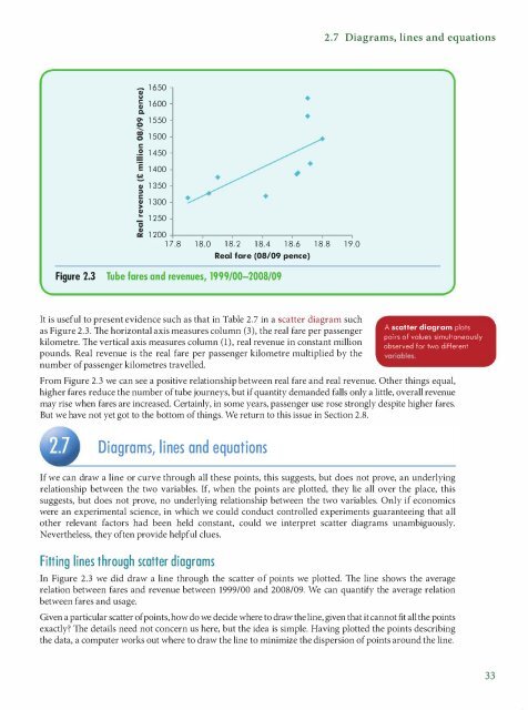
Learning Outcomes By the end of thi
- Page 130 and 131:
5.1 Demand by a single consumer is
- Page 132 and 133:
5.1 Demand by a single consumer Ill
- Page 134 and 135:
5.1 Demand by a single consumer QF
- Page 136 and 137:
5.1 Demand by a single consumer whe
- Page 138 and 139:
5.1 Demand by a single consumer How
- Page 140 and 141:
5.2 Adjustment to income changes ou
- Page 142 and 143:
5.3 Adjustment to price changes and
- Page 144 and 145:
5.3 Adjustment to price changes Thi
- Page 146 and 147:
5.3 Adjustment to price changes imp
- Page 148 and 149:
5.3 Adjustment to price changes Q '
- Page 150 and 151:
5.5 Complements and substitutes it
- Page 152 and 153:
5.6 Transfers in kind that to the s
- Page 154 and 155:
Review questions • The market dem
- Page 156 and 157:
Our theory of consumer choice assum
- Page 158 and 159:
APPENDIX Consumer choice with measu
- Page 160 and 161:
6.2 A firm's accounts A sole trader
- Page 162 and 163:
6.2 A firm's accounts Inventories I
- Page 164 and 165:
6.2 A firm's accounts Earnings When
- Page 166 and 167:
6.4 Corporate finance and corporate
- Page 168 and 169:
6.5 The firm's supply decision Tabl
- Page 170 and 171:
6.6 Marginal cost and marginal reve
- Page 172 and 173:
6.6 Marginal cost and marginal reve
- Page 174 and 175:
6.6 Marginal cost and marginal reve
- Page 176 and 177:
6. 7 Marginal cost and marginal rev
- Page 178 and 179:
Review questions in total cost when
- Page 180 and 181:
Learning Outcomes By the end of thi
- Page 182 and 183:
7.2 Production in the short run: di
- Page 184 and 185:
7.2 Production in the short run: di
- Page 186 and 187:
7.3 Short-run costs As you can see
- Page 188 and 189:
7.3 Short-run costs 60 50 SMC - 40
- Page 190 and 191:
7.3 Short-run costs down average co
- Page 192 and 193:
7.4 A firm's output decision in the
- Page 194 and 195:
7.6 Long-run total, marginal and av
- Page 196 and 197:
7. 7 Returns to scale - "O 0 DI ..
- Page 198 and 199:
7. 7 Returns to scale Scale economi
- Page 200 and 201:
7. 7 Returns to scale Table 7.10 Mi
- Page 202 and 203:
--1-----1 7.8 The firm's long-run o
- Page 204 and 205:
Summary Summary • This chapter di
- Page 206 and 207:
Review questions 8 Suppose that fir
- Page 208 and 209:
8.1 Perfect competition Perfect com
- Page 210 and 211:
8.2 A perfectly competitive firm's
- Page 212 and 213:
8.2 A perfectly competitive firm's
- Page 214 and 215:
8.3 Industry supply curves In the s
- Page 216 and 217:
8.4 Comparative statics for a compe
- Page 218 and 219:
.. 8.6 Profit-maximizing output for
- Page 220 and 221:
8.6 Profit-maximizing output for a
- Page 222 and 223:
8. 7 Output and price under monopol
- Page 224 and 225:
8. 7 Output and price under monopol
- Page 226 and 227:
8.8 A monopoly has no supply curve
- Page 228 and 229:
8.9 Monopoly and technical change f
- Page 230 and 231:
8.10 Natural monopoly 'ti QI 0 :I P
- Page 232 and 233:
Review questions • Adding at each
- Page 234 and 235:
Learning Outcomes By the end of thi
- Page 236 and 237:
9 .1 Why market structures differ D
- Page 238 and 239:
9 .1 Why market structures differ T
- Page 240 and 241:
9.3 Oligopoly and interdependence A
- Page 242 and 243:
9.3 Oligopoly and interdependence T
- Page 244 and 245:
9.4 Game theory and interdependent
- Page 246 and 247:
9.5 Reaction functions demand curve
- Page 248 and 249:
9.5 Reaction functions Deriving the
- Page 250 and 251:
9.5 Reaction functions Mergers and
- Page 252 and 253:
9.5 Reaction functions The Stackelb
- Page 254 and 255:
9.7 Strategic entry deterrence Inno
- Page 256 and 257:
9.8 Summing up Barriers at the chec
- Page 258 and 259:
Review questions Review questions c
- Page 260 and 261:
Learning Outcomes By the end of thi
- Page 262 and 263:
I 0.1 The firm's demand for factors
- Page 264 and 265:
10.2 The firm's demand for labour i
- Page 266 and 267:
10.3 The industry demand curve for
- Page 268 and 269:
10.4 The supply of labour Table 10.
- Page 270 and 271:
10.4 The supply of labour A reducti
- Page 272 and 273:
10.5 Industry labour market equilib
- Page 274 and 275:
10.5 Industry labour market equilib
- Page 276 and 277:
10.6 Transfer earnings and economic
- Page 278 and 279:
10. 7 Do labour markets clear? Mini
- Page 280 and 281:
10. 7 Do labour markets clear? How
- Page 282 and 283:
10.8 UK wages and employment Table
- Page 284 and 285:
Summary reducing demand for both fa
- Page 286 and 287:
Review questions In a graph with th
- Page 288 and 289:
APPENDIX Isoquants and the choice o
- Page 290 and 291:
Learning Outcomes By the end of thi
- Page 292 and 293:
11.2 Rentals, interest rates and as
- Page 294 and 295:
11.2 Rentals, interest rates and as
- Page 296 and 297:
11.2 Rentals, interest rates and as
- Page 298 and 299:
11.3 Saving, investment and the rea
- Page 300 and 301:
11. 5 The supply of capital service
- Page 302 and 303:
11.6 Equilibrium and adjustment in
- Page 304 and 305:
11.8 Land and rents supply of skill
- Page 306 and 307:
11.9 Income distribution in the UK
- Page 308 and 309:
Summary of average earnings. As liv
- Page 310 and 311:
Review questions the quantity of ca
- Page 312 and 313:
Learning Outcomes By the end of thi
- Page 314 and 315:
12.l Individual attitudes to risk S
- Page 316 and 317:
12.2 Insurance and risk Life assura
- Page 318 and 319:
12.3 Asymmetric information The uti
- Page 320 and 321:
12.3 Asymmetric information Executi
- Page 322 and 323:
12.4 Uncertainty and asset returns
- Page 324 and 325:
12.5 Portfolio selection We use the
- Page 326 and 327:
12.5 Portfolio selection Conversely
- Page 328 and 329:
12.6 Efficient asset markets Beta i
- Page 330 and 331:
12.6 Efficient asset markets II Beh
- Page 332 and 333:
12. 7 More on risk You own a copper
- Page 334 and 335:
12.8 E-products 100 80 60 - - - - -
- Page 336 and 337:
12.8 E-products If Britain had to s
- Page 338 and 339:
Summary Britannica shelved Serious
- Page 340 and 341:
Review questions 4 You set up a fir
- Page 342:
Welfa re economics Normative or wel
- Page 345 and 346:
CHAPTER 13 Welfare economics Welfar
- Page 347 and 348:
CHAPTER 13 Welfare economics Perfec
- Page 349 and 350:
CHAPTER 13 Welfare economics margin
- Page 351 and 352:
CHAPTER 13 Welfare economics II) E
- Page 353 and 354:
CHAPTER 13 Welfare economics have c
- Page 355 and 356:
CHAPTER 13 Welfare economics DD Wit
- Page 357 and 358:
CHAPTER 13 Welfare economics .. ;
- Page 359 and 360:
CHAPTER 13 Welfare economics 0 Firm
- Page 361 and 362:
CHAPTER 13 Welfare economics Was th
- Page 363 and 364:
CHAPTER 13 Welfare economics 0 u -
- Page 365 and 366:
CHAPTER 13 Welfare economics benefi
- Page 367 and 368:
CHAPTER 13 Welfare economics P' "i
- Page 369 and 370:
CHAPTER 13 Welfare economics • Di
- Page 371 and 372:
CHAPTER 13 Welfare economics Q MPC
- Page 373 and 374:
CHAPTER 14 Government spending and
- Page 375 and 376:
CHAPTER 14 Government spending and
- Page 377 and 378:
CHAPTER 14 Government spending and
- Page 379 and 380:
CHAPTER 14 Government spending and
- Page 381 and 382:
CHAPTER 14 Government spending and
- Page 383 and 384:
CHAPTER 14 Government spending and
- Page 385 and 386:
CHAPTER 14 Government spending and
- Page 387 and 388:
CHAPTER 14 Government spending and
- Page 389 and 390:
CHAPTER 14 Government spending and
- Page 391 and 392:
CHAPTER 14 Government spending and
- Page 393 and 394:
CHAPTER 14 Government spending and
- Page 396 and 397:
Learning Outcomes By the end of thi
- Page 398 and 399:
15.2 Some facts Annual real output
- Page 400 and 401:
15.3 An overview Since profits are
- Page 402 and 403:
15.4 National income accounting
- Page 404 and 405:
15.4 National income accounting Sav
- Page 406 and 407:
15.4 National income accounting phy
- Page 408 and 409:
15.4 National income accounting Hou
- Page 410 and 411:
15.5 What GNP measures Table l 5.3
- Page 412 and 413:
15.5 What GNP measures Table 15.4 N
- Page 414 and 415:
15.6 International comparisons Citi
- Page 416 and 417:
Review questions Review questions c
- Page 418 and 419:
Learning Outcomes By the end of thi
- Page 420 and 421:
16. l Components of aggregate deman
- Page 422 and 423:
16.2 Aggregate demand S =-A + (1 -
- Page 424 and 425:
16.3 Equilibrium output C'I ·- c -
- Page 426 and 427:
16.4 Another approach: planned savi
- Page 428 and 429:
16. 5 A fall in aggregate demand A
- Page 430 and 431:
16.7 The paradox of thrift Table 16
- Page 432 and 433:
16.8 The role of confidence The cha
- Page 434 and 435:
Review questions 2 Suppose the MPC
- Page 436 and 437:
17 .2 Government and aggregate dema
- Page 438 and 439:
17 .2 Government and aggregate dema
- Page 440 and 441:
17 .2 Government and aggregate dema
- Page 442 and 443:
17 .2 Government and aggregate dema
- Page 444 and 445:
17.4 Deficits and the fiscal stance
- Page 446 and 447:
17.5 Automatic stabilizers and disc
- Page 448 and 449:
17 .6 The national debt and the def
- Page 450 and 451:
17. 7 Foreign trade and income dete
- Page 452 and 453:
17. 7 Foreign trade and income dete
- Page 454 and 455:
Summary and employment. In Figure 1
- Page 456 and 457:
Review questions 2 The government s
- Page 458 and 459:
18. 1 Money and its functions The m
- Page 460 and 461:
18.2 Modern banking M_o_d_er_n_ha
- Page 462 and 463:
18.3 How banks create money How did
- Page 464 and 465:
18.4 Financial crises However, ther
- Page 466 and 467:
18.4 Financial crises UK bank inter
- Page 468 and 469:
18.5 The traditional theory of mone
- Page 470 and 471:
18.6 UK money supply after the 2006
- Page 472 and 473:
18. 7 The demand for money flow and
- Page 474 and 475:
18. 7 The demand for money Table 18
- Page 476 and 477:
Review questions • Financial dere
- Page 478 and 479:
Learning Outcomes By the end of thi
- Page 480 and 481:
19.2 Traditional means of monetary
- Page 482 and 483:
19 .3 Lender of last resort Second,
- Page 484 and 485:
19.4 Equilibrium in financial marke
- Page 486 and 487:
19.5 Monetary control However, more
- Page 488 and 489:
19.5 Monetary control UK quantitati
- Page 490 and 491:
19. 7 The transmission mechanism AD
- Page 492 and 493:
19. 7 The transmission mechanism Wh
- Page 494 and 495:
19. 7 The transmission mechanism In
- Page 496 and 497:
19. 7 The transmission mechanism He
- Page 498 and 499:
Review questions • A higher inter
- Page 500 and 501:
Learning Outcomes By the end of thi
- Page 502 and 503:
20.2 The IS-LM model T_he_IS_-_L_
- Page 504 and 505:
20.2 The IS-LM model Until 2008 mon
- Page 506 and 507:
20.3 The IS-LM model in action Fisc
- Page 508 and 509:
20.4 Shocks to money demand Hence,
- Page 510 and 511:
20.5 The policy mix IS schedule, IS
- Page 512 and 513:
20.6 The effect of future taxes Que
- Page 514 and 515:
Summary helped explain positive UK
- Page 516 and 517:
Review questions IS-LM diagram, rec
- Page 518 and 519:
21. l Inflation and aggregate deman
- Page 520 and 521:
21.2 Aggregate supply demand. The A
- Page 522 and 523:
21.3 Equilibrium inflation AS0 AS,
- Page 524 and 525:
21.3 Equilibrium inflation It was c
- Page 526 and 527:
21.4 The labour market and wage beh
- Page 528 and 529:
21.6 The adjustment process The eco
- Page 530 and 531:
21. 7 Sluggish adjustment to shocks
- Page 532 and 533:
21.8 Trade-offs in monetary objecti
- Page 534 and 535:
21.8 Trade-offs in monetary objecti
- Page 536 and 537:
Review questions • In practice, w
- Page 538 and 539:
Learning Outcomes By the end of thi
- Page 540 and 541:
22. l Money and inflation rises wit
- Page 542 and 543:
22.2 Inflation and interest rates N
- Page 544 and 545:
22.3 Inflation, money and deficits
- Page 546 and 547:
22.4 Inflation, unemployment and ou
- Page 548 and 549:
22.4 Inflation, unemployment and ou
- Page 550 and 551:
22.4 Inflation, unemployment and ou
- Page 552 and 553:
22.5 The costs of inflation find th
- Page 554 and 555:
22.5 The costs of inflation You los
- Page 556 and 557:
22.6 Controlling inflation Without
- Page 558 and 559:
22. 7 The Monetary Policy Committee
- Page 560 and 561:
Summary 18 16 14 12 10 8 6 4 2 0 He
- Page 562 and 563:
Review questions Money growth (%) I
- Page 564 and 565:
Learning Outcomes By the end of thi
- Page 566 and 567:
23. l The labour market may simply
- Page 568 and 569:
23.2 Analysing unemployment The fig
- Page 570 and 571:
23.2 Analysing unemployment of an h
- Page 572 and 573:
23.3 Explaining changes in unemploy
- Page 574 and 575:
23.3 Explaining changes in unemploy
- Page 576 and 577:
23.3 Explaining changes in unemploy
- Page 578 and 579:
23.4 Cyclical fluctuations in unemp
- Page 580 and 581:
23.5 The cost of unemployment Count
- Page 582 and 583:
23.5 The cost of unemployment in th
- Page 584 and 585:
Review questions • Most European
- Page 586 and 587:
Learning Outcomes By the end of thi
- Page 588 and 589:
24.1 The foreign exchange market do
- Page 590 and 591:
24.2 Exchange rate regimes ... ii)
- Page 592 and 593:
24.3 The balance of payments statis
- Page 594 and 595:
24.4 The real exchange rate In row
- Page 596 and 597:
24.6 The financial account Table 24
- Page 598 and 599:
24.6 The financial account This sec
- Page 600 and 601:
24. 7 Internal and external balance
- Page 602 and 603:
24.8 The long-run equilibrium real
- Page 604 and 605:
Summary This figure is helpful in t
- Page 606 and 607:
Review questions Review questions c
- Page 608 and 609:
Learning Outcomes By the end of thi
- Page 610 and 611:
25. l Fixed exchange rates So far,
- Page 612 and 613:
25. l Fixed exchange rates Gordon B
- Page 614 and 615:
25. l Fixed exchange rates A shock
- Page 616 and 617:
25.3 Devaluation 1 .., Devaluation
- Page 618 and 619:
25.3 Devaluation Table 25.1 The 196
- Page 620 and 621:
25.4 Floating exchange rates UK. Af
- Page 622 and 623:
25.5 Monetary and fiscal policy und
- Page 624 and 625:
25.5 Monetary and fiscal policy und
- Page 626 and 627:
Summary Summary • With a fixed ex
- Page 628 and 629:
Review questions 11 The following t
- Page 630 and 631:
26. 1 Economic growth Table 26.1 Re
- Page 632 and 633:
26.2 Growth: an overview In the lon
- Page 634 and 635:
26.3 Technical knowledge Learning b
- Page 636 and 637:
26.4 Growth and accumulation increa
- Page 638 and 639:
26.5 Growth through technical progr
- Page 640 and 641:
26.6 Growth in the OECD II : e!p ;:
- Page 642 and 643:
26.6 Growth in the OECD Within the
- Page 644 and 645:
26.6 Growth in the OECD Annual real
- Page 646 and 647:
26.8 The costs of growth rate g? If
- Page 648 and 649:
Review questions • Potential outp
- Page 650 and 651:
Learning Outcomes By the end of thi
- Page 652 and 653:
2 7 .1 Trend and cycle: statistics
- Page 654 and 655:
27.2 Theories of the business cycle
- Page 656 and 657:
27.2 Theories of the business cycle
- Page 658 and 659:
.. 27.2 Theories of the business cy
- Page 660 and 661:
27 .3 Real business cycles provides
- Page 662 and 663:
27.4 Towards a consensus: supply-si
- Page 664 and 665:
27.5 An international business cycl
- Page 666 and 667:
Review questions • Some swings in
- Page 668:
The world economy Part Five focuses
- Page 671 and 672:
CHAPTER 28 International trade Is t
- Page 673 and 674:
CHAPTER 28 International trade Tabl
- Page 675 and 676:
CHAPTER 28 International trade The
- Page 677 and 678:
CHAPTER 28 International trade Comp
- Page 679 and 680:
CHAPTER 28 International trade Conv
- Page 681 and 682:
CHAPTER 28 International trade Fanc
- Page 683 and 684:
CHAPTER 28 International trade The
- Page 685 and 686:
CHAPTER 28 International trade High
- Page 687 and 688:
CHAPTER 28 International trade thei
- Page 689 and 690:
CHAPTER 28 International trade Of c
- Page 691 and 692:
CHAPTER 28 International trade Conc
- Page 693 and 694:
CHAPTER 28 International trade SS
- Page 695 and 696:
CHAPTER 28 International trade 7 Wh
- Page 697 and 698:
CHAPTER 29 Exchange rate regimes Ta
- Page 699 and 700:
CHAPTER 29 Exchange rate regimes co
- Page 701 and 702:
CHAPTER 29 Exchange rate regimes re
- Page 703 and 704:
CHAPTER 29 Exchange rate regimes 0.
- Page 705 and 706:
CHAPTER 29 Exchange rate regimes It
- Page 707 and 708:
CHAPTER 29 Exchange rate regimes Ta
- Page 709 and 710:
CHAPTER 29 Exchange rate regimes 0
- Page 711 and 712:
CHAPTER 29 Exchange rate regimes th
- Page 713 and 714:
CHAPTER 29 Exchange rate regimes 14
- Page 715 and 716:
CHAPTER 29 Exchange rate regimes 0
- Page 717 and 718:
CHAPTER 29 Exchange rate regimes
- Page 720 and 721:
Activity 1.1 (a) (b) Activity 2.1 (
- Page 722 and 723:
Answers to activity questions Activ
- Page 724 and 725:
Answers to activity questions Activ
- Page 726 and 727:
Absolute advantage an individual, c
- Page 728 and 729:
Glossary Demand for money a demand
- Page 730 and 731:
Glossary Gross domestic product (GD
- Page 732 and 733:
Glossary Marginal product the margi
- Page 734 and 735:
Glossary Percentage change the abso
- Page 736 and 737:
Glossary Sole trader a business own
- Page 738 and 739:
A absolute advantage 11-12 internat
- Page 740 and 741:
Index commodity composition of trad
- Page 742 and 743:
Index elasticity of supply 82-4 ele
- Page 744 and 745:
Index happiness 594 new products 59
- Page 746 and 747:
Index Laffer curve supply-side econ
- Page 748 and 749:
Index exports 369 foreign countries
- Page 750 and 751:
Index reading diagrams 34-5 real bu
- Page 752 and 753:
Index future taxes effect 475-7 gov