- Page 1 and 2:
ISSN 1364-503X volume 369 number 19
- Page 3 and 4:
Phil. Trans. R. Soc. A (2011) 369,
- Page 5 and 6:
Editorial David Garner Phil. Trans.
- Page 7 and 8:
Four degrees and beyond: the potent
- Page 9 and 10:
Preface 5 commitments might give us
- Page 11 and 12:
Downloaded from rsta.royalsocietypu
- Page 13 and 14:
8 M. New et al. In the final plenar
- Page 15 and 16:
10 M. New et al. supports the messa
- Page 17 and 18: 12 M. New et al. Table 1. Impacts a
- Page 19 and 20: 14 M. New et al. actors (NNSAs)—r
- Page 21 and 22: 16 M. New et al. as permanent crop
- Page 23 and 24: 18 M. New et al. 24 Boe, J. L., Hal
- Page 25 and 26: Beyond 'dangerous' climate change:
- Page 27 and 28: Beyond dangerous climate change 21
- Page 29 and 30: Beyond dangerous climate change 23
- Page 31 and 32: Beyond dangerous climate change 25
- Page 33 and 34: (i) Energy and industrial process e
- Page 35 and 36: Beyond dangerous climate change 29
- Page 37 and 38: Beyond dangerous climate change 31
- Page 39 and 40: (a) 50 (b) GtCO 2e yr -1 40 30 20 1
- Page 41 and 42: Table 1. Summary of scenario pathwa
- Page 43 and 44: Beyond dangerous climate change 37
- Page 45 and 46: Beyond dangerous climate change 39
- Page 47 and 48: Beyond dangerous climate change 41
- Page 49 and 50: Beyond dangerous climate change 43
- Page 51 and 52: Cumulative carbon emissions, emissi
- Page 53 and 54: 46 N. H. A. Bowerman et al. althoug
- Page 55 and 56: 48 N. H. A. Bowerman et al. a likel
- Page 57 and 58: 50 N. H. A. Bowerman et al. (b) Mod
- Page 59 and 60: 52 N. H. A. Bowerman et al. In most
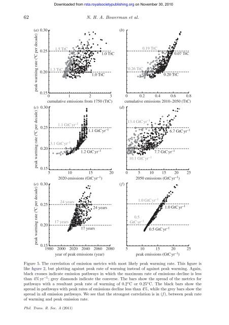
- Page 61 and 62: 54 N. H. A. Bowerman et al. rates o
- Page 63 and 64: 56 N. H. A. Bowerman et al. (a) pea
- Page 65 and 66: 58 N. H. A. Bowerman et al. We can
- Page 67: 60 N. H. A. Bowerman et al. (a) rel
- Page 71 and 72: 64 N. H. A. Bowerman et al. 4. Conc
- Page 73 and 74: 66 N. H. A. Bowerman et al. increas
- Page 75 and 76: Downloaded from rsta.royalsocietypu
- Page 77 and 78: emissions (GtC) Review. Global warm
- Page 79 and 80: Review. Global warming reaching 4
- Page 81 and 82: Review. Global warming reaching 4
- Page 83 and 84: global surface warming (°C) 6 5 4
- Page 85 and 86: Review. Global warming reaching 4
- Page 87 and 88: temperature (relative to 1861-1890
- Page 89 and 90: °C above pre-industrial 8 7 6 5 4
- Page 91 and 92: Review. Global warming reaching 4
- Page 93 and 94: Regional temperature and precipitat
- Page 95 and 96: 86 M. G. Sanderson et al. technical
- Page 97 and 98: 88 M. G. Sanderson et al. Table 1.
- Page 99 and 100: 90 M. G. Sanderson et al. (a) 90°
- Page 101 and 102: 92 M. G. Sanderson et al. An area o
- Page 103 and 104: 94 M. G. Sanderson et al. South Ame
- Page 105 and 106: 96 M. G. Sanderson et al. For DJF (
- Page 107 and 108: 98 M. G. Sanderson et al. 12 Betts,
- Page 109 and 110: Downloaded from rsta.royalsocietypu
- Page 111 and 112: Water availability in +2 ◦ C and
- Page 113 and 114: (ii) Water stress index Water avail
- Page 115 and 116: (b) (c) (d) (a) Water availability
- Page 117 and 118: Water availability in +2 ◦ C and
- Page 119 and 120:
(a) number of models, black line nu
- Page 121 and 122:
change in run-off (%) change in run
- Page 123 and 124:
Water availability in +2 ◦ C and
- Page 125 and 126:
Water availability in +2 ◦ C and
- Page 127 and 128:
Agriculture and food systems in sub
- Page 129 and 130:
118 P. K. Thornton et al. 1. Introd
- Page 131 and 132:
120 P. K. Thornton et al. increases
- Page 133 and 134:
122 P. K. Thornton et al. Table 1.
- Page 135 and 136:
124 P. K. Thornton et al. century.
- Page 137 and 138:
126 P. K. Thornton et al. and polit
- Page 139 and 140:
128 P. K. Thornton et al. — The r
- Page 141 and 142:
130 P. K. Thornton et al. keepers i
- Page 143 and 144:
132 P. K. Thornton et al. 3 Frayne,
- Page 145 and 146:
134 P. K. Thornton et al. 41 Erikse
- Page 147 and 148:
136 P. K. Thornton et al. 83 Challi
- Page 149 and 150:
Downloaded from rsta.royalsocietypu
- Page 151 and 152:
Humid tropical forests on a warmer
- Page 153 and 154:
(a) Humid tropical forests on a war
- Page 155 and 156:
Humid tropical forests on a warmer
- Page 157 and 158:
Humid tropical forests on a warmer
- Page 159 and 160:
Humid tropical forests on a warmer
- Page 161 and 162:
0 retraction risk 17 120 80 40 (a)
- Page 163 and 164:
Humid tropical forests on a warmer
- Page 165 and 166:
0 retraction risk 17 120 80 40 0
- Page 167 and 168:
Humid tropical forests on a warmer
- Page 169 and 170:
Humid tropical forests on a warmer
- Page 171 and 172:
Humid tropical forests on a warmer
- Page 173 and 174:
Sea-level rise and its possible imp
- Page 175 and 176:
162 R. J. Nicholls et al. expected.
- Page 177 and 178:
164 R. J. Nicholls et al. sea-level
- Page 179 and 180:
166 R. J. Nicholls et al. mean temp
- Page 181 and 182:
168 R. J. Nicholls et al. interglac
- Page 183 and 184:
170 R. J. Nicholls et al. discussed
- Page 185 and 186:
172 R. J. Nicholls et al. land loss
- Page 187 and 188:
174 R. J. Nicholls et al. global ad
- Page 189 and 190:
176 R. J. Nicholls et al. Hence, th
- Page 191 and 192:
178 R. J. Nicholls et al. to climat
- Page 193 and 194:
180 R. J. Nicholls et al. 43 Pardae
- Page 195 and 196:
Climate-induced population displace
- Page 197 and 198:
Climate-induced population displace
- Page 199 and 200:
Climate-induced population displace
- Page 201 and 202:
Climate-induced population displace
- Page 203 and 204:
Climate-induced population displace
- Page 205 and 206:
Climate-induced population displace
- Page 207 and 208:
Climate-induced population displace
- Page 209 and 210:
Climate-induced population displace
- Page 211 and 212:
Downloaded from rsta.royalsocietypu
- Page 213 and 214:
198 M. Stafford Smith et al. the di
- Page 215 and 216:
200 M. Stafford Smith et al. greate
- Page 217 and 218:
202 M. Stafford Smith et al. Table
- Page 219 and 220:
204 M. Stafford Smith et al. (c) Go
- Page 221 and 222:
206 M. Stafford Smith et al. mean g
- Page 223 and 224:
208 M. Stafford Smith et al. These
- Page 225 and 226:
210 M. Stafford Smith et al. consid
- Page 227 and 228:
212 M. Stafford Smith et al. — De
- Page 229 and 230:
214 M. Stafford Smith et al. 12 Lem
- Page 231 and 232:
216 M. Stafford Smith et al. 51 Ste
- Page 233 and 234:
REVIEW Phil. Trans. R. Soc. A (2011
- Page 235 and 236:
Review. Interactions in a 4 ◦ C w
- Page 237 and 238:
Review. Interactions in a 4 ◦ C w
- Page 239 and 240:
spread in mosquitoborne disease may
- Page 241 and 242:
[89,94,95] further acidification by
- Page 243 and 244:
Review. Interactions in a 4 ◦ C w
- Page 245 and 246:
Review. Interactions in a 4 ◦ C w
- Page 247 and 248:
Review. Interactions in a 4 ◦ C w
- Page 249 and 250:
Review. Interactions in a 4 ◦ C w
- Page 251 and 252:
Review. Interactions in a 4 ◦ C w
- Page 253 and 254:
Review. Interactions in a 4 ◦ C w
- Page 255 and 256:
Review. Interactions in a 4 ◦ C w
- Page 257 and 258:
Review. Interactions in a 4 ◦ C w
- Page 259:
Editorial Editorial 3 D. Garner Pre