MOAC_Powerpoint_2016

You also want an ePaper? Increase the reach of your titles
YUMPU automatically turns print PDFs into web optimized ePapers that Google loves.
112<br />
Lesson 6<br />
BUILDING CHARTS<br />
Charts are visual representations of numerical data. Chart features such as columns, bars, lines,<br />
or pie slices make it easy to understand trends or compare values. Once you have created a chart in<br />
PowerPoint, you can easily modify the data on which the chart is based, choose a different type of<br />
chart to display the data, change the layout of the chart, and modify its formats.<br />
Inserting a Chart from a Content Placeholder<br />
Excel opens when you create a chart in PowerPoint and you enter the data in Excel that you<br />
want to plot on the chart. Then when you return to PowerPoint, the chart appears with the<br />
data presented. As with tables and other objects, such as diagrams and pictures, the easiest<br />
way to insert a chart is to click the Insert Chart icon in any content placeholder. PowerPoint<br />
guides you the rest of the way to complete the chart. In the following exercise, you will place<br />
a chart on a slide using a content placeholder.<br />
STEP BY STEP<br />
Insert a Chart<br />
GET READY. Before you begin these steps, make sure that your computer is on. Sign on, if<br />
necessary.<br />
1. START PowerPoint, if the program is not already running.<br />
2. OPEN the Revenues presentation from the data files for this lesson and then SAVE it as<br />
Revenues Final.<br />
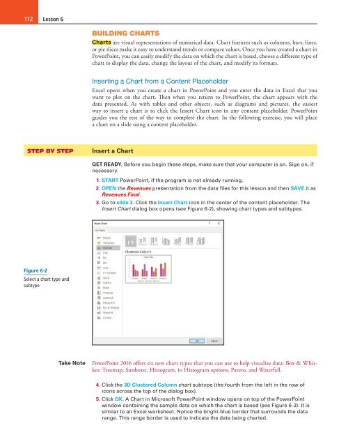
3. Go to slide 3. Click the Insert Chart icon in the center of the content placeholder. The<br />
Insert Chart dialog box opens (see Figure 6-2), showing chart types and subtypes.<br />
Figure 6-2<br />
Select a chart type and<br />
subtype<br />
Take Note<br />
PowerPoint <strong>2016</strong> offers six new chart types that you can use to help visualize data: Box & Whisker,<br />
Treemap, Sunburst, Histogram, in Histogram options, Pareto, and Waterfall.<br />
4. Click the 3D Clustered Column chart subtype (the fourth from the left in the row of<br />
icons across the top of the dialog box).<br />
5. Click OK. A Chart in Microsoft PowerPoint window opens on top of the PowerPoint<br />
window containing the sample data on which the chart is based (see Figure 6-3). It is<br />
similar to an Excel worksheet. Notice the bright-blue border that surrounds the data<br />
range. This range border is used to indicate the data being charted.