Alberto Risueño Pérez - Gredos - Universidad de Salamanca
Alberto Risueño Pérez - Gredos - Universidad de Salamanca
Alberto Risueño Pérez - Gredos - Universidad de Salamanca

Create successful ePaper yourself
Turn your PDF publications into a flip-book with our unique Google optimized e-Paper software.
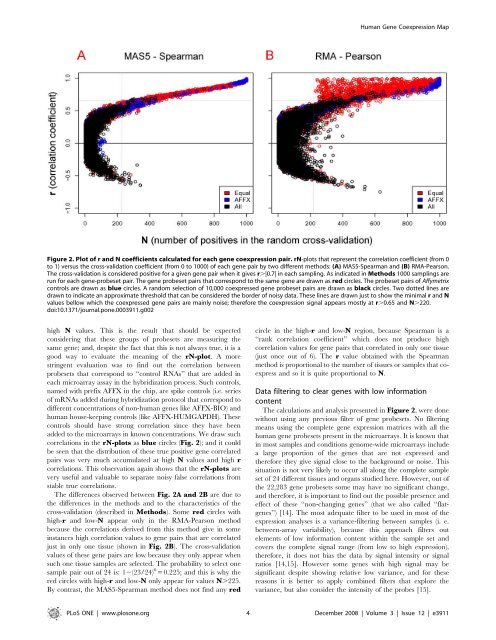
high N values. This is the result that should be expected<br />
consi<strong>de</strong>ring that these groups of probesets are measuring the<br />
same gene; and, <strong>de</strong>spite the fact that this is not always true, it is a<br />
good way to evaluate the meaning of the rN-plot. A more<br />
stringent evaluation was to find out the correlation between<br />
probesets that correspond to ‘‘control RNAs’’ that are ad<strong>de</strong>d in<br />
each microarray assay in the hybridization process. Such controls,<br />
named with prefix AFFX in the chip, are spike controls (i.e. series<br />
of mRNAs ad<strong>de</strong>d during hybridization protocol that correspond to<br />
different concentrations of non-human genes like AFFX-BIO) and<br />
human house-keeping controls (like AFFX-HUMGAPDH). These<br />
controls should have strong correlation since they have been<br />
ad<strong>de</strong>d to the microarrays in known concentrations. We draw such<br />
correlations in the rN-plots as blue circles (Fig. 2); and it could<br />
be seen that the distribution of these true positive gene correlated<br />
pairs was very much accumulated at high N values and high r<br />
correlations. This observation again shows that the rN-plots are<br />
very useful and valuable to separate noisy false correlations from<br />
stable true correlations.<br />
The differences observed between Fig. 2A and 2B are due to<br />
the differences in the methods and to the characteristics of the<br />
cross-validation (<strong>de</strong>scribed in Methods). Some red circles with<br />
high-r and low-N appear only in the RMA-Pearson method<br />
because the correlations <strong>de</strong>rived from this method give in some<br />
instances high correlation values to gene pairs that are correlated<br />
just in only one tissue (shown in Fig. 2B). The cross-validation<br />
values of these gene pairs are low because they only appear when<br />
such one tissue samples are selected. The probability to select one<br />
sample pair out of 24 is: 12(23/24) 6 = 0.225; and this is why the<br />
red circles with high-r and low-N only appear for values N.225.<br />
By contrast, the MAS5-Spearman method does not find any red<br />
Human Gene Coexpression Map<br />
Figure 2. Plot of r and N coefficients calculated for each gene coexpression pair. rN-plots that represent the correlation coefficient (from 0<br />
to 1) versus the cross-validation coefficient (from 0 to 1000) of each gene pair by two different methods: (A) MAS5-Spearman and (B) RMA-Pearson.<br />
The cross-validation is consi<strong>de</strong>red positive for a given gene pair when it gives r.|0.7| in each sampling. As indicated in Methods 1000 samplings are<br />
run for each gene-probeset pair. The gene probeset pairs that correspond to the same gene are drawn as red circles. The probeset pairs of Affymetrix<br />
controls are drawn as blue circles. A random selection of 10,000 coexpressed gene probeset pairs are drawn as black circles. Two dotted lines are<br />
drawn to indicate an approximate threshold that can be consi<strong>de</strong>red the bor<strong>de</strong>r of noisy data. These lines are drawn just to show the minimal r and N<br />
values bellow which the coexpressed gene pairs are mainly noise; therefore the coexpression signal appears mostly at r.0.65 and N.220.<br />
doi:10.1371/journal.pone.0003911.g002<br />
circle in the high-r and low-N region, because Spearman is a<br />
‘‘rank correlation coefficient’’ which does not produce high<br />
correlation values for gene pairs that correlated in only one tissue<br />
(just once out of 6). The r value obtained with the Spearman<br />
method is proportional to the number of tissues or samples that coexpress<br />
and so it is quite proportional to N.<br />
Data filtering to clear genes with low information<br />
content<br />
The calculations and analysis presented in Figure 2, were done<br />
without using any previous filter of gene probesets. No filtering<br />
means using the complete gene expression matrices with all the<br />
human gene probesets present in the microarrays. It is known that<br />
in most samples and conditions genome-wi<strong>de</strong> microarrays inclu<strong>de</strong><br />
a large proportion of the genes that are not expressed and<br />
therefore they give signal close to the background or noise. This<br />
situation is not very likely to occur all along the complete sample<br />
set of 24 different tissues and organs studied here. However, out of<br />
the 22,283 gene probesets some may have no significant change,<br />
and therefore, it is important to find out the possible presence and<br />
effect of these ‘‘non-changing genes’’ (that we also called ‘‘flatgenes’’)<br />
[14]. The most a<strong>de</strong>quate filter to be used in most of the<br />
expression analyses is a variance-filtering between samples (i. e.<br />
between-array variability), because this approach filters out<br />
elements of low information content within the sample set and<br />
covers the complete signal range (from low to high expression),<br />
therefore, it does not bias the data by signal intensity or signal<br />
ratios [14,15]. However some genes with high signal may be<br />
significant <strong>de</strong>spite showing relative low variance, and for these<br />
reasons it is better to apply combined filters that explore the<br />
variance, but also consi<strong>de</strong>r the intensity of the probes [15].<br />
PLoS ONE | www.plosone.org 4 December 2008 | Volume 3 | Issue 12 | e3911