- Page 1 and 2:
Proceedings of the 5th European Con
- Page 3 and 4:
Contents Paper Title Author(s) Page
- Page 5 and 6:
Paper Title Author(s) Page No. Cont
- Page 7 and 8:
Preface The 5th European Conference
- Page 9 and 10:
Dr Jorge Ricardo da Costa Ferreira
- Page 11 and 12:
LSE while working at the British St
- Page 13 and 14:
Minna Isomursu, PhD, is a research
- Page 15 and 16:
Elmarie Papageorgiou is a Senior Le
- Page 17 and 18:
Information and Knowledge Managemen
- Page 19 and 20:
João Agrela et al. So modeling bec
- Page 21 and 22:
João Agrela et al. ETRS 89 project
- Page 23 and 24:
João Agrela et al. (accidents) tha
- Page 25 and 26:
Figure 8: Final model João Agrela
- Page 27 and 28:
João Agrela et al. outputs and res
- Page 29 and 30:
System Integration Model Based on O
- Page 31 and 32:
Kamsuriah Ahmad, Azwan Mohamed and
- Page 33 and 34:
Kamsuriah Ahmad, Azwan Mohamed and
- Page 35 and 36:
Building Virtual Communities on top
- Page 37 and 38:
Cuneyt Gurcan Akcora, Barbara Carmi
- Page 39 and 40:
Cuneyt Gurcan Akcora, Barbara Carmi
- Page 41 and 42:
Cuneyt Gurcan Akcora, Barbara Carmi
- Page 43 and 44:
References Cuneyt Gurcan Akcora, Ba
- Page 45 and 46:
Karen Anderson, Göran Samuelsson a
- Page 47 and 48:
Karen Anderson, Göran Samuelsson a
- Page 49 and 50:
Karen Anderson, Göran Samuelsson a
- Page 51 and 52:
Karen Anderson, Göran Samuelsson a
- Page 53 and 54:
Developing a Model for Assessing IT
- Page 55 and 56:
Mohammad Abooyee Ardakan et al. Fig
- Page 57 and 58:
Mohammad Abooyee Ardakan et al. cor
- Page 59 and 60:
Investigating the Relationship of M
- Page 61 and 62:
Mohammad Abooyee Ardakan, Babak Soh
- Page 63 and 64:
Mohammad Abooyee Ardakan, Babak Soh
- Page 65 and 66:
Mohammad Abooyee Ardakan, Babak Soh
- Page 67 and 68:
Table 3: Goodness of fit indices Mo
- Page 69 and 70:
Evaluation of ICT Investment in Hea
- Page 71 and 72:
Figure 1: Search strategy for syste
- Page 73 and 74:
A. Arviansyah, Egon Berghout and Ch
- Page 75 and 76:
Managerial A. Arviansyah, Egon Berg
- Page 77 and 78:
A. Arviansyah, Egon Berghout and Ch
- Page 79 and 80:
A. Arviansyah, Egon Berghout and Ch
- Page 81 and 82:
The Uses of Business Outcomes for I
- Page 83 and 84:
Dawit Asmelash Measurability of th
- Page 85 and 86:
Dawit Asmelash affected business pr
- Page 87 and 88:
Business Units HR Sales Step 2 Iden
- Page 89 and 90:
Dawit Asmelash In this case, at thi
- Page 91 and 92:
Data Governance in Practice: The SM
- Page 93 and 94:
Carolyn Begg and Tom Caira Our rese
- Page 95 and 96:
Carolyn Begg and Tom Caira In the f
- Page 97 and 98:
Carolyn Begg and Tom Caira Decision
- Page 99 and 100:
Carolyn Begg and Tom Caira SMEs nee
- Page 101 and 102:
Fergal Carton et al. The language u
- Page 103 and 104:
Fergal Carton et al. 2008) to abstr
- Page 105 and 106:
Payment integration (payment produc
- Page 107 and 108:
Fergal Carton et al. Kim,C., Mirsob
- Page 109 and 110:
Walter Castelnovo devised for, have
- Page 111 and 112:
Walter Castelnovo the potential ris
- Page 113 and 114:
Walter Castelnovo allow the informa
- Page 115 and 116:
Walter Castelnovo Risk assessment,
- Page 117 and 118:
Embedding Human Values Into Informa
- Page 119 and 120:
Sunil Choenni, Peter van Waart and
- Page 121 and 122:
Sunil Choenni, Peter van Waart and
- Page 123 and 124:
Sunil Choenni, Peter van Waart and
- Page 125 and 126:
Evaluating the Role and Potential o
- Page 127 and 128:
Renata Paola Dameri For these reaso
- Page 129 and 130:
Final assessment and evaluation. Re
- Page 131 and 132:
Renata Paola Dameri STRATEGIC GOALS
- Page 133 and 134:
Renata Paola Dameri To clearly com
- Page 135 and 136:
ICT and PA: A Marriage Made in Heav
- Page 137 and 138:
Maria Concetta De Vivo, Alberto Pol
- Page 139 and 140:
Maria Concetta De Vivo, Alberto Pol
- Page 141 and 142:
Maria Concetta De Vivo, Alberto Pol
- Page 143 and 144:
Jan Devos, Hendrik Van Landeghem an
- Page 145 and 146:
Jan Devos, Hendrik Van Landeghem an
- Page 147 and 148:
Jan Devos, Hendrik Van Landeghem an
- Page 149 and 150:
References Jan Devos, Hendrik Van L
- Page 151 and 152:
Luciana Duranti and Adam Jansen Dig
- Page 153 and 154:
Luciana Duranti and Adam Jansen A
- Page 155 and 156:
References Luciana Duranti and Adam
- Page 157 and 158:
Kate Dymoke-Bradshaw and Ann Brown
- Page 159 and 160:
Kate Dymoke-Bradshaw and Ann Brown
- Page 161 and 162:
Kate Dymoke-Bradshaw and Ann Brown
- Page 163 and 164:
Kate Dymoke-Bradshaw and Ann Brown
- Page 165 and 166:
Graham Fletcher and Marie Cahillane
- Page 167 and 168:
Graham Fletcher and Marie Cahillane
- Page 169 and 170:
Graham Fletcher and Marie Cahillane
- Page 171 and 172:
Graham Fletcher and Marie Cahillane
- Page 173 and 174:
How Open Source Software Products:
- Page 175 and 176:
Chiara Friso, Valentina Lenarduzzi,
- Page 177 and 178:
Chiara Friso, Valentina Lenarduzzi,
- Page 179 and 180:
Il giornale elettronico (Trivella,
- Page 181 and 182:
Chiara Friso, Valentina Lenarduzzi,
- Page 183 and 184:
Yuwanuch Gulatee and Barbara Combes
- Page 185 and 186:
Table 1: Wholly online participants
- Page 187 and 188:
Yuwanuch Gulatee and Barbara Combes
- Page 189 and 190:
Yuwanuch Gulatee and Barbara Combes
- Page 191 and 192:
Florian Hamel, Thomas Ph. Herz, Fal
- Page 193 and 194:
Florian Hamel, Thomas Ph. Herz, Fal
- Page 195 and 196:
Florian Hamel, Thomas Ph. Herz, Fal
- Page 197 and 198:
Florian Hamel, Thomas Ph. Herz, Fal
- Page 199 and 200:
Martin Hill, John Salt and Graham F
- Page 201 and 202:
Martin Hill, John Salt and Graham F
- Page 203 and 204:
Martin Hill, John Salt and Graham F
- Page 205 and 206:
Transforming Information to Knowled
- Page 207 and 208:
Vered Holzmann and Ben Holzmann Tot
- Page 209 and 210:
Vered Holzmann and Ben Holzmann kno
- Page 211 and 212:
Vered Holzmann and Ben Holzmann Prz
- Page 213 and 214:
Grant Howard and Sam Lubbe High-lev
- Page 215 and 216:
3. Theoretical discussion 3.1 Green
- Page 217 and 218:
Grant Howard and Sam Lubbe 3.6 Envi
- Page 219 and 220:
Grant Howard and Sam Lubbe Easterbr
- Page 221 and 222:
Evaluating ICT Based Services for O
- Page 223 and 224:
Minna Isomursu and Marja Harjumaa t
- Page 225 and 226:
4.2 Challenges with research method
- Page 227 and 228:
Minna Isomursu and Marja Harjumaa b
- Page 229 and 230:
The Geography of Criminality - Info
- Page 231 and 232:
Intelligence Paulo João, Jorge Fer
- Page 233 and 234:
4.1 Crime hot-spots Paulo João, Jo
- Page 235 and 236:
Paulo João, Jorge Ferreira and Jos
- Page 237 and 238:
Paulo João, Jorge Ferreira and Jos
- Page 239 and 240:
Paulo João, Jorge Ferreira and Jos
- Page 241 and 242:
Mobile Virtual Network Operator Inf
- Page 243 and 244:
Hallur Leivsgarð Joensen and Torbe
- Page 245 and 246:
Hallur Leivsgarð Joensen and Torbe
- Page 247 and 248:
Hallur Leivsgarð Joensen and Torbe
- Page 249 and 250:
Hallur Leivsgarð Joensen and Torbe
- Page 251 and 252:
Björn Johansson and Linda Bergkvis
- Page 253 and 254:
Björn Johansson and Linda Bergkvis
- Page 255 and 256:
Björn Johansson and Linda Bergkvis
- Page 257 and 258:
Björn Johansson and Linda Bergkvis
- Page 259 and 260:
A Fair Partnership Model by Sharing
- Page 261 and 262:
Ghassan Kbar 2. Partnership and VC
- Page 263 and 264:
Ghassan Kbar Entering state of the
- Page 265 and 266:
Ghassan Kbar Saudi-chamber, (2011)
- Page 267 and 268:
Ghassan Kbar and Abdul Aziz AlDusar
- Page 269 and 270:
Ghassan Kbar and Abdul Aziz AlDusar
- Page 271 and 272:
Ghassan Kbar and Abdul Aziz AlDusar
- Page 273 and 274:
Ghassan Kbar and Abdul Aziz AlDusar
- Page 275 and 276:
Dong-Hyun Kim and Hyun-Joo Kim We i
- Page 277 and 278:
Dong-Hyun Kim and Hyun-Joo Kim As a
- Page 279 and 280:
Dong-Hyun Kim and Hyun-Joo Kim We m
- Page 281 and 282:
Erdem Kirkbesoglu and Gizem Ogutcu
- Page 283 and 284:
Erdem Kirkbesoglu and Gizem Ogutcu
- Page 285 and 286:
Erdem Kirkbesoglu and Gizem Ogutcu
- Page 287 and 288:
Portfolio Management in Non-Profit
- Page 289 and 290:
Bert Kleersnijder and Egon Berghout
- Page 291 and 292:
Bert Kleersnijder and Egon Berghout
- Page 293 and 294:
Bert Kleersnijder and Egon Berghout
- Page 295 and 296:
Why is an IS Project Late? - A Case
- Page 297 and 298:
2. The project 2.1 Background and r
- Page 299 and 300:
Juha Kontio Phase In stallation Ope
- Page 301 and 302:
Table 2: Identified reason of the p
- Page 303 and 304:
Juha Kontio There are also reasons
- Page 305 and 306:
2. Performance review model for NDP
- Page 307 and 308:
Misoo Kwon Among the review indicat
- Page 309 and 310:
Type Average time saved Misoo Kwon
- Page 311 and 312:
Luigi Lavazza In conclusion, when a
- Page 313 and 314:
Luigi Lavazza The former can be de
- Page 315 and 316:
Luigi Lavazza For each process, we
- Page 317 and 318:
6. Conclusions Luigi Lavazza When e
- Page 319 and 320:
eBusiness Model Design and Evaluati
- Page 321 and 322:
Monika Magnusson categories of busi
- Page 323 and 324:
Monika Magnusson Business Model Ele
- Page 325 and 326:
5.2 Guiding questions Monika Magnus
- Page 327 and 328:
Monika Magnusson Hay, M. and Kamsha
- Page 329 and 330:
Monika Magnusson and Marie-Therese
- Page 331 and 332:
Monika Magnusson and Marie-Therese
- Page 333 and 334:
4.3 Goals at the project level Moni
- Page 335 and 336:
Monika Magnusson and Marie-Therese
- Page 337 and 338:
Alignment in Enterprise Architectur
- Page 339 and 340:
Thanos Magoulas, Aida Hadzic, Ted S
- Page 341 and 342:
Thanos Magoulas, Aida Hadzic, Ted S
- Page 343 and 344:
3.4 Infological alignment Thanos Ma
- Page 345 and 346:
Thanos Magoulas, Aida Hadzic, Ted S
- Page 347 and 348:
Thanos Magoulas, Aida Hadzic, Ted S
- Page 349 and 350:
Panagiotis Manolitzas et al. to Gov
- Page 351 and 352:
Panagiotis Manolitzas et al. Anothe
- Page 353 and 354:
Table 1: Criteria weights and satis
- Page 355 and 356:
Panagiotis Manolitzas et al. Satisf
- Page 357 and 358:
Understanding the Impact of Knowled
- Page 359 and 360:
Magdeline Mashilo and Tiko Iyamu Ac
- Page 361 and 362:
Magdeline Mashilo and Tiko Iyamu Cu
- Page 363 and 364:
Magdeline Mashilo and Tiko Iyamu Th
- Page 365 and 366:
Magdeline Mashilo and Tiko Iyamu Ho
- Page 367 and 368:
2. Literature review 2.1 The Batik
- Page 369 and 370:
Nor Laila Md Noor and Ariza Nordin
- Page 371 and 372:
Nor Laila Md Noor and Ariza Nordin
- Page 373 and 374:
Isolated Strategies Nor Laila Md No
- Page 375 and 376:
HOT-fit Evaluation Framework: Valid
- Page 377 and 378:
Maryati Mohd Yusof In order to vali
- Page 379 and 380:
Maryati Mohd Yusof Further framewor
- Page 381 and 382:
Maryati Mohd Yusof Kaplan, B., and
- Page 383 and 384:
Gunilla Myreteg social context (Orl
- Page 385 and 386:
Gunilla Myreteg needed routine. Ano
- Page 387 and 388:
Gunilla Myreteg used, which in turn
- Page 389 and 390:
Environmental Scanning Practice of
- Page 391 and 392:
Roslina Othman and Siti Rohimi Hame
- Page 393 and 394:
Roslina Othman and Siti Rohimi Hame
- Page 395 and 396:
Roslina Othman and Siti Rohimi Hame
- Page 397 and 398:
5. Conclusion Roslina Othman and Si
- Page 399 and 400:
Understanding Financial and non-Fin
- Page 401 and 402:
Elmarie Papageorgiou and Herman de
- Page 403 and 404:
Elmarie Papageorgiou and Herman de
- Page 405 and 406:
Elmarie Papageorgiou and Herman de
- Page 407 and 408:
Type of non-financial information a
- Page 409 and 410:
Elmarie Papageorgiou and Herman de
- Page 411 and 412:
Shabnam Pasandide, Abbas Toloie Esh
- Page 413 and 414:
Shabnam Pasandide, Abbas Toloie Esh
- Page 415 and 416:
Shabnam Pasandide, Abbas Toloie Esh
- Page 417 and 418:
Shabnam Pasandide, Abbas Toloie Esh
- Page 419 and 420:
Can eGovernment Systems Bridge the
- Page 421 and 422:
Higher quality of services Elias Pi
- Page 423 and 424:
Elias Pimenidis, Lazaros Iliadis, a
- Page 425 and 426:
Elias Pimenidis, Lazaros Iliadis, a
- Page 427 and 428:
Contributions to the Measurement an
- Page 429 and 430:
Rui Alexandre Pires and Maria do C
- Page 431 and 432:
Rui Alexandre Pires and Maria do C
- Page 433 and 434:
assessment Rui Alexandre Pires and
- Page 435 and 436:
Rui Alexandre Pires and Maria do C
- Page 437 and 438:
Rozilawati Razali and Mahamsiatus K
- Page 439 and 440:
Figure 1: Research design 3.2 Phase
- Page 441 and 442:
Rozilawati Razali and Mahamsiatus K
- Page 443 and 444:
Rozilawati Razali and Mahamsiatus K
- Page 445 and 446:
David Sammon, Tadhg Nagle and John
- Page 447 and 448:
David Sammon, Tadhg Nagle and John
- Page 449 and 450:
David Sammon, Tadhg Nagle and John
- Page 451 and 452:
David Sammon, Tadhg Nagle and John
- Page 453 and 454:
Teresa Santos, Ségio Freire and Jo
- Page 455 and 456:
Teresa Santos, Ségio Freire and Jo
- Page 457 and 458:
Teresa Santos, Ségio Freire and Jo
- Page 459 and 460:
Reflections on the Role of the Lect
- Page 461 and 462:
3. Reflective practice Elsje Scott,
- Page 463 and 464:
Elsje Scott, Peter Weimann and Nata
- Page 465 and 466:
Elsje Scott, Peter Weimann and Nata
- Page 467 and 468:
Elsje Scott, Peter Weimann and Nata
- Page 469 and 470:
Elena Serova traditional ERP manage
- Page 471 and 472:
Elena Serova Increase in percentag
- Page 473 and 474:
9. Conclusion Elena Serova At prese
- Page 475 and 476:
Sharina Tajul Urus, Alemayehu Molla
- Page 477 and 478:
4.2 Description of feral systems Sh
- Page 479 and 480:
Sharina Tajul Urus, Alemayehu Molla
- Page 481 and 482:
Type Sharina Tajul Urus, Alemayehu
- Page 483 and 484:
Open Source Disease Control Softwar
- Page 485 and 486:
Jose Teixeira and Reima Suomi do no
- Page 487 and 488:
Jose Teixeira and Reima Suomi from
- Page 489 and 490:
Jose Teixeira and Reima Suomi Futur
- Page 491 and 492:
Value of Knowledge Management Syste
- Page 493 and 494:
Nelly Todorova Human capital repres
- Page 495 and 496:
Nelly Todorova IT value from pure f
- Page 497 and 498:
Nelly Todorova unique and inimitabl
- Page 499 and 500:
Accountability and the Reconstructi
- Page 501 and 502:
Geert-Jan van Bussel cluding the pr
- Page 503 and 504:
Geert-Jan van Bussel (e.g., Wijnhov
- Page 505 and 506:
Geert-Jan van Bussel complementary,
- Page 507 and 508:
The Question of Selecting Appropria
- Page 509 and 510: Bartosz Wachnik We can discern two
- Page 511 and 512: Bartosz Wachnik Table 1: Criteria o
- Page 513 and 514: Tasks in an ERP implementation proj
- Page 515 and 516: Bartosz Wachnik Tests’ recapitul
- Page 517 and 518: PhD Research Papers 501
- Page 519 and 520: Information Systems for Production
- Page 521 and 522: Denisa Ferenčíková 3. Correctly
- Page 523 and 524: Denisa Ferenčíková method requir
- Page 525 and 526: Denisa Ferenčíková mentioned typ
- Page 527 and 528: 1.2 Service oriented architecture A
- Page 529 and 530: Antonio Hidalgo Landa, Ian Owens an
- Page 531 and 532: Antonio Hidalgo Landa, Ian Owens an
- Page 533 and 534: Antonio Hidalgo Landa, Ian Owens an
- Page 535 and 536: Antonio Hidalgo Landa, Ian Owens an
- Page 537 and 538: Hesbon Nyagowa, Dennis Ocholla and
- Page 539 and 540: Hesbon Nyagowa, Dennis Ocholla and
- Page 541 and 542: Hesbon Nyagowa, Dennis Ocholla and
- Page 543 and 544: Hesbon Nyagowa, Dennis Ocholla and
- Page 545 and 546: Hesbon Nyagowa, Dennis Ocholla and
- Page 547 and 548: The Specification of Competency Que
- Page 549 and 550: Yadary Ortega-González et al. Figu
- Page 551 and 552: Yadary Ortega-González et al. merg
- Page 553 and 554: Yadary Ortega-González et al. Comp
- Page 555 and 556: Yadary Ortega-González et al. Lysa
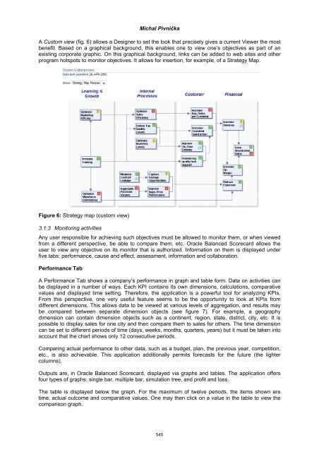
- Page 557 and 558: Michal Pivnička to (Collis 2008),
- Page 559: Figure 2: List of scorecards window
- Page 563 and 564: Michal Pivnička necessary calculat
- Page 565 and 566: Michal Pivnička combines two or mo
- Page 567 and 568: Michal Pivnička When any informati
- Page 569 and 570: Challenges in Business Case Develop
- Page 571 and 572: Bart-Jan van Putten, Franziska Brec
- Page 573 and 574: Bart-Jan van Putten, Franziska Brec
- Page 575 and 576: Bart-Jan van Putten, Franziska Brec
- Page 577 and 578: Bart-Jan van Putten, Franziska Brec
- Page 579 and 580: Bart-Jan van Putten and Markus Schi
- Page 581 and 582: Bart-Jan van Putten and Markus Schi
- Page 583 and 584: Bart-Jan van Putten and Markus Schi
- Page 585 and 586: Bart-Jan van Putten and Markus Schi
- Page 587 and 588: Mohamad Norzamani Sahroni and Marya
- Page 589 and 590: Table 1: Type of medical error Moha
- Page 591 and 592: Mohamad Norzamani Sahroni and Marya
- Page 593 and 594: Non Academic Papers 577
- Page 595 and 596: Management of Waiting List for Surg
- Page 597 and 598: Rita Cristóvão and Pedro Gomes In
- Page 599 and 600: Figure 4: Circuit of the patient in
- Page 601 and 602: Rita Cristóvão and Pedro Gomes Fi
- Page 603 and 604: Rita Cristóvão and Pedro Gomes ne
- Page 605 and 606: Rita Cristóvão and Pedro Gomes Fi
- Page 607 and 608: Rita Cristóvão and Pedro Gomes T
- Page 609 and 610: Work in Progress Papers with Poster
- Page 611 and 612:
Information Management Enabling Col
- Page 613 and 614:
Maria Bergenstjerna Data will be co
- Page 615 and 616:
2. Methodology Giovanni Camponovo R
- Page 617 and 618:
Giovanni Camponovo separate concept
- Page 619 and 620:
Giovanni Camponovo A graphical summ
- Page 621 and 622:
Giovanni Camponovo 3.5 Motivations
- Page 623 and 624:
Giovanni Camponovo Butler, B., Spro
- Page 625 and 626:
An Enterprise Ontology Approach for
- Page 627 and 628:
Bernardo Gomes, André Vasconcelos
- Page 629 and 630:
Bernardo Gomes, André Vasconcelos
- Page 631 and 632:
Bernardo Gomes, André Vasconcelos
- Page 633 and 634:
Soudabeh Khodambashi and Maryati Mo
- Page 635 and 636:
National ICT Strategy and its Imple
- Page 637 and 638:
Ermelinda Kordha and As. Kozeta Sev
- Page 639 and 640:
João Soares, José Tribolet and An
- Page 641:
João Soares, José Tribolet and An