- Page 1 and 2:
Standards& Guidelines e GE Identity
- Page 3 and 4:
Basic Standards e GE Identity Progr
- Page 5 and 6:
To: GE Identity Program participant
- Page 7 and 8:
What is the GE Identity Program? 11
- Page 9 and 10:
Who is included in the GE Identity
- Page 11 and 12:
field (which includes outline circl
- Page 13 and 14:
g positive Monogram e reverse Monog
- Page 15 and 16:
Trademark Practices & Protections G
- Page 17 and 18:
Definitions trademark or service ma
- Page 19 and 20:
Design Marks In all applications, u
- Page 21 and 22:
These guidelines apply to affiliate
- Page 23 and 24:
For examples of resellers’ use of
- Page 25 and 26:
Suppliers Suppliers of materials, e
- Page 27 and 28:
Secondary Trademarks & Service Mark
- Page 29 and 30:
g 2nd’ryMarq g 2nd’ryMarq 2nd
- Page 31 and 32:
Select secondary word marks accordi
- Page 33 and 34:
In copy, use secondary word marks a
- Page 35 and 36:
Trade Names, Trademarks, &theGE Ide
- Page 37 and 38:
Appendices, continued Appendix B: C
- Page 39 and 40:
I. Requirements A. General All GE b
- Page 41 and 42:
III. Responsibilities of leaders A.
- Page 43 and 44:
III. Responsibilities of leaders, c
- Page 45 and 46:
III. Responsibilities of leaders, c
- Page 47 and 48:
I. General A. All created or acquir
- Page 49 and 50:
III. Trademarks: Created or acquire
- Page 51 and 52:
I. General II.Trade name A. All joi
- Page 53 and 54:
III. Identification alternatives fo
- Page 55 and 56:
V. Summary of requirements for join
- Page 57 and 58:
II. Third-party license review fact
- Page 59 and 60:
Graphic Signatures g GE Identity Pr
- Page 61 and 62:
Graphic Signature General Guideline
- Page 63 and 64:
Grow your kitchen with Gg Spacemake
- Page 65 and 66:
g g g GE Plastics Spacemaker We bri
- Page 67 and 68:
g g g g g g g GE Transportation Sys
- Page 69 and 70:
g g g GE Typography GE Typography G
- Page 71 and 72:
To construct the primary signature
- Page 73 and 74:
To construct the compact signature
- Page 75 and 76:
To construct the vertical signature
- Page 77 and 78:
Use the special signatures only in
- Page 79 and 80:
Gg Gg Gg Idling with others? Get th
- Page 81 and 82:
ITC New Baskerville Italic ABCDEFGH
- Page 83 and 84:
g g g g Profile We bring good thing
- Page 85 and 86:
g g g g g Signature Typography As s
- Page 87 and 88:
GE Plastics GE PLASTICS We bring go
- Page 89 and 90:
g 2nd’ryMarq g 2nd’ryMarq 2nd
- Page 91 and 92:
Color These guidelines apply to the
- Page 93 and 94:
Laser Red* Platinum Grey* *When mat
- Page 95 and 96:
g g g g We bring good things to lif
- Page 97 and 98:
e e e e Gg We bring good things to
- Page 99 and 100:
e g e g Gg We bring good things to
- Page 101 and 102:
e g Gg We bring good things to life
- Page 103 and 104:
e g Gg e g We bring good things to
- Page 105 and 106:
Typography g GE Identity Program Pr
- Page 107 and 108:
The Univers series of typefaces has
- Page 109 and 110:
The ITC New Baskerville series of t
- Page 111 and 112:
Dynamic Monogram Contents GE Identi
- Page 113 and 114:
When using this version, follow the
- Page 115 and 116:
When using this version, follow the
- Page 117 and 118:
Horizontal Left-Bleeding Dynamic Mo
- Page 119 and 120:
When using any of the bar versions
- Page 121 and 122:
Gg e GE Typography Dynamic Monogram
- Page 123 and 124:
e g GE Typography Dynamic Monogram
- Page 125 and 126:
Application Standards Gg GE Identit
- Page 127 and 128:
Products Contents GE Identity Progr
- Page 129 and 130:
e g 2nd’ryMarq g 2nd’ryMarq 2nd
- Page 131 and 132:
Identification Elements: Primary si
- Page 133 and 134:
Identification Elements: Vertical s
- Page 135 and 136:
Identification Elements: Compact si
- Page 137 and 138:
Identification Elements: Monogram o
- Page 139 and 140:
e Product Examples 210.19 Diesel-El
- Page 141 and 142:
Although the guidelines that apply
- Page 143 and 144:
Packaging g GE Identity Program The
- Page 145 and 146:
g Signature Typography Featured Typ
- Page 147 and 148:
e Supporting Typography Signature T
- Page 149 and 150:
e Signature Typography Featured Typ
- Page 151 and 152:
This example demonstrates the use o
- Page 153 and 154:
g GE Plastics NorylThermoplastic Re
- Page 155 and 156:
e MPI g MPI TM Hand Held 2-Way Radi
- Page 157 and 158:
e Rangr Mobile Radio Rangr Mobile R
- Page 159 and 160:
Packaging outside the U.S.A. Packag
- Page 161 and 162:
Shipping Cases&Cartons g GE Identit
- Page 163 and 164:
g Signature Typography Featured Typ
- Page 165 and 166:
e Supporting Typography Signature T
- Page 167 and 168:
Featured Typography generic product
- Page 169 and 170:
g Refrigerator The examples on this
- Page 171 and 172:
g Silicone Auto Product 12 Tubes pa
- Page 173 and 174:
OEM Shipping Cases & Cartons Origin
- Page 175 and 176:
Advertising g GE Identity Program T
- Page 177 and 178:
The advertising standards consist o
- Page 179 and 180:
2. Use the structure of the adverti
- Page 181 and 182:
Why we take Print Advertising Examp
- Page 183 and 184:
e GE Medical Systems We bring good
- Page 185 and 186:
T 7 0 0 6500 HOURS. In the most dem
- Page 187 and 188:
When the advertising format is narr
- Page 189 and 190:
For headlines and text, any typefac
- Page 191 and 192:
In short headlines, ITC New Baskerv
- Page 193 and 194:
Against colored backgrounds, graphi
- Page 195 and 196:
Laser Red and the minimum 133-line
- Page 197 and 198:
e GE Aircraft Engines We bring good
- Page 199 and 200:
e e e e We bring good things to lif
- Page 201 and 202:
g Yellow Pages Advertising Examples
- Page 203 and 204:
1. 2. 3. 4. 5. 6. GE COMPANY PRODUC
- Page 205 and 206:
Recruitment Advertising g GE Identi
- Page 207 and 208:
Engineers GE is looking for imagina
- Page 209 and 210:
Engineers GE is looking for brillia
- Page 211 and 212:
Engineers GE is looking for imagina
- Page 213 and 214:
Sales Support Professionals Experts
- Page 215 and 216:
Although no two GE recruitment adve
- Page 217 and 218:
Promotional Brochures g GE Identity
- Page 219 and 220:
Use a grid. A grid is an underlying
- Page 221 and 222:
The first step in developing a prom
- Page 223 and 224:
A 4 B 4 g e e CAA GE Center for Adv
- Page 225 and 226:
The examples on pages 08 to 11 demo
- Page 227 and 228:
When multiple photographs or illust
- Page 229 and 230:
This example demonstrates the third
- Page 231 and 232:
e GE Signa The MR Reference Point S
- Page 233 and 234:
e Signature Content: Communicative
- Page 235 and 236:
On the back of promotional brochure
- Page 237 and 238:
Product Literature Contents GE Iden
- Page 239 and 240:
Use color correctly. • In a graph
- Page 241 and 242:
For an explanation of the product l
- Page 243 and 244:
When it is necessary to emphasize,
- Page 245 and 246:
When multiple photographs or illust
- Page 247 and 248:
When developing the inside of produ
- Page 249 and 250:
On the back of product brochures, a
- Page 251 and 252:
When a large number of specificatio
- Page 253 and 254:
Use & Care Guides are developed acc
- Page 255 and 256:
Promotional Materials Contents GE I
- Page 257 and 258:
Poster e e Appliances Sale! Product
- Page 259 and 260:
These guidelines cover a wide range
- Page 261 and 262:
e GE GE Capital Fleet Services Cell
- Page 263 and 264:
When developing novelties to promot
- Page 265 and 266:
• Do not use - group, division, d
- Page 267 and 268:
Exhibits g GE Identity Program The
- Page 269 and 270:
History The GE exhibit program was
- Page 271 and 272:
01 Section 01: Overview Typical Exh
- Page 273 and 274:
01 Section 01: Overview Typical Exh
- Page 275 and 276:
For assistance executing a GE exhib
- Page 277 and 278:
The project scheduling outline at t
- Page 279 and 280:
1. Budget Review 2. Establish annua
- Page 281 and 282:
53. Live Show and Presenters 54. De
- Page 283 and 284:
The GE exhibit program is built on
- Page 285 and 286:
Standard header background colors g
- Page 287 and 288:
03 Zone 1: Brand Identity • Zone
- Page 289 and 290:
g GE Medical Systems 39"x 39" 39"x
- Page 291 and 292:
g Heading on 2 lines: ITC New Baske
- Page 293 and 294:
5m (195") a g GE Aircraft Engines 3
- Page 295 and 296:
Presentations g GE Identity Program
- Page 297 and 298:
Producing a presentation layout is
- Page 299 and 300:
01 Section 01: Introduction Recomme
- Page 301 and 302:
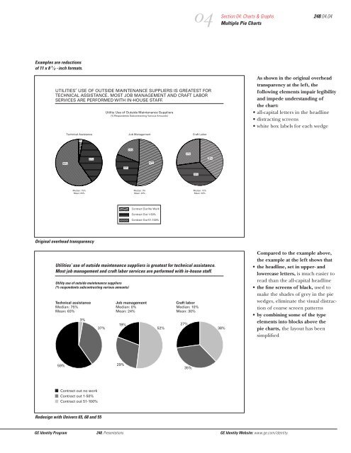
Examples are reductions of 11 x 8 1
- Page 303 and 304:
Examples are reductions of a 4 5
- Page 305 and 306:
Examples are reductions of 11 x 8 1
- Page 307 and 308:
The same basic style for text is us
- Page 309 and 310:
Examples are reductions of 11 x 8 1
- Page 311 and 312:
Examples are reductions of 11 x 8 1
- Page 313 and 314:
Examples are reductions of 11 x 8 1
- Page 315 and 316:
03 Section 03: Headlines, Text, & T
- Page 317 and 318:
Examples are reductions of 11 x 8 1
- Page 319 and 320:
Examples are reductions of 11 x 8 1
- Page 321 and 322:
Examples are reductions of 11 x 8 1
- Page 323 and 324:
Edward Tufte’s book, The Visual D
- Page 325 and 326:
Examples are reductions of 11 x 8 1
- Page 327 and 328:
Examples are reductions of 11 x 8 1
- Page 329 and 330:
Examples are reductions of 11 x 8 1
- Page 331 and 332:
Employee Communications Gg Newslett
- Page 333:
Newsletters Contents GE Identity Pr
- Page 336 and 337:
*For computer artwork, the followin
- Page 338 and 339:
2 HQnews / April 11, 2003 Confessio
- Page 340 and 341:
Justifying narrow columns of text c
- Page 342 and 343:
Employee Identification g GE Identi
- Page 344 and 345:
When designing security badges, fol
- Page 346 and 347:
Stationery for North American Busin
- Page 348 and 349:
g Robert W. Holmes Vice President G
- Page 350 and 351:
A. Address block ——————
- Page 352 and 353:
Employee’s Name & Job Title Subco
- Page 354 and 355:
Business Communicative Name Certifi
- Page 356 and 357:
GE Identity Program 261, Stationery
- Page 358 and 359:
GE Identity Program 261, Stationery
- Page 360 and 361:
GE Identity Program 261, Stationery
- Page 362 and 363:
GE Identity Program 261, Stationery
- Page 364 and 365:
GE Identity Program 261, Stationery
- Page 366 and 367:
GE Identity Program 261, Stationery
- Page 368 and 369:
GE Identity Program 261, Stationery
- Page 370 and 371:
GE Identity Program 261, Stationery
- Page 372 and 373:
GE Identity Program 261, Stationery
- Page 374 and 375:
GE Identity Program 261, Stationery
- Page 376 and 377:
GE Identity Program 261, Stationery
- Page 378 and 379:
GE Identity Program 261, Stationery
- Page 380 and 381:
Stationery for Corporate Staff g GE
- Page 382 and 383:
g Stuart L. Barber Staff Executive
- Page 384 and 385:
General Specifications Too tight An
- Page 386 and 387:
E-mail Address Andrew.Harman@corpor
- Page 388 and 389:
GE Identity Program 262, Stationery
- Page 390 and 391:
GE Identity Program 262, Stationery
- Page 392 and 393:
GE Identity Program 262, Stationery
- Page 394 and 395:
GE Identity Program 262, Stationery
- Page 396 and 397:
Formatting Stationery in North Amer
- Page 398 and 399:
one-third fold line The salutation
- Page 400 and 401:
one-third fold line The salutation
- Page 402 and 403:
Standard Corporate Envelope The add
- Page 404 and 405:
g GE NEWS RELEASE General Electric
- Page 406 and 407:
Stationery for Businesses outside N
- Page 408 and 409:
g Richard A. Eason Research Directo
- Page 410 and 411:
A. Address block ——————
- Page 412 and 413:
Employee’s Name & Job Title Subco
- Page 414 and 415:
Business Communicative Name Certifi
- Page 416 and 417:
GE Identity Program 264, Stationery
- Page 418 and 419:
GE Identity Program 264, Stationery
- Page 420 and 421:
GE Identity Program 264, Stationery
- Page 422 and 423:
GE Identity Program 264, Stationery
- Page 424 and 425:
Formatting Stationery outside North
- Page 426 and 427:
Addressee’s Name Day Month Year P
- Page 428 and 429:
Forms& Checks g GE Identity Program
- Page 430 and 431:
Understanding the requirements of g
- Page 432 and 433:
Predesign Planning Before tackling
- Page 434 and 435:
Vertical format 8 1 ⁄2 "x 11" 8 1
- Page 436 and 437:
Example 1 g Example 2 Example 3 Exa
- Page 438 and 439:
To differentiate and emphasize item
- Page 440 and 441:
Consolidating forms by adapting an
- Page 442 and 443:
If the amount of information to com
- Page 444 and 445:
Forms used by GE’s business partn
- Page 446 and 447:
Rule Weights • To structure infor
- Page 448 and 449:
The Laser Line may bleed left, but
- Page 450 and 451:
Facility Signs Contents GE Identity
- Page 452 and 453:
The pylon sign is a three-faced mon
- Page 454 and 455:
The monument is a single-faced sign
- Page 456 and 457:
The pole sign is a double-faced sig
- Page 458 and 459:
The ground sign is identical to the
- Page 460 and 461:
The cantilever-mounted wall sign is
- Page 462 and 463:
The flush-mounted wall sign is sing
- Page 464 and 465:
A graphic signature may be fabricat
- Page 466 and 467:
The roof sign is a custom-built sig
- Page 468 and 469:
Decals of graphic signatures, the M
- Page 470 and 471:
The standard directional sign provi
- Page 472 and 473:
Vehicles g These standards apply ge
- Page 474 and 475:
Use white as the base color of the
- Page 476 and 477:
Note: See the general guidelines on
- Page 478 and 479:
Note: See the general guidelines on
- Page 480 and 481:
g GE Utility & Industrial Service A
- Page 482 and 483:
g e g Industrial Haulage 290.10 Bec
- Page 484 and 485:
If a tarpaulin is designed to fit a
- Page 486 and 487:
g Shelton, Connecticut GE Supply Sh
- Page 488 and 489:
Component Names g GE Identity Progr
- Page 490 and 491:
As the Company simplifies its organ
- Page 492 and 493:
The Communicative Name “GE” In
- Page 494 and 495:
Summary Standards &Guidelines g GE
- Page 496 and 497:
g Summary of Graphic Signatures GE
- Page 498 and 499:
g GE g Spacemaker g We g Medical Sy
- Page 500 and 501:
Univers 68 ABCDEFGHIJKLMNOPQRSTUVWX
- Page 502 and 503:
g e e e e g Gg Gg Gg Gg e g e e e e
- Page 504 and 505:
g a We bring good things to life. e
- Page 506 and 507:
WE’VE JUST TOPPED THE TOP COOKTOP
- Page 508 and 509:
Grow your kitchen with Gg Spacemake
- Page 510 and 511:
New Businesses Name&Trademark Pract
- Page 512 and 513:
Joint Ventures Name &Trademark Prac
- Page 514 and 515:
e FANUC A good example of the benef
- Page 516 and 517:
e g GE Similar benefits accrued whe
- Page 518 and 519:
Monogram Laser Line Signature Typog
- Page 520 and 521:
Graphic Identifier e FANUC e FANUC
- Page 522 and 523:
Acquisitions Name &Trademark Practi
- Page 524 and 525:
A primary purpose of the GE Identit
- Page 526 and 527:
The acquisitions naming decision tr
- Page 528 and 529:
Note: Before permitting an acquisit
- Page 530 and 531:
Market Considerations & GE Ownershi
- Page 532 and 533:
1 ⁄4 D D 1 ⁄4 D 1 ⁄4 D e Mark
- Page 534 and 535:
Once the • design and layout of t
- Page 536 and 537:
Company applications Company applic
- Page 538 and 539:
Product Literature Advertising g Sp
- Page 540 and 541:
Acquisitions Name & Trademark Pract
- Page 542 and 543:
g GE We bring good things to life.
- Page 544 and 545:
A primary purpose of the GE Identit
- Page 546 and 547:
Note: Before an acquisition may ado
- Page 548 and 549:
Joint Ventures Name & Trademark Pra
- Page 550 and 551:
g GE We bring good things to life.
- Page 552 and 553:
Market Considerations & GE Ownershi
- Page 554 and 555:
1 ⁄4 D D 1 ⁄4 D 1 ⁄4 D e Mark
- Page 556 and 557:
Once the • design and layout of t
- Page 558 and 559:
Company applications Company applic
- Page 560 and 561:
Product Literature Advertising g Sp
- Page 562 and 563:
Licensees Trademark Practices Conte
- Page 564 and 565:
In 1987, GE introduced an identity
- Page 566 and 567:
1. Do not use the GE graphic system
- Page 568 and 569:
Stationery Business forms specific
- Page 570 and 571:
Products Packages Gg Spacemaker Gg
- Page 572 and 573:
Advertising Exhibits re te feugait
- Page 574 and 575:
Dealers& Distributors Trademark &Gr
- Page 576 and 577:
Introduction 360.02 As a GE dealer,
- Page 578 and 579:
In 1987, GE introduced an identity
- Page 580 and 581:
1 ⁄2 D D D D 1 ⁄2 D D g GE Prim
- Page 582 and 583:
Five Basic Rules for Dealers & Dist
- Page 584 and 585:
Five Basic Rules for Dealers & Dist
- Page 586 and 587:
Prova en lada av any ER energi-soar
- Page 588 and 589:
Television and Radio Advertising Gu
- Page 590 and 591:
Gg Lampa Prova! e Authorized Distri
- Page 592 and 593:
e 7 8 * # 0 Authorized Dealer CV 20
- Page 594 and 595:
e Mobile Communications Authorized
- Page 596 and 597:
Weyburn’s Home Appliances Barnsdo
- Page 598 and 599:
g e Correct reproduction Correct re
- Page 600 and 601:
Original Equipment Manufacturer (OE
- Page 602 and 603:
OEM Shipping Cases & Cartons Origin
- Page 604 and 605:
Using the Adobe ® Acrobat ® famil
- Page 606 and 607:
Standard Guidel thumbnail navigatio
- Page 608 and 609:
last page scroll bar dards&. uideli
- Page 610 and 611:
GE Logo Font Contents 382.01 Introd
- Page 612 and 613:
field (which includes the outline c
- Page 614 and 615:
` shift 1 2 q a When the Monogram i
- Page 616 and 617:
` shift 1 2 q a Gg We bring To prod
- Page 618 and 619:
For artwork only. Use these only wh
- Page 620 and 621:
g Signature g Signature g Signature
- Page 622 and 623:
g g g g Signature Typography Signat
- Page 624 and 625:
FAQ : g Basic Standards Frequently
- Page 626 and 627:
FAQ: Basic Standards, continued 391
- Page 628 and 629:
FAQ: Advertising & Branding, contin
- Page 630 and 631:
Reproduction Materials e Contained
- Page 632 and 633:
16 15 14 13 12 11 10 9 8 7 6 5 4 3
- Page 634 and 635:
16 15 14 13 12 11 10 9 8 7 6 5 4 3
- Page 636 and 637:
Standards& Guidelines e GE Identity
- Page 638 and 639:
Products g GE Identity Program The
- Page 640 and 641:
Follow these general guidelines to
- Page 642 and 643:
Identification Elements: Primary si
- Page 644 and 645:
Identification Elements: Compact si
- Page 646 and 647:
Identification Elements: Special si
- Page 648 and 649:
Identification Elements: Special si
- Page 650 and 651:
Identification Elements: Compact si
- Page 652 and 653:
Identification Elements: Compact si
- Page 654 and 655:
Original Equipment Manufacturer (OE
- Page 656 and 657:
Packaging Contents GE Identity Prog
- Page 658 and 659:
e Supporting Typography Signature T
- Page 660 and 661:
Packaging Guidelines, continued GE
- Page 662 and 663:
Featured Typography generic product
- Page 664 and 665:
e e e The Home Pro Line Silicone II
- Page 666 and 667:
e Keep Do not drop Carry-Cool Porta
- Page 668 and 669:
The examples on this page cannot be
- Page 670 and 671:
V e r s a t i l e T o a s t i n g e
- Page 672 and 673:
OEM Packaging Original Equipment Ma
- Page 674 and 675:
Shipping Cases & Cartons Contents G
- Page 676 and 677:
e Supporting Typography Signature T
- Page 678 and 679:
e Signature Typography Featured Typ
- Page 680 and 681:
g GE Silicones Gesil N 2600 Silicon
- Page 682 and 683:
e Permanent Split Capacitor g Energ
- Page 684 and 685:
Shipping Cases & Cartons outside th
- Page 686 and 687:
Marketing Communications Gg GE Iden
- Page 688 and 689:
Advertising Contents GE Identity Pr
- Page 690 and 691:
g g g g GE Aircraft Engines We brin
- Page 692 and 693:
man at 203 326-4199 r choice in inv
- Page 694 and 695:
To align the graphic signature with
- Page 696 and 697:
Graphic signatures should be sized
- Page 698 and 699:
e Print Advertising Examples F 1 1
- Page 700 and 701:
Graphic support elements such as ph
- Page 702 and 703:
Introducing a line of built-in appl
- Page 704 and 705:
Against light grey backgrounds, the
- Page 706 and 707:
The minimum 133-line screen require
- Page 708 and 709:
Outdoor advertisement A ding-free c
- Page 710 and 711:
e e GE GE Aircraft Engines We bring
- Page 712 and 713:
These guidelines apply to Yellow Pa
- Page 714 and 715:
These guidelines apply to White Pag
- Page 716 and 717:
Advertising outside the U.S.A. GE I
- Page 718 and 719:
Recruitment Advertising Contents 24
- Page 720 and 721:
1/3 2/3 Engineers GE is looking for
- Page 722 and 723:
Engineers GE is looking for bright
- Page 724 and 725:
A Director of Quality. Leeds Financ
- Page 726 and 727:
A Director of Quality. Leeds Financ
- Page 728 and 729:
Advertising outside the U.S.A. GE I
- Page 730 and 731:
Promotional Brochures Contents GE I
- Page 732 and 733:
Use color correctly. • In a graph
- Page 734 and 735:
For an explanation of the promotion
- Page 736 and 737:
The content of a graphic signature
- Page 738 and 739:
When a single photograph or illustr
- Page 740 and 741:
A thematic graphic is an image used
- Page 742 and 743:
The examples on pages 20 to 25 demo
- Page 744 and 745:
Gg Signature Content: Communicative
- Page 746 and 747:
When developing the inside of promo
- Page 748 and 749:
Literature Product g GE Identity Pr
- Page 750 and 751:
These guidelines apply to all produ
- Page 752 and 753:
The first step in developing a prod
- Page 754 and 755:
The content of a graphic signature
- Page 756 and 757:
Information can be emphasized by us
- Page 758 and 759:
Product literature covers can appea
- Page 760 and 761:
Product literature of different sha
- Page 762 and 763:
Specification sheets are developed
- Page 764 and 765:
The typefaces used outside a graphi
- Page 766 and 767:
Promotional Materials g GE Identity
- Page 768 and 769:
In all promotional materials, use a
- Page 770 and 771:
Counter card Display header band e
- Page 772 and 773:
When preparing direct mail material
- Page 774 and 775:
In these direct mail brochures, GE
- Page 776 and 777:
When designing T-shirts for promoti
- Page 778 and 779:
e GE Aircraft Engines Conditioned t
- Page 780 and 781:
01 02 03 Exhibits Contents GE Ident
- Page 782 and 783:
01 Section 01: Overview Typical Exh
- Page 784 and 785:
01 Section 01: Overview Typical Exh
- Page 786 and 787:
01 Section 01: Overview Typical Exh
- Page 788 and 789: 02 GE’s most frequent exhibitors
- Page 790 and 791: 02 XI. Live Show and Presenters A.
- Page 792 and 793: 27. Project Planning with Exhibit S
- Page 794 and 795: 77. Final Team Strategy Meeting Att
- Page 796 and 797: Wall panel White Carpet Solid grey
- Page 798 and 799: Zone 1: Brand Identity Zone 2: Prod
- Page 800 and 801: g 1m white graphic signature overla
- Page 802 and 803: g Heading on 2 lines: ITC New Baske
- Page 804 and 805: g GE Plastics x g GE Plastics Secti
- Page 806 and 807: a g GE Appliances a g GE Appliances
- Page 808 and 809: 01 02 03 04 Presentations Contents
- Page 810 and 811: again again 01 Which form is best:
- Page 812 and 813: Sequence and Emphasis of Informatio
- Page 814 and 815: Examples are reductions of 11 x 8 1
- Page 816 and 817: Examples are reductions of 11 x 8 1
- Page 818 and 819: Examples are reductions of a 4 5
- Page 820 and 821: Examples are reductions of 11 x 8 1
- Page 822 and 823: Examples are reductions of a 4 5
- Page 824 and 825: Examples are reductions of 11 x 8 1
- Page 826 and 827: Examples are reductions of a 4 5
- Page 828 and 829: Examples are reductions of 11 x 8 1
- Page 830 and 831: Examples are reductions of a 4 5
- Page 832 and 833: Examples are reductions of a 4 5
- Page 834 and 835: Examples are reductions of a 4 5
- Page 836 and 837: Examples are reductions of 11 x 8 1
- Page 840 and 841: Examples are reductions of 11 x 8 1
- Page 842 and 843: Examples are reductions of 11 x 8 1
- Page 844 and 845: Newsletters g These standards apply
- Page 847 and 848: HQ to link with live videoconferenc
- Page 849 and 850: Keep the masthead clear of any symb
- Page 851 and 852: Typeset headlines in ITC New Basker
- Page 853 and 854: HQnews / April 11, 2003 Visiting Ch
- Page 855 and 856: g Virginia Wilson GE Transportation
- Page 857 and 858: g GE Consumer Service Uniform Patch
- Page 859 and 860: Stationery for North American Busin
- Page 861 and 862: A. Address block g 1. Employee’s
- Page 863 and 864: General Specifications Too tight Co
- Page 865 and 866: Contact Numbers E-mail Address Robe
- Page 867 and 868: GE Identity Program 261, Stationery
- Page 869 and 870: GE Identity Program 261, Stationery
- Page 871 and 872: GE Identity Program 261, Stationery
- Page 873 and 874: GE Identity Program 261, Stationery
- Page 875 and 876: GE Identity Program 261, Stationery
- Page 877 and 878: GE Identity Program 261, Stationery
- Page 879 and 880: GE Identity Program 261, Stationery
- Page 881 and 882: GE Identity Program 261, Stationery
- Page 883 and 884: GE Identity Program 261, Stationery
- Page 885 and 886: GE Identity Program 261, Stationery
- Page 887 and 888: GE Identity Program 261, Stationery
- Page 889 and 890:
GE Identity Program 261, Stationery
- Page 891 and 892:
GE Identity Program 261, Stationery
- Page 893 and 894:
Stationery for Corporate Staff Cont
- Page 895 and 896:
Address block 1. Employee’s name
- Page 897 and 898:
Employee’s Name & Title Corporate
- Page 899 and 900:
GE Identity Program 262, Stationery
- Page 901 and 902:
GE Identity Program 262, Stationery
- Page 903 and 904:
GE Identity Program 262, Stationery
- Page 905 and 906:
GE Identity Program 262, Stationery
- Page 907 and 908:
GE Identity Program 262, Stationery
- Page 909 and 910:
Formatting Stationery in North Amer
- Page 911 and 912:
Addressee’s Name Month Day, Year
- Page 913 and 914:
Standard Envelope The address is ty
- Page 915 and 916:
Airmail Envelope The address is typ
- Page 917 and 918:
The address is typed to align with
- Page 919 and 920:
Stationery for Businesses outside N
- Page 921 and 922:
A. Address block g 1. Employee’s
- Page 923 and 924:
General Specifications Typesetting
- Page 925 and 926:
Contact Numbers Website Address (Op
- Page 927 and 928:
All dimensions are given in millime
- Page 929 and 930:
GE Identity Program 264, Stationery
- Page 931 and 932:
GE Identity Program 264, Stationery
- Page 933 and 934:
GE Identity Program 264, Stationery
- Page 935 and 936:
Formatting Stationery outside North
- Page 937 and 938:
one-third fold line The salutation
- Page 939 and 940:
center line The address is typed to
- Page 941 and 942:
Forms & Checks Contents GE Identity
- Page 943 and 944:
• Speak in a language your audien
- Page 945 and 946:
The word “form” generally shoul
- Page 947 and 948:
Horizontal format 11" x 8 1 ⁄2 "
- Page 949 and 950:
Example 5 g Example 6 g Beneficiary
- Page 951 and 952:
For general information, use 8/8 -p
- Page 953 and 954:
The standard format sizes include
- Page 955 and 956:
To collect a small amount of inform
- Page 957 and 958:
To differentiate and emphasize item
- Page 959 and 960:
Typeset the address block in 8/8-po
- Page 961 and 962:
Facility Signs g GE Identity Progra
- Page 963 and 964:
The guidelines summarized here help
- Page 965 and 966:
Graphic Signature To maximize the c
- Page 967 and 968:
Graphic Signatures To take advantag
- Page 969 and 970:
Graphic Signature To maximize the h
- Page 971 and 972:
Graphic Signatures To take advantag
- Page 973 and 974:
Graphic Signatures To take advantag
- Page 975 and 976:
Graphic Signatures To take advantag
- Page 977 and 978:
Graphic Signatures Depending on the
- Page 979 and 980:
Graphic Signatures Depending on the
- Page 981 and 982:
Graphic Signatures Depending on the
- Page 983 and 984:
Follow this procedure to order faci
- Page 985 and 986:
Vehicles Contents GE Identity Progr
- Page 987 and 988:
Use black or an appropriate color i
- Page 989 and 990:
g v GE Motors Tractor-Trailers, con
- Page 991 and 992:
gGE Computer Service g GE Computer
- Page 993 and 994:
e g e In-Plant Vehicles 290.09 Beca
- Page 995 and 996:
g e Heavy Construction Equipment 29
- Page 997 and 998:
Note: See the general guidelines on
- Page 999 and 1000:
affiliate an independent legal enti
- Page 1001 and 1002:
gletters /curlicues Laser Line the
- Page 1003:
signature content the message conta