- Page 1 and 2:
INTERACTION DESIGN PRINCIPLES FOR I
- Page 3 and 4:
ACKNOWLEDGMENTS This thesis would n
- Page 5 and 6:
2.3.3 Constraints 2.4 Electronic /
- Page 7 and 8:
4.2 Designing for Television 4.2.1
- Page 9 and 10:
Table 1.1 Table 1.2 Table 1.3 Table
- Page 11 and 12:
Figure 2.6 Figure 2.7 Figure 2.8 Fi
- Page 13 and 14:
Figure 5.4 Figure 5.5 Figure 5.6 Fi
- Page 15 and 16:
Figure 5.36 Figure 5.37 Figure 5.38
- Page 17 and 18:
SUMMARY Interactive television (iTV
- Page 19 and 20:
However, it is clear that televisio
- Page 21 and 22:
looking closely at existing designs
- Page 23 and 24:
For viewers with analog television
- Page 25 and 26:
Figure 1.3 Percent of Households wi
- Page 27 and 28:
interact with television shows by u
- Page 29 and 30:
New Media usage is dominated by 18
- Page 31 and 32:
Figure 1.6 Winky Dink and You The o
- Page 33 and 34:
1.4.1 BBC Interactive Figure 1.7 In
- Page 35 and 36:
1.4.2 Additional Examples Many othe
- Page 37 and 38:
Table 1.6 (continued). Greece Local
- Page 39 and 40:
Table 1.6 (continued). New Zealand
- Page 41 and 42:
using a combination of visual cultu
- Page 43 and 44:
CHAPTER 2 BROAD CATEGORIES OF ITV P
- Page 45 and 46:
Table 2.1 Categorization of iTV by
- Page 47 and 48:
capable of storing an enormous amou
- Page 49 and 50:
(c) Figure 2.2 Examples of Comcast
- Page 51 and 52:
(c) (d) Figure 2.3 Examples of Gems
- Page 53 and 54:
users to send email, chat, and surf
- Page 55 and 56:
2.6 WEB-BASED SYNCHRONOUS (TWO-SCRE
- Page 57 and 58:
interactive or enhanced content on
- Page 59 and 60:
they allow for greater versatility,
- Page 61 and 62:
Networks have also used wireless de
- Page 63 and 64:
The American Film Institute’s enh
- Page 65 and 66:
game consoles with televisions and
- Page 67 and 68:
Interactivity must be tied to origi
- Page 69 and 70:
CHAPTER 3 BROAD CATEGORIES OF ITV P
- Page 71 and 72:
information about the topic at hand
- Page 73 and 74:
said they would do so again in the
- Page 75 and 76:
3.2.1 Representative Example in Spo
- Page 77 and 78:
(a) (b) Figure 3.3 Test the Nation
- Page 79 and 80:
interactive TV betting service tota
- Page 81 and 82:
application was also available on t
- Page 83 and 84:
the ABC telecast throughout the eve
- Page 85 and 86:
platforms. The navigation is timeli
- Page 87 and 88:
3.7 SHOPPING Shopping, or purchasin
- Page 89 and 90:
- and as close to the regular exper
- Page 91 and 92:
CNN Crossfire, broadcast in front o
- Page 93 and 94:
Dramas may need to operate under a
- Page 95 and 96:
The participatory aspect of many pr
- Page 97 and 98:
4.1.1 Grid-Based Design Grid-based
- Page 99 and 100:
The Law of Similarity. Elements tha
- Page 101 and 102:
more visually pleasing, but can hel
- Page 103 and 104:
Figure 4.3 TV Aspect Ratios Althoug
- Page 105 and 106:
and graphics-safe areas for designi
- Page 107 and 108:
4.2.4 Line Width The image on a tel
- Page 109 and 110:
shapes, to make similar letters dis
- Page 111 and 112:
specification. OCAP is intended to
- Page 113 and 114:
pages. Web applications that exceed
- Page 115 and 116:
Source: Human Factors International
- Page 117 and 118: working on a computer is not a soli
- Page 119 and 120: media, among others. Figure 4.9 pro
- Page 121 and 122: MSN TV 2, which Microsoft rolled ou
- Page 123 and 124: with a handheld remote control from
- Page 125 and 126: Table 4.2 outlines some of the diff
- Page 127 and 128: should be designed with the televis
- Page 129 and 130: Pages that appear in series, one af
- Page 131 and 132: CHAPTER 5 PRINCIPLES OF INTERACTION
- Page 133 and 134: through… The computer’s spatial
- Page 135 and 136: medium. The current state of this e
- Page 137 and 138: through the different elements offe
- Page 139 and 140: y the wider context of the program
- Page 141 and 142: History IQ focused on keeping the i
- Page 143 and 144: een programs that were still in dev
- Page 145 and 146: features of a DVD immediately after
- Page 147 and 148: context where the learner is consci
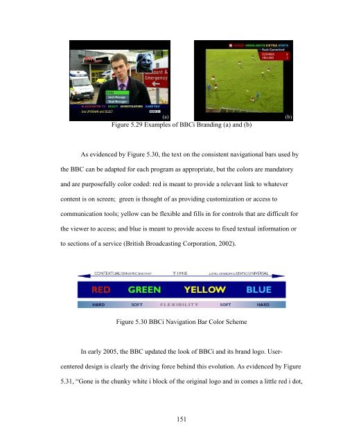
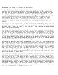
- Page 149 and 150: viewing experiences so that each vi
- Page 151 and 152: (a) (b) Figure 5.10 TiVo WishList (
- Page 153 and 154: e voted off the island. In both cas
- Page 155 and 156: them so conducive to iTV programmin
- Page 157 and 158: own content in ways similar to this
- Page 159 and 160: In the first of a series of on-air
- Page 161 and 162: Jakob Nielsen notes that users are
- Page 163 and 164: (a) (b) Figure 5.22 TV411 Interface
- Page 165 and 166: Figure 5.25 Life 360 Competing Elem
- Page 167: (a) (b) (c) (d) Figure 5.28 Example
- Page 171 and 172: Lamont brings up compelling advanta
- Page 173 and 174: lower right-hand areas are privileg
- Page 175 and 176: 5.4 NAVIGATION Navigation pertains
- Page 177 and 178: Figure 5.35 New Americans Orientati
- Page 179 and 180: Figure 5.37 Test the Nation User In
- Page 181 and 182: applications based on the televisio
- Page 183 and 184: esearchers, “In many ways, the pa
- Page 185 and 186: In Robert Miller’s classic user r
- Page 187 and 188: ecycling bin from Windows, that sta
- Page 189 and 190: importance (see chapter three). In
- Page 191 and 192: Figure 5.46 Examples of Mobile Inte
- Page 193 and 194: CHAPTER 6 CONCLUSIONS AND FUTURE DI
- Page 195 and 196: Figure 6.2 Convergence of Entertain
- Page 197 and 198: (a) Figure 6.3 Examples of MTV Hija
- Page 199 and 200: television producers to create show
- Page 201 and 202: user-centered design, incorporates
- Page 203 and 204: Sheri Lamont, who has practiced and
- Page 205 and 206: ecognition of outstanding achieveme
- Page 207 and 208: REFERENCES Adams, M., Anand, P. & F
- Page 209 and 210: Halle, T. (2003). Standards for int
- Page 211 and 212: Norman, D. (2004) Emotional design:
- Page 213 and 214: Thurrott, P. (2004, October 12). Wi
- Page 215 and 216: BROADBAND A network capable of deli
- Page 217 and 218: MEDIA CENTER Media centers, or PC T
- Page 219:
which a television and a personal c