- Page 2 and 3:
A Manual for Writers of Research Pa
- Page 4 and 5:
Indexing BooksNancy C. MulvanyGetti
- Page 6 and 7:
Part I Research and Writing: From P
- Page 8 and 9:
15 General Introduction to Citation
- Page 10 and 11:
Appendix: Paper Format and Submissi
- Page 12 and 13:
that have emerged since 2003 and th
- Page 14 and 15:
We first discuss the aims of resear
- Page 16 and 17:
You may think your report will add
- Page 18 and 19:
1.2 Three Kinds of Questions That R
- Page 20 and 21:
That impulse is understandable. But
- Page 22 and 23:
You might even post those five goal
- Page 24 and 25:
knowledge:masks in religious ceremo
- Page 26 and 27:
9. Look for questions that other re
- Page 28 and 29:
esearch. You can, of course, look f
- Page 30 and 31:
If you can think of only one or two
- Page 32 and 33:
3.3.2 Skim the Internet3.3.3 Talk t
- Page 34 and 35:
understand what you think until you
- Page 36 and 37:
translator(s)What data identify the
- Page 38 and 39:
(Bibliographic Index is a bibliogra
- Page 40 and 41:
Skim bibliographies of recent books
- Page 42 and 43:
influential a source is by how ofte
- Page 44 and 45:
4.5 Review Your Progress4.5.1 Searc
- Page 46 and 47: PART-WHOLE CONTRADICTIONS. You can
- Page 48 and 49: label the places (see fig. 4.1, wit
- Page 50 and 51: major reasons, and so on). Highligh
- Page 52 and 53: two, and if you take notes on a com
- Page 54 and 55: 4.6 Manage Moments of Normal PanicT
- Page 56 and 57: good research report, readers hear
- Page 58 and 59: think your answer is significant, i
- Page 60 and 61: differently, you must acknowledge a
- Page 62 and 63: Around here, when it's a warm night
- Page 64 and 65: To accept that claim, readers must
- Page 66 and 67: 5.6 Assemble an ArgumentHere is a s
- Page 68 and 69: 6.2.6).6.2 Create a Plan That Meets
- Page 70 and 71: 2. Rephrase your question as a lack
- Page 72 and 73: You can follow the same procedure t
- Page 74 and 75: its end expressing its point. That
- Page 76 and 77: 7.10 Guard against Inappropriate As
- Page 78 and 79: y their lack of original thinking.
- Page 80 and 81: Now might I do it [kill him] pat, n
- Page 82 and 83: As one invention begets another one
- Page 84 and 85: 2. What help must you acknowledge i
- Page 86 and 87: families were headed by a single mo
- Page 88 and 89: A.3.1 on creating and inserting tab
- Page 90 and 91: 1. Include only relevant data. If y
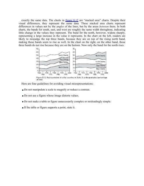
- Page 92 and 93: BAR CHARTS. Bar charts communicate
- Page 94 and 95: Figure 8.7 shows how a stacked bar
- Page 98 and 99: www.itpub.net
- Page 100 and 101: 9.2 Make Sure the Body of Your Repo
- Page 102 and 103: Of each section, ask What question
- Page 104 and 105: give them a framework for understan
- Page 106 and 107: you just surveyed:Ever since Girola
- Page 108 and 109: Be sure to include in these openers
- Page 110 and 111: 11.5 Give It Up and Print It OutYou
- Page 112 and 113: principal demonstrates that she is
- Page 114 and 115: squeezed into so little volume chan
- Page 116 and 117: Most instructors and editors do agr
- Page 118 and 119: problem is the ones you are sure of
- Page 120 and 121: comments so that you can do better
- Page 122 and 123: 13.1.2 Understand the Difference be
- Page 124 and 125: of us do), you can then skip to the
- Page 126 and 127: want to listen to them. Your aims a
- Page 128 and 129: 15.2.2 Information Required in Cita
- Page 130 and 131: journal, collection, or series it a
- Page 132 and 133: deciding how much change counts as
- Page 134 and 135: You can assemble your bibliography
- Page 136 and 137: information about the source (autho
- Page 138 and 139: 3. Author(s) Plus Editor or Transla
- Page 140 and 141: 16.1.3 CapitalizationCapitalize mos
- Page 142 and 143: university may specify that you sho
- Page 144 and 145: You may choose to include in your b
- Page 146 and 147:
16.3.5 Complex NotesCITATIONS. If y
- Page 148 and 149:
full note.N: 5. Jan H. Kalicki and
- Page 150 and 151:
number of a reference is the same a
- Page 152 and 153:
17.1.2 Title17.1.3 Edition17.1.4 Vo
- Page 154 and 155:
17.7 Informally Published Electroni
- Page 156 and 157:
17.1 BooksBooks reflect a wider ran
- Page 158 and 159:
4. Timothy E. Fulop and Albert J. R
- Page 160 and 161:
Many Spanish last names are compoun
- Page 162 and 163:
B: Aaron, Henry. Why Is Welfare So
- Page 164 and 165:
B: Pelikan, Jaroslav. Christian Doc
- Page 166 and 167:
Cambridge, MA: MIT PressChapel Hill
- Page 168 and 169:
illustration number.N: 50. Richard
- Page 170 and 171:
N: 3. Anne Carr and Douglas J. Schu
- Page 172 and 173:
download or other delivery from a b
- Page 174 and 175:
B: Jenkins, J. Craig, David Jacobs,
- Page 176 and 177:
B: Schapiro, Mark. “New Power for
- Page 178 and 179:
Articles published online. For onli
- Page 180 and 181:
parenthetical notes (see 16.4.3). Y
- Page 182 and 183:
N: 34. Hazel V. Clark, Mesopotamia:
- Page 184 and 185:
17.6.3 Interviews and Personal Comm
- Page 186 and 187:
Locating information. Although some
- Page 188 and 189:
consistently, and adapt the general
- Page 190 and 191:
For video recordings, see 17.8.5; f
- Page 192 and 193:
with Harry N. Abrams, 1998. Publish
- Page 194 and 195:
note.N: 4. Senator Kennedy of Massa
- Page 196 and 197:
Executive departments, bureaus, and
- Page 198 and 199:
Lower federal courts. For lower fed
- Page 200 and 201:
them in your bibliography, although
- Page 202 and 203:
Style: The Basic Form18.1 Basic Pat
- Page 204 and 205:
In reference list entries, separate
- Page 206 and 207:
R: Chapter Author's Last Name, Chap
- Page 208 and 209:
If your reference list includes two
- Page 210 and 211:
18.3.1 Placement in TextWhenever yo
- Page 212 and 213:
citations. See 16.3.2-16.3.4 for no
- Page 214 and 215:
19.5.8 CD-ROMs or DVD-ROMs19.5.9 On
- Page 216 and 217:
This chapter provides detailed info
- Page 218 and 219:
(Menchú 1999, 50-51)(Adorno and Be
- Page 220 and 221:
Van Rensselaer, StephenMedici, Lore
- Page 222 and 223:
Dates. Use a comma to set off dates
- Page 224 and 225:
When you cite an edition other than
- Page 226 and 227:
Some numbered series have existed f
- Page 228 and 229:
SPECIAL TYPES OF LOCATORS. Some par
- Page 230 and 231:
Calhoun, Craig. 2005. Foreword to M
- Page 232 and 233:
19.2.1 Author's NameGive authors' n
- Page 234 and 235:
For a reference list entry, give th
- Page 236 and 237:
the magazine in place of the author
- Page 238 and 239:
15.4.1). Note that a URL alone is n
- Page 240 and 241:
traditional or shorter abbreviation
- Page 242 and 243:
In your reference list, cite works
- Page 244 and 245:
19.6.3 Interviews and Personal Comm
- Page 246 and 247:
followed by to and the name of the
- Page 248 and 249:
enclosed in quotation marks. Use he
- Page 250 and 251:
P: (Federal Express, “Caveman”
- Page 252 and 253:
If your paper is in literary studie
- Page 254 and 255:
R: U.S. Congress. Congressional Rec
- Page 256 and 257:
U.S. Bureau of the Census. 1975. Me
- Page 258 and 259:
language, provide the page number a
- Page 260 and 261:
United Kingdom. n.d. Rotuli parliam
- Page 262 and 263:
20.3 Compounds and Words Formed wit
- Page 264 and 265:
ABBREVIATIONS. Form plurals of abbr
- Page 266 and 267:
the role of the United Statesinstea
- Page 268 and 269:
foodbornechildlikeworldwideExceptio
- Page 270 and 271:
French Canadian explorerMiddle East
- Page 272 and 273:
when the prefix precedes a compound
- Page 274 and 275:
Abbreviations. Do not break abbrevi
- Page 276 and 277:
Special elements such as abbreviati
- Page 278 and 279:
Do not use commas when all the elem
- Page 280 and 281:
commas when such elements do not br
- Page 282 and 283:
If the included question is at the
- Page 284 and 285:
21.8.2 BracketsBrackets are most of
- Page 286 and 287:
We have noted similar motifs in Jap
- Page 288 and 289:
Chiang Kai-shekthe Honda Motor Comp
- Page 290 and 291:
treaties, government programs, and
- Page 292 and 293:
22.2.2 Words Defined as TermsTo emp
- Page 294 and 295:
given with an initial capital only.
- Page 296 and 297:
Web sites referred to generally (MS
- Page 298 and 299:
so, be consistent.If you are writin
- Page 300 and 301:
ROUND NUMBERS. Spell out a round nu
- Page 302 and 303:
23.1.6 Names with NumbersSome types
- Page 304 and 305:
In most numbers of four or more dig
- Page 306 and 307:
The research was conducted over sev
- Page 308 and 309:
do not, reconsider the structure of
- Page 310 and 311:
disciplines. If you are writing a p
- Page 312 and 313:
24.2.1 Personal NamesIn general, do
- Page 314 and 315:
24.2.3 Academic DegreesYou may use
- Page 316 and 317:
She was ineligible for the presiden
- Page 318 and 319:
24.4 Time and Dates24.4.1 TimeYou m
- Page 320 and 321:
Depending on the context, you may e
- Page 322 and 323:
24.6.3 New TestamentNote that the a
- Page 324 and 325:
parenthetical statements in the tex
- Page 326 and 327:
25.3.1 Permissible Changes25.3.2 Om
- Page 328 and 329:
The same placement options apply to
- Page 330 and 331:
R. ROISTER DOISTER. Except I have h
- Page 332 and 333:
INSERTIONS. If you need to insert a
- Page 334 and 335:
If you omit material between senten
- Page 336 and 337:
sometimes used interchangeably with
- Page 338 and 339:
Sources: Data from Richard H. Adams
- Page 340 and 341:
This grid of columns (vertical) and
- Page 342 and 343:
26.2.5 The StubThe leftmost column
- Page 344 and 345:
designate notes with asterisks, bot
- Page 346 and 347:
sentences. Such captions are also c
- Page 348 and 349:
hand) before submitting it. Softwar
- Page 350 and 351:
Many departments and universities h
- Page 352:
www.itpub.net
- Page 356:
www.itpub.net
- Page 359 and 360:
TITLE PAGE. Class papers should beg
- Page 361 and 362:
—New York Sun, February 13, 1917E
- Page 363 and 364:
class paper) includes many foreign
- Page 366:
www.itpub.net
- Page 369 and 370:
CHAPTERS. Most theses and dissertat
- Page 371 and 372:
that appear together without interv
- Page 374 and 375:
Examples of such material would be
- Page 376 and 377:
A.3 Submission RequirementsA.3.1 Pr
- Page 378 and 379:
Keep a table that cannot be present
- Page 380 and 381:
multimedia files.BibliographyThere
- Page 382 and 383:
The Booklist. Chicago: American Lib
- Page 384 and 385:
1. Bowman, John S., ed. The Cambrid
- Page 386 and 387:
Visual Representation of Data (Tabl
- Page 388 and 389:
4. Walford, Albert J., Anthony Chal
- Page 390 and 391:
University Press, 2004.2. Ward, Sir
- Page 392 and 393:
3. Øyen, Else, ed. Comparative Met
- Page 394 and 395:
http://www netlibrary.com.2. Warner
- Page 396 and 397:
EducationGeography4. Journal of Eco
- Page 398 and 399:
5. Garner, Bryan A. The Elements of
- Page 400 and 401:
Sociology3. Kennedy, J. Library Res
- Page 402 and 403:
1. McGraw-Hill Dictionary of Scient
- Page 404 and 405:
Chemistry4. Genetics Citation Index
- Page 406 and 407:
MathematicsPhysics2. Seyfert, Carl
- Page 408 and 409:
Chicago. He is the author of Style:
- Page 410 and 411:
of abbreviations list, 389in biblio
- Page 412 and 413:
See also figuresBC, 328, 339BCE, 32
- Page 414 and 415:
visual and performing arts, sources
- Page 416 and 417:
URLs, 177of words derived from pers
- Page 418 and 419:
working hypothesis as, 50-51See als
- Page 420 and 421:
headline-style capitalization and,
- Page 422 and 423:
of journal articles, citation of in
- Page 424 and 425:
drama. See plays; theater, citation
- Page 426 and 427:
eference list-style citation of, 25
- Page 428 and 429:
highlights in, 86-87inserted into f
- Page 430 and 431:
front matter, 377-391; abstract, 39
- Page 432 and 433:
See also figures; graphicsgrouped b
- Page 434 and 435:
methods of research illustrated on,
- Page 436 and 437:
as topic source, 14, 17journal writ
- Page 438 and 439:
magazinesbibliography-style citatio
- Page 440 and 441:
newspapersabbreviation of, 336-337a
- Page 442 and 443:
lists and, 329-330with names, 323-3
- Page 444 and 445:
multivolume dissertation, 375-376te
- Page 446 and 447:
in figure captions, 370function of,
- Page 448 and 449:
slash separating lines of, 350posse
- Page 450 and 451:
in glossary, 390line breaks and hyp
- Page 452 and 453:
from foreign language, 312integrati
- Page 454 and 455:
purpose of, 221specific requirement
- Page 456 and 457:
esearch method page, 390Reverend, u
- Page 458 and 459:
sentencesquoted material ending in,
- Page 460 and 461:
See also literature review; note-ta
- Page 462 and 463:
hard copy submission, 407-408prepar
- Page 464 and 465:
3-em dash, 148-149, 304timeabbrevia
- Page 466 and 467:
See also questions, researchtransit
- Page 468 and 469:
as primary sources, 25reference lis
- Page 470:
www.itpub.net