- Page 2 and 3:
E M I S S I O N S S C E N A R I O S
- Page 4 and 5:
PUBLISHED BY THE PRESS SYNDICATE OF
- Page 6 and 7:
Contents Foreword Preface Summary f
- Page 8 and 9:
Preface The Intergovernmental Panel
- Page 10 and 11:
C O N T E N T S Why new Intergovern
- Page 12 and 13:
4 Summary for Policymakers Box SPM-
- Page 14 and 15:
6 Summary for Policymaker -3.5 i i
- Page 16 and 17:
8 Summary for PoUcymake. b Scenario
- Page 18 and 19:
lu Summary for Policymakers 0 I I I
- Page 20 and 21:
Summary for Policymakers such as fe
- Page 22 and 23:
14 Summary for Policymakers CQ so t
- Page 24 and 25:
16 Summary for Policymakers CQ ^ Ч
- Page 26 and 27:
18 Summary for Policymakers s I, I
- Page 28 and 29:
Summary for Policymakers P3 M ^ NO
- Page 30 and 31:
CONTENTS 1. Introduction and Backgr
- Page 32 and 33:
24 Technical Summai-y intended to b
- Page 34 and 35:
26 Technical Summary 1900 1950 2000
- Page 36 and 37:
28 Technical Summary Figure TS-2: S
- Page 38 and 39:
30 Technical Summaiy Box TS-3: SRES
- Page 40 and 41:
32 Technical Summary Figure TS-3: P
- Page 42 and 43:
34 Technical Summary Renewables/Nuc
- Page 44 and 45:
36 Technical Summary Figure TS-5 il
- Page 46 and 47:
38 Technical Summar 1900 1950 2000
- Page 48 and 49:
40 Technical Summary 40 1990 2000 2
- Page 50 and 51:
42 Technical Summary family). Chapt
- Page 52 and 53:
44 Technical Summary 1930 1960 1990
- Page 54 and 55:
46 Technical Summary does not exist
- Page 56 and 57:
48 Technical Summary CQ CP 00 00 l>
- Page 58 and 59:
50 Technical Summary n rí M •л
- Page 60 and 61:
52 Technical Summary pa Ю un ^ Ч
- Page 62 and 63:
54 Technical Summary (S ее CQ fN
- Page 64 and 65:
56 Technical Summary References: Al
- Page 67 and 68:
1 Background and Overview
- Page 69 and 70:
Background and Overview 61 1.1. Int
- Page 71 and 72:
Background and Overview 63 Box 1-1:
- Page 73 and 74:
Background and Overview 65 interven
- Page 75 and 76:
Background and Overview 67 powerful
- Page 77 and 78:
Background and Overview 69 1900 195
- Page 79 and 80:
Background and Overview 71 SRES Sce
- Page 81 and 82:
Background and Overview 73 1900 195
- Page 83 and 84:
Background and Overview characteriz
- Page 85 and 86:
2 An Overview of the Scenario Liter
- Page 87 and 88:
An Overview of the Scenario Literat
- Page 89 and 90:
An Overview of the Scenario Literat
- Page 91 and 92:
An Overview of the Scenario Literat
- Page 93 and 94:
An Overview of the Scenario Literat
- Page 95 and 96:
An Overview of the Scenario Literat
- Page 97 and 98:
An Overview of the Scenario Literat
- Page 99 and 100:
An Overview of the Scenario Literat
- Page 101 and 102:
An Overview of the Scenario Literat
- Page 103 and 104:
An Overview of the Scenario Literat
- Page 105 and 106:
An Overview of the Scenario Literat
- Page 107 and 108:
An Overview of the Scenario Literat
- Page 109 and 110:
hn Overview of the Scenario Literat
- Page 111 and 112:
3 Scenario Driving Forces
- Page 113 and 114:
Scenario Driving Forces 105 3.1. In
- Page 115 and 116:
Scenario Driving Forces 107 Section
- Page 117 and 118:
Scenario Driving Forces J 09 UN 199
- Page 119 and 120:
Scenario Driving Forces 111 deficit
- Page 121 and 122:
Scenario Driving Forces 113 recent
- Page 123 and 124:
Scénario Driving Forces lis Box 3-
- Page 125 and 126:
Scénario Driving Forces 117 Table
- Page 127 and 128:
Scenario Driving Forces 119 о I ht
- Page 129 and 130:
Scenario Driving Forces 121 in biol
- Page 131 and 132:
Scenario Driving Forces 123 0.15 0.
- Page 133 and 134:
Scenario Driving Forces 125 GDP per
- Page 135 and 136:
Scenario Driving Forces 127 aluminu
- Page 137 and 138:
Scenario Driving Forces 129 Table 3
- Page 139 and 140:
Scenario Driving Forces 131 cooling
- Page 141 and 142:
Scenario Driving Forces 133 saved f
- Page 143 and 144:
Scenario Driving Forces 135 give re
- Page 145 and 146:
Scenario Driving Forces 137 3.4.3.3
- Page 147 and 148:
Scenario Driving Forces 139 economi
- Page 149 and 150:
Scenario Driving Forces 141 growth"
- Page 151 and 152:
Scenario Driving Forces 143 (a) (b)
- Page 153 and 154:
Scenario Driving Forces 145 the ext
- Page 155 and 156:
Scénario Driving Forces 147 Global
- Page 157 and 158:
Scénario Driving Forces 149 anywhe
- Page 159 and 160:
Scenario Driving Forces 151 (a) Sul
- Page 161 and 162:
Scenario Driving Forces 153 Nakicen
- Page 163 and 164:
Scenaiio Driving Forces 155 3.7. Po
- Page 165 and 166:
Scenario Driving Forces 157 Overpro
- Page 167 and 168:
Scenario Driving Forces 159 Christi
- Page 169 and 170:
Scenario Drivmg Forces 161 lEA (Int
- Page 171 and 172:
Scénario Driving Forces 163 Murthy
- Page 173 and 174:
Scenario Driving Forces 165 Stevens
- Page 175 and 176:
4 An Overview of Scenarios
- Page 177 and 178:
An Overview of Scenarios 169 4.1. I
- Page 179 and 180:
An Overview of Scenaiios 171 within
- Page 181 and 182:
An Overview of Scenarios 173 • De
- Page 183 and 184:
An Overview of Scenarios 175 Table
- Page 185 and 186:
An Overview of Scenarios drivmg for
- Page 187 and 188:
An Overview of Scenarios 179 Figure
- Page 189 and 190:
An Overview of Scenarios 181 The A2
- Page 191 and 192:
An Overview of Scenarios 183 capita
- Page 193 and 194:
An Overview of Scenarios 185 ^ 4j f
- Page 195 and 196:
An Overview of Scenarios 187 scenar
- Page 197 and 198:
An Overview of Scenarios 189 • Hi
- Page 199 and 200:
An Overview of Scenarios 191
- Page 201 and 202:
An Overview of Scenarios 193 16 14
- Page 203 and 204:
An Overview of Scenarios 195 Table
- Page 205 and 206:
An Overview of Scenarios 197 growth
- Page 207 and 208:
An Overview of Scenarios 199 Box 4-
- Page 209 and 210:
An Overview of Scenarios 201 Figure
- Page 211 and 212:
An Ovei-view of Scenarios 203 The b
- Page 213 and 214:
An Overview of Scenarios 205 I ^ 1
- Page 215 and 216:
An Overview of Scenarios 207 100 S
- Page 217 and 218: An Overview of Scenarios 209 Table
- Page 219 and 220: An Overview of Scenarios 211 availa
- Page 221 and 222: An Overview of Scenarios 213 Box 4-
- Page 223 and 224: An Overview of Scenarios 215 produc
- Page 225 and 226: An Overview of Scenarios 217 In par
- Page 227 and 228: An Overview of Scenarios 219 S о
- Page 229 and 230: An Overview of Scenarios 221 Table
- Page 231 and 232: An Overview of Scenarios 223 a curr
- Page 233 and 234: An Overview of Scenarios 225 4.4.8.
- Page 235 and 236: An Overview of Scenarios 227 20% л
- Page 237 and 238: An Overview of Scenarios 229 Table
- Page 239 and 240: An Overview of Scenarios 231 Table
- Page 241 and 242: An Overview of Scenarios 233 Dietz
- Page 243 and 244: An Overview of Scenarios 235 consid
- Page 245 and 246: An Overview of Scenai ios 237 Gallo
- Page 247 and 248: Emission Scenarios
- Page 249 and 250: Emission Scénarios 241 5.1 Introdu
- Page 251 and 252: Emission Scenarios 243 Box 5-1: Sce
- Page 253 and 254: Emission Scenar nos PQ PQ и CN m
- Page 255 and 256: Emission Scenarios 247 tí ü
- Page 257 and 258: Emission Scenarios 249 40 35 |Energ
- Page 259 and 260: Emission Scenarios 251 25 , [Energy
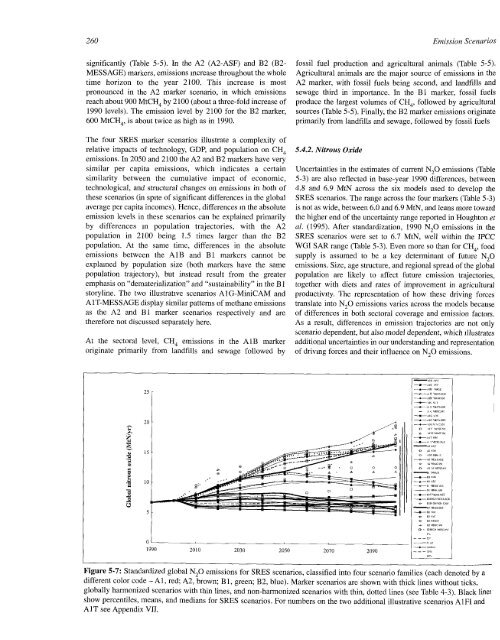
- Page 261 and 262: Emission Scenarios 253 I I .2 I I
- Page 263 and 264: Emission Scenanos 255 the base-year
- Page 265 and 266: Emission Scénarios 257 is between
- Page 267: Emission Scenarios 259 700 600 Bl F
- Page 271 and 272: Emission Scénarios 263 oi • •
- Page 273 and 274: Emission Scénarios 265 Table 5-7:
- Page 275 and 276: Emission Scénarios 267 Table 5-9:
- Page 277 and 278: Emission Scenarios 269 technically
- Page 279 and 280: Emission Scénarios 271 ^ — BIT M
- Page 281 and 282: Emission Scénarios 273 4000 AlB AI
- Page 283 and 284: Emission Scenarios 275 M B v/ы —
- Page 285 and 286: Emission Scenarios 277 Box 5-3: Sul
- Page 287 and 288: Emission Scenarios 279 Box 5-4: Fut
- Page 289 and 290: Emission Scenarios о ON — 00 Ч
- Page 291 and 292: Emission Scenarios QS ON NO со ON
- Page 293 and 294: Emission Scenarios 285 Table 5-14:
- Page 295 and 296: Emission Scenarios 287 -OECD90 REF
- Page 297 and 298: Emission Scenarios 289 1200 oU, \ \
- Page 299 and 300: Emission Scenarios 291 Box 5-5: Gri
- Page 301 and 302: 6 Summary Discussions and Recommend
- Page 303 and 304: Summary Discussions and Recommendat
- Page 305 and 306: Summary Discussions and Recommendat
- Page 307 and 308: Summary Discussions and Recommendat
- Page 309 and 310: Summary Discussions and Recommendat
- Page 311 and 312: Summary Discussions and Recommendat
- Page 313 and 314: Summary Discussions and Recommendat
- Page 315 and 316: Summary Discussions and Recommendat
- Page 317 and 318: Summary Discussions and Recommendat
- Page 319 and 320:
Summary Discussions and Recommendat
- Page 321 and 322:
Summary Discussions and Recommendat
- Page 323 and 324:
Summary Discussions and Recommendat
- Page 325 and 326:
Summary Discussions and Recommendat
- Page 327 and 328:
Summary Discussions and Recommendat
- Page 329:
SPECIAL REPORT ON EMISSIONS SCENARI
- Page 332 and 333:
324 SRES Terms of Reference: New IP
- Page 335 and 336:
II SRES Writing Team and SRES Revie
- Page 337 and 338:
SRES Writmg Team ami SRES Reviewers
- Page 339 and 340:
Ill Definition of SRES World Re
- Page 341:
Definition of SRES World Regions Me
- Page 344 and 345:
336 Six Modeling Approaches Six Mod
- Page 346 and 347:
338 Six Modeling Approaches e < .S
- Page 348 and 349:
340 Six Modeling Approaches Populat
- Page 350 and 351:
342 Six Modeling Approaches Table I
- Page 352 and 353:
344 Six Modeling Approaches Table I
- Page 354 and 355:
346 Six Modeling Approaches for dev
- Page 356 and 357:
348 Data Description Database Descr
- Page 358 and 359:
350 Data Description Table V-2. Lis
- Page 361 and 362:
Open Process
- Page 363 and 364:
Open Process 355 Table VI'2: SRES w
- Page 365 and 366:
Open Process 357 1Г)-ч);ОООЧ
- Page 367 and 368:
Open Process 359 Preliminary Al Mar
- Page 369 and 370:
Open Process 361 Preliminary Al Mar
- Page 371 and 372:
Open Process 363 Table VI-4b: Stand
- Page 373 and 374:
Open Process 365 Preliminary A2 Mar
- Page 375 and 376:
Open Process 367 Preliminary A2 Mar
- Page 377 and 378:
Open Process 369 Preliminary Bl Mar
- Page 379 and 380:
Open Process 371 Preliminary Bl Mar
- Page 381 and 382:
Open Process 373 Table VI-4d: Stand
- Page 383 and 384:
Open Process 375 Preliminary B2 Mar
- Page 385:
Open Process 377 Preliminary B2 Mar
- Page 388 and 389:
380 Statistical Table Table VII.l:
- Page 390 and 391:
3S2 Statistical Table Marker Scenar
- Page 392 and 393:
384 Statistical Table Marker Scenar
- Page 394 and 395:
386 Statistical Table Scenario AlB-
- Page 396 and 397:
388 Statistical Table Scenario AlB-
- Page 398 and 399:
390 Statistical Table Scenario AlB-
- Page 400 and 401:
392 Statistical Table Scenario AIB-
- Page 402 and 403:
394 Statistical Table Scenario AIB-
- Page 404 and 405:
396 Statistical Table Scenario AIB-
- Page 406 and 407:
398 Statistical Table Scenario AIB-
- Page 408 and 409:
400 Statistical Table Scenario AIB-
- Page 410 and 411:
402 Statistical Table Scenario AlB-
- Page 412 and 413:
404 Statistical Table Scenario AlB-
- Page 414 and 415:
4U0 Statistical Table Scenario AlB-
- Page 416 and 417:
408 Statistical Table Scenario AlB-
- Page 418 and 419:
410 Statistical Table Scenario AlB-
- Page 420 and 421:
412 Statistical Table Scenario AlC-
- Page 422 and 423:
414 Statistical Table Scenario AlC-
- Page 424 and 425:
416 Statistical Table Scenario AIC-
- Page 426 and 427:
418 Statistical Table Scenario AlC-
- Page 428 and 429:
420 Statistical Table Scenario AlC-
- Page 430 and 431:
422 Statistical Table Scenario AlC-
- Page 432 and 433:
424 Statistical Table Scenario AlC-
- Page 434 and 435:
426 Statistical Table Scenario AIG-
- Page 436 and 437:
428 Statistical Table Scenario AIG-
- Page 438 and 439:
430 Statistical Table Scenario AIG-
- Page 440 and 441:
432 Statistical Table Scenario AIG-
- Page 442 and 443:
434 Statistical Table Scenario AIG-
- Page 444 and 445:
436 Statistical Table Illustrative
- Page 446 and 447:
438 Statistical Table Illustrative
- Page 448 and 449:
440 Statistical Table Illustrative
- Page 450 and 451:
442 Statistical Table Scenario AIT-
- Page 452 and 453:
444 Statistical Table Scenario AIT-
- Page 454 and 455:
446 Statistical Table Illustrative
- Page 456 and 457:
448 Statistical Table Illustrative
- Page 458 and 459:
450 Statistical Table Illustrative
- Page 460 and 461:
452 Statis-tical Table Scenario AIT
- Page 462 and 463:
454 Statistical Table Scenario AIT-
- Page 464 and 465:
456 Statistical Table Scenario Alvl
- Page 466 and 467:
458 Statistical Table Scenario Alvl
- Page 468 and 469:
460 Statistical Table Scenario Alvl
- Page 470 and 471:
462 Statistical Table Scenario Alv2
- Page 472 and 473:
464 Statistical Table Scenario Alv2
- Page 474 and 475:
466 Statistical Table Scenario A2-A
- Page 476 and 477:
468 Statistical Table Scenario A2-A
- Page 478 and 479:
470 Statistical Table Scenario A2-A
- Page 480 and 481:
472 Statistical Table Marker Scenar
- Page 482 and 483:
474 Statistical Table Marker Scenar
- Page 484 and 485:
476 Statistical Table Scenario A2G-
- Page 486 and 487:
478 Statistical Table Scenario A2G-
- Page 488 and 489:
480 Statistical Table Scenario A2G-
- Page 490 and 491:
482 Statistical Table Scenario A2-I
- Page 492 and 493:
484 Statistical Table Scenario A2-M
- Page 494 and 495:
486 Statistical Table Scenario A2-M
- Page 496 and 497:
488 Statistical Table Scenario A2-M
- Page 498 and 499:
490 Statistical Table Scenario A2-M
- Page 500 and 501:
492 Statistical Table Scenario A2-A
- Page 502 and 503:
494 Statistical Table Scenario A2-A
- Page 504 and 505:
496 Statistical Table Scenario Bl-A
- Page 506 and 507:
498 Statistical Table Scenario Bl-A
- Page 508 and 509:
500 Statistical Table Scenario В1-
- Page 510 and 511:
502 Statistical Table Scenario Bl-A
- Page 512 and 513:
504 Statistical Table Scenario Bl-A
- Page 514 and 515:
506 Statistical Table Marker Scenar
- Page 516 and 517:
508 Statistical Table Marker Scenar
- Page 518 and 519:
510 Statistical Table Marker Scenar
- Page 520 and 521:
512 Statistical Table Scenario Bl-M
- Page 522 and 523:
514 Statistical Table Scenario Bl-M
- Page 524 and 525:
516 Statistical Table Scenario Bl-M
- Page 526 and 527:
518 Statistical Table Scenario Bl-M
- Page 528 and 529:
520 Statistical Table Scenario Bl-M
- Page 530 and 531:
522 Statistical Table OECDTO^^"'^'"
- Page 532 and 533:
524 Statistical Table Scenario Bl-M
- Page 534 and 535:
526 Statistical Table Scenario BIT-
- Page 536 and 537:
528 Statistical Table Scenario BIT-
- Page 538 and 539:
530 Statistical Table Scenario BIT-
- Page 540 and 541:
532 Statistical Table Scenario BlHi
- Page 542 and 543:
534 Statistical Table Scenario BlHi
- Page 544 and 545:
536 Statistical Table Scenario BlHi
- Page 546 and 547:
538 Statistical Table Scenario BlHi
- Page 548 and 549:
540 Statistical Table Scenario BlHi
- Page 550 and 551:
542 Statistical Table Scenario B2-A
- Page 552 and 553:
544 Statistical Table Scenario В2-
- Page 554 and 555:
546 Statistical Table Scenario B2-A
- Page 556 and 557:
548 Statistical Table Scenario B2-A
- Page 558 and 559:
550 Statistical Table Scenario B2-A
- Page 560 and 561:
552 Statistical Table Scenario В2-
- Page 562 and 563:
554 Statistical Table Scenario B2-I
- Page 564 and 565:
556 Statistical Table Scenario B2-M
- Page 566 and 567:
558 Statistical Table Scenario B2-1
- Page 568 and 569:
560 Statistical Table Scenario B2-M
- Page 570 and 571:
562 Statistical Table Marker Scenar
- Page 572 and 573:
564 Statistical Table Marker Scenar
- Page 574 and 575:
566 Statistical Table Scenario B2-M
- Page 576 and 577:
568 Statistical Table Scenario B2-M
- Page 578 and 579:
570 Statistical Table Scenario B2-M
- Page 580 and 581:
572 Statistical Table Scenario B2C-
- Page 582 and 583:
574 Statistical Table Scenario B2C-
- Page 584 and 585:
576 Statistical Table Scenario B2Hi
- Page 586 and 587:
578 Statistical Table Scenario BZHi
- Page 588 and 589:
580 Statistical Table Scenario B2Hi
- Page 590 and 591:
582 Acronyms and Abbreviations Acro
- Page 592 and 593:
584 Acronyms and Abbreviations USCB
- Page 594 and 595:
586 Chemical Symbols Chemical Symbo
- Page 596 and 597:
588 Units Table X-1: SI (Système I
- Page 598 and 599:
590 Glossary of Terms Glossary of T
- Page 600 and 601:
592 Glossary of Terms Fuel Switchin
- Page 602 and 603:
594 Glossary of Terms standards for
- Page 605 and 606:
XII List of Major IPCC Reports
- Page 607:
List of Major IPCC Reports 599 Tech